Best Uthakhamkong

BEST
A new brand identity and visual system for a New Zealand wedding photography and film studio built on honesty. Designed by POV - www.pov.nz

VOWLY

A new brand identity and website for a New Zealand wedding photography and film studio built on honest light and honest moments.

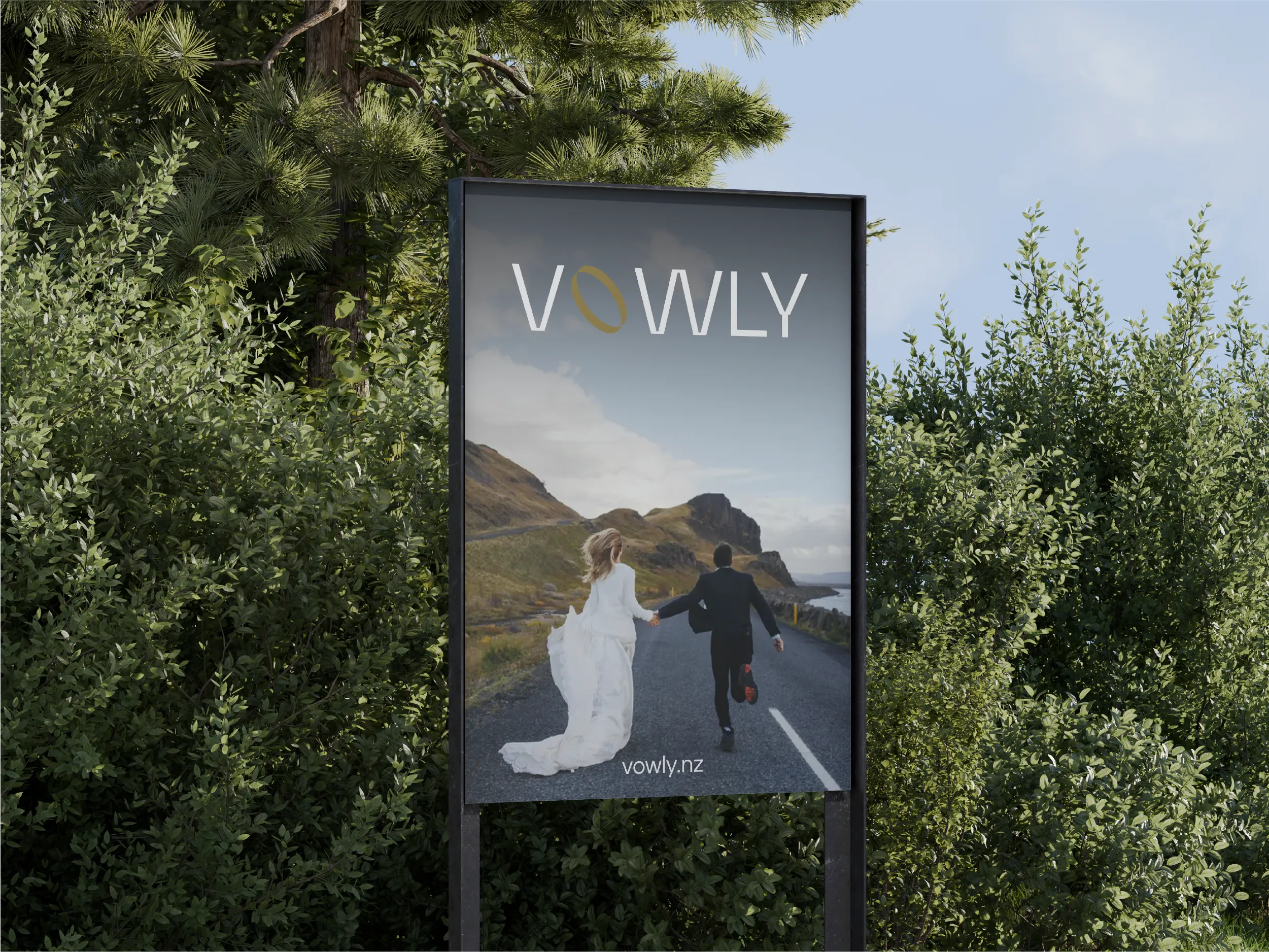
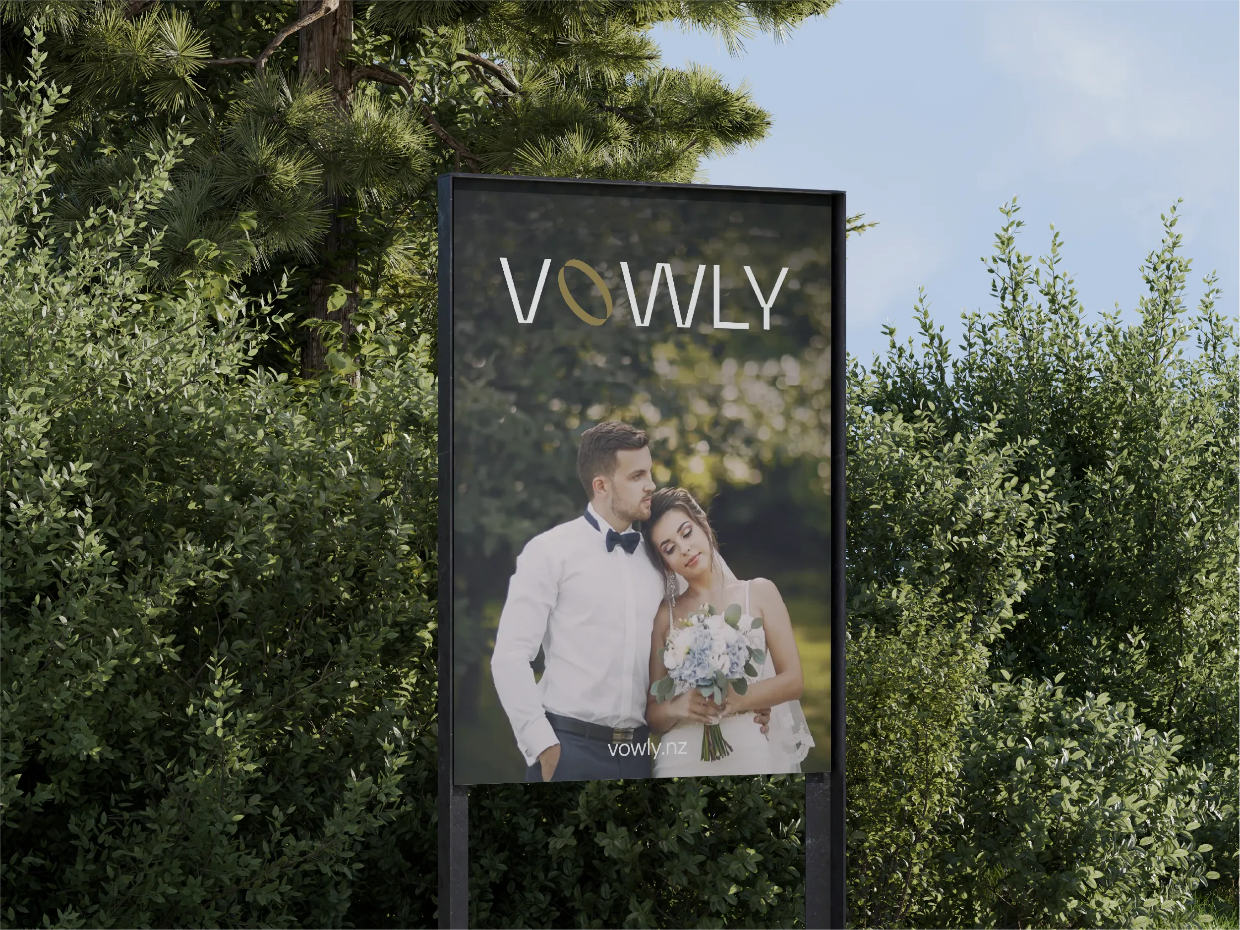
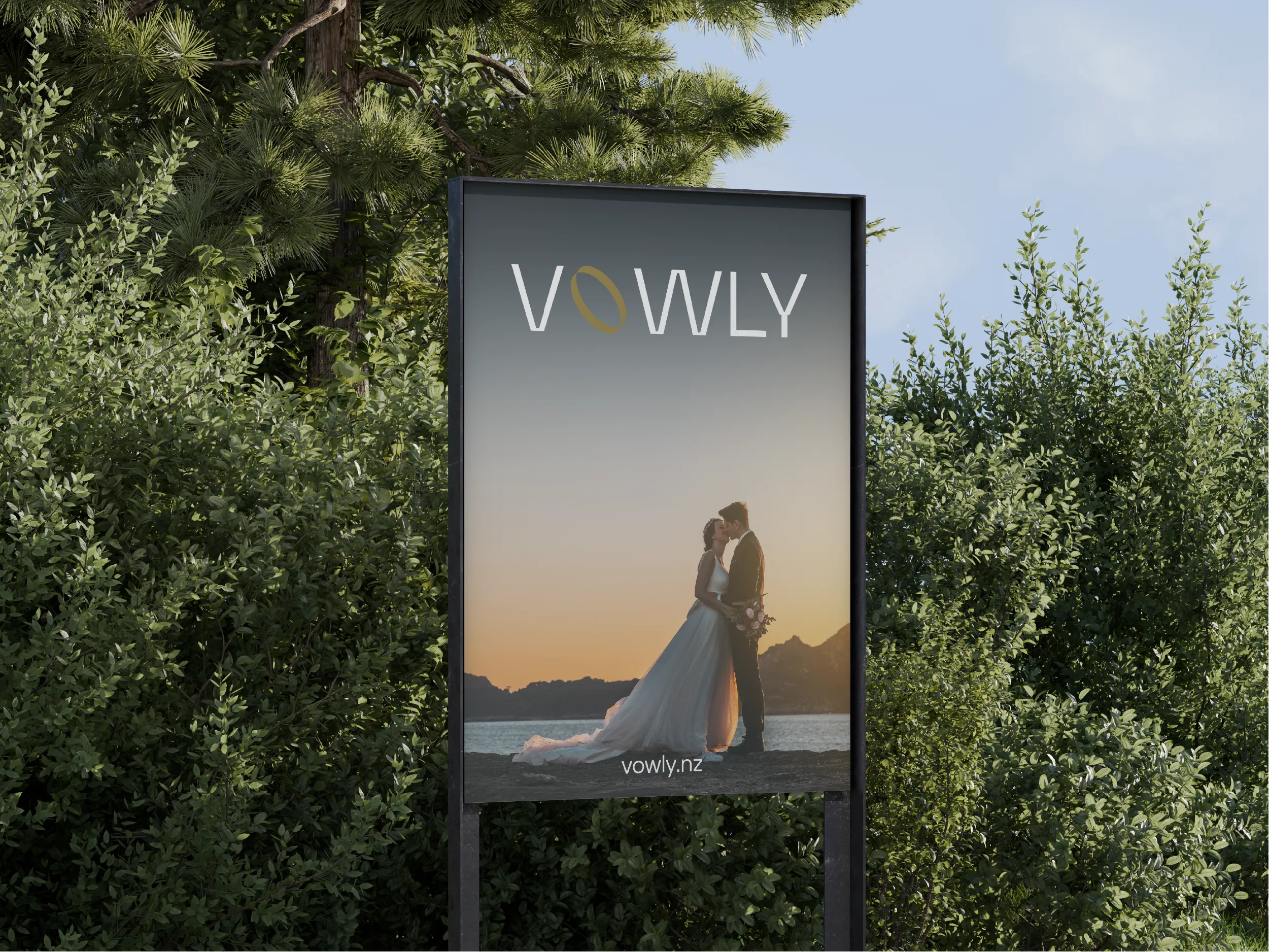
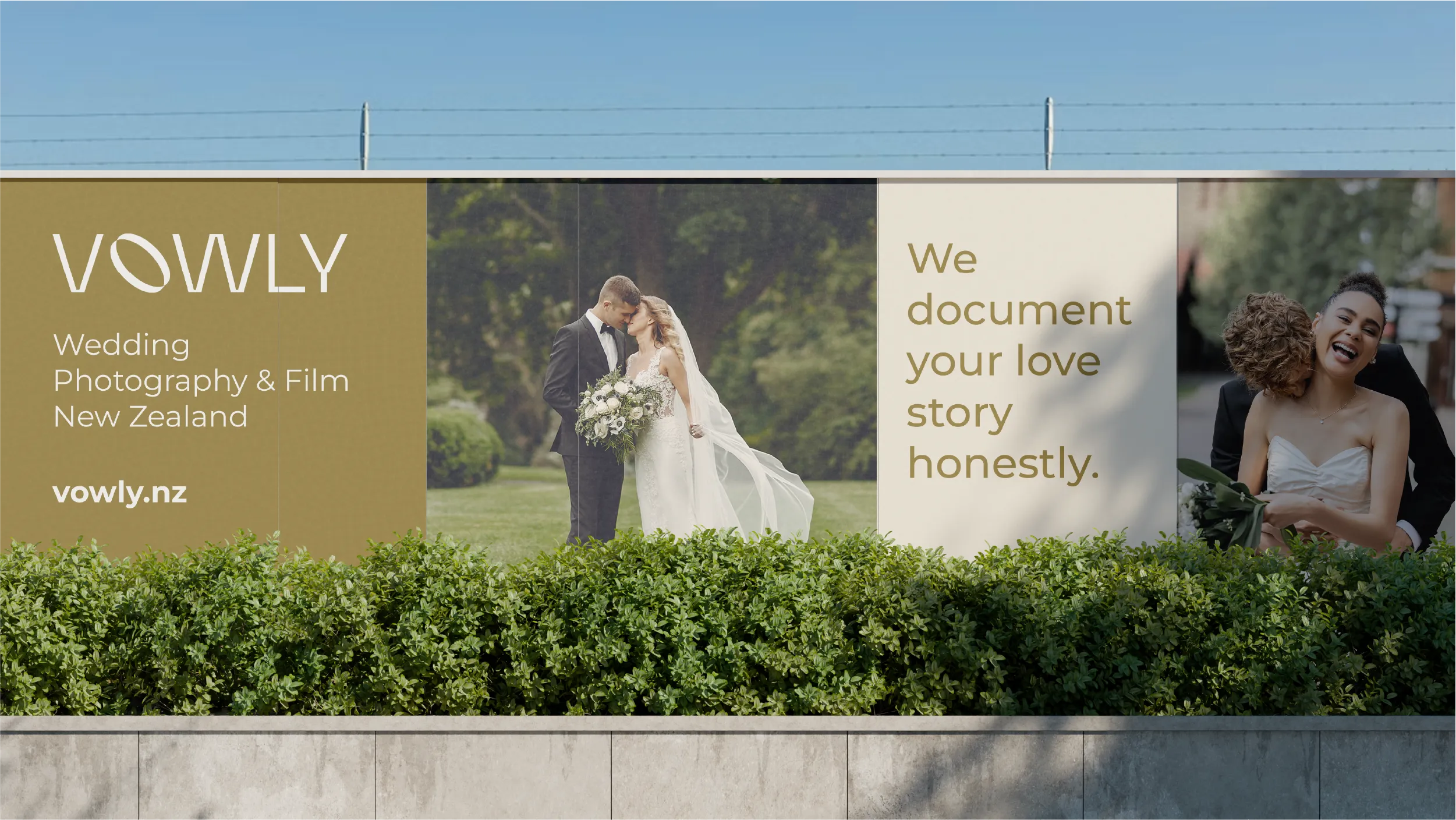
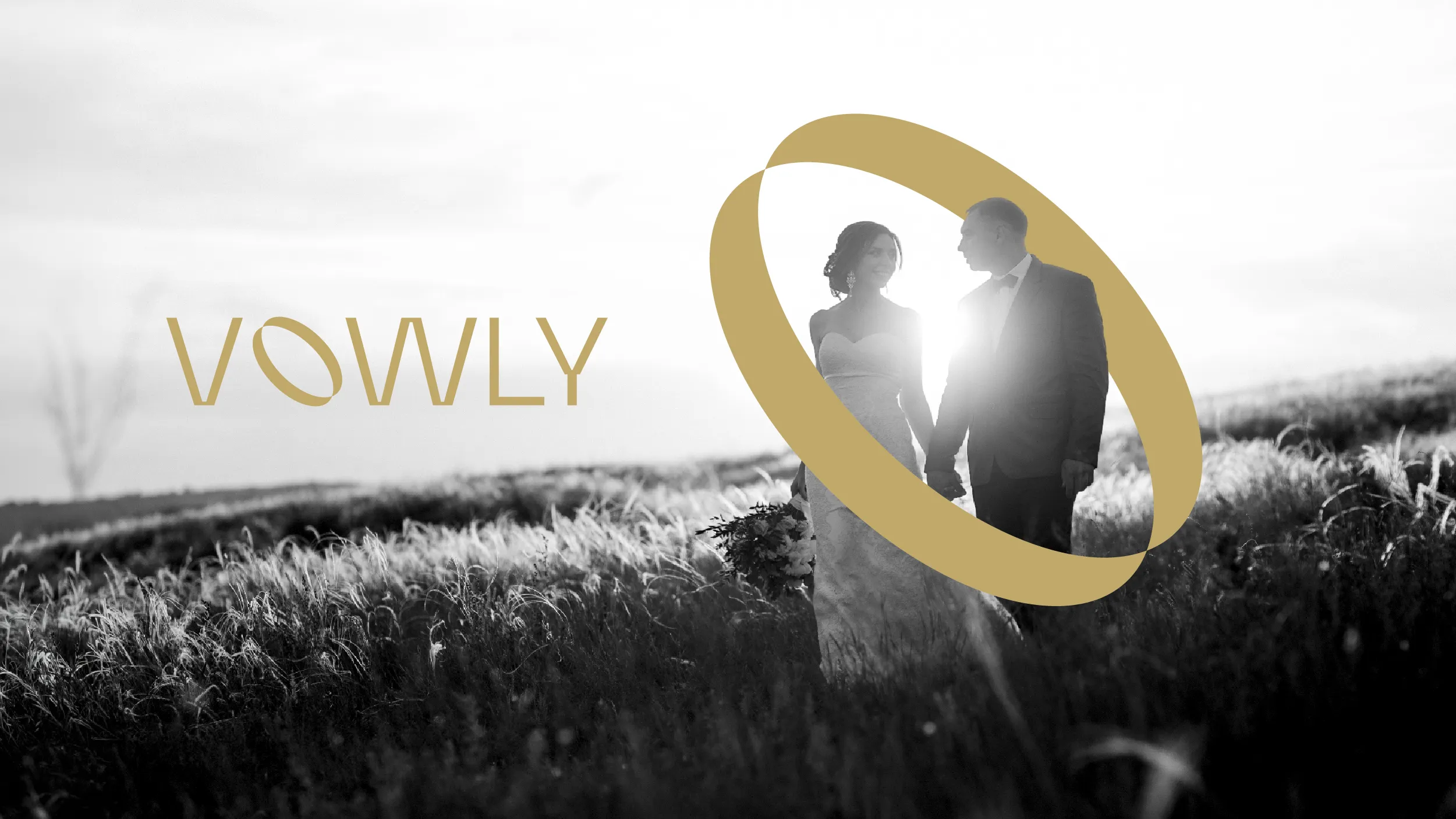
The New Zealand wedding photography market has a familiar visual language, and Vowly wanted nothing to do with it. The studio’s strength was in its honesty and restraint, and the brief asked for a brand that reflected that clearly. What Uthakhamkong built makes space for the photography to be seen without the design getting in the way.

A new brand identity and visual system for a New Zealand wedding photography and film studio built on honesty. Designed by POV - www.pov.nz

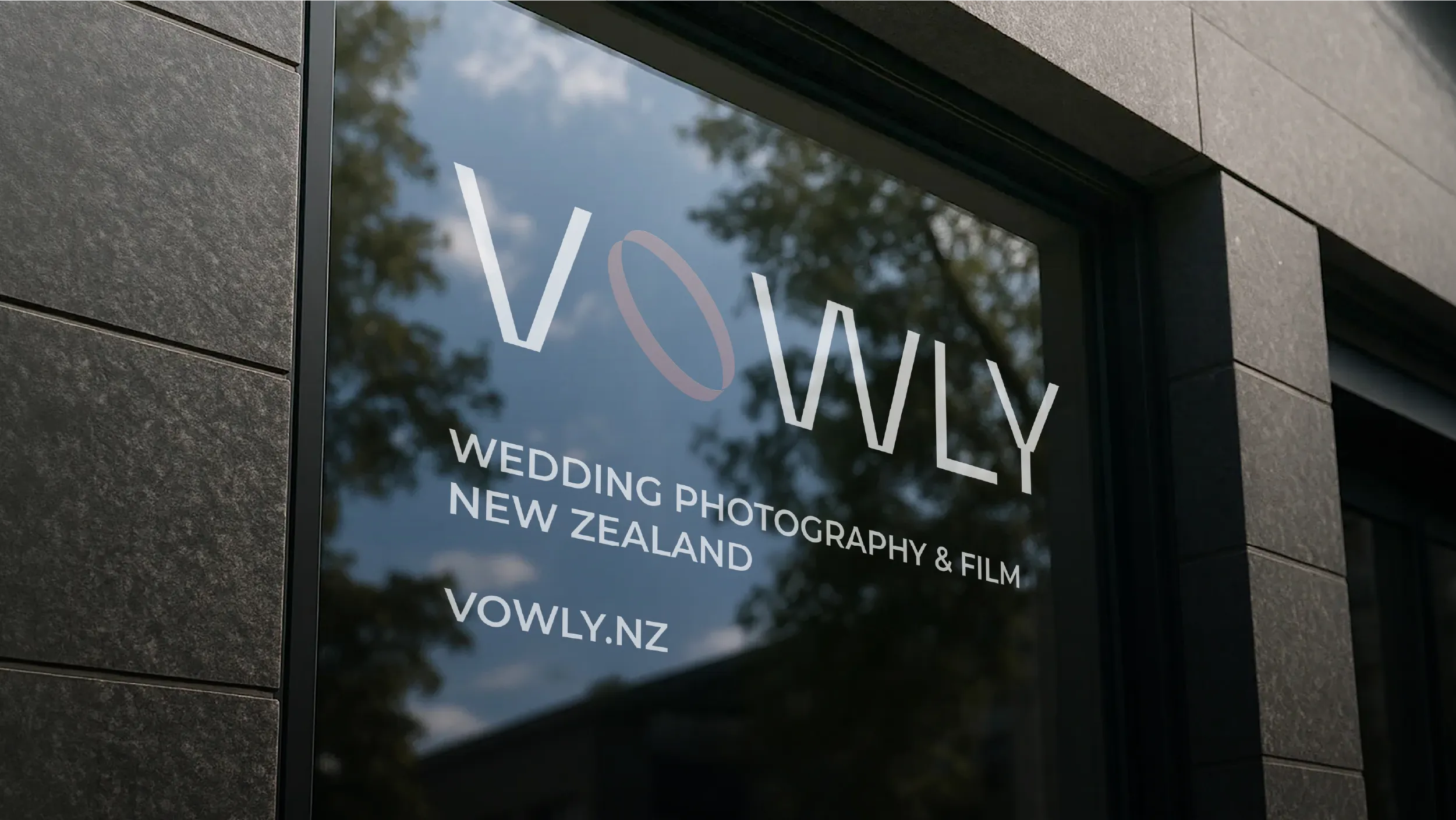
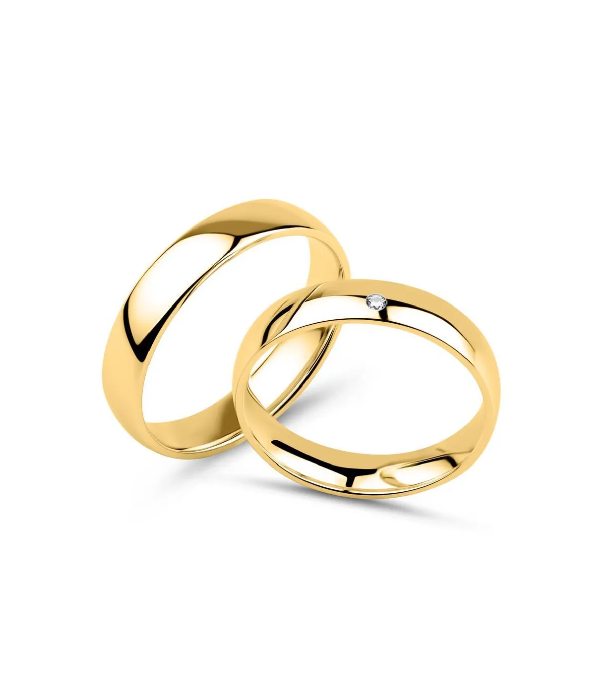
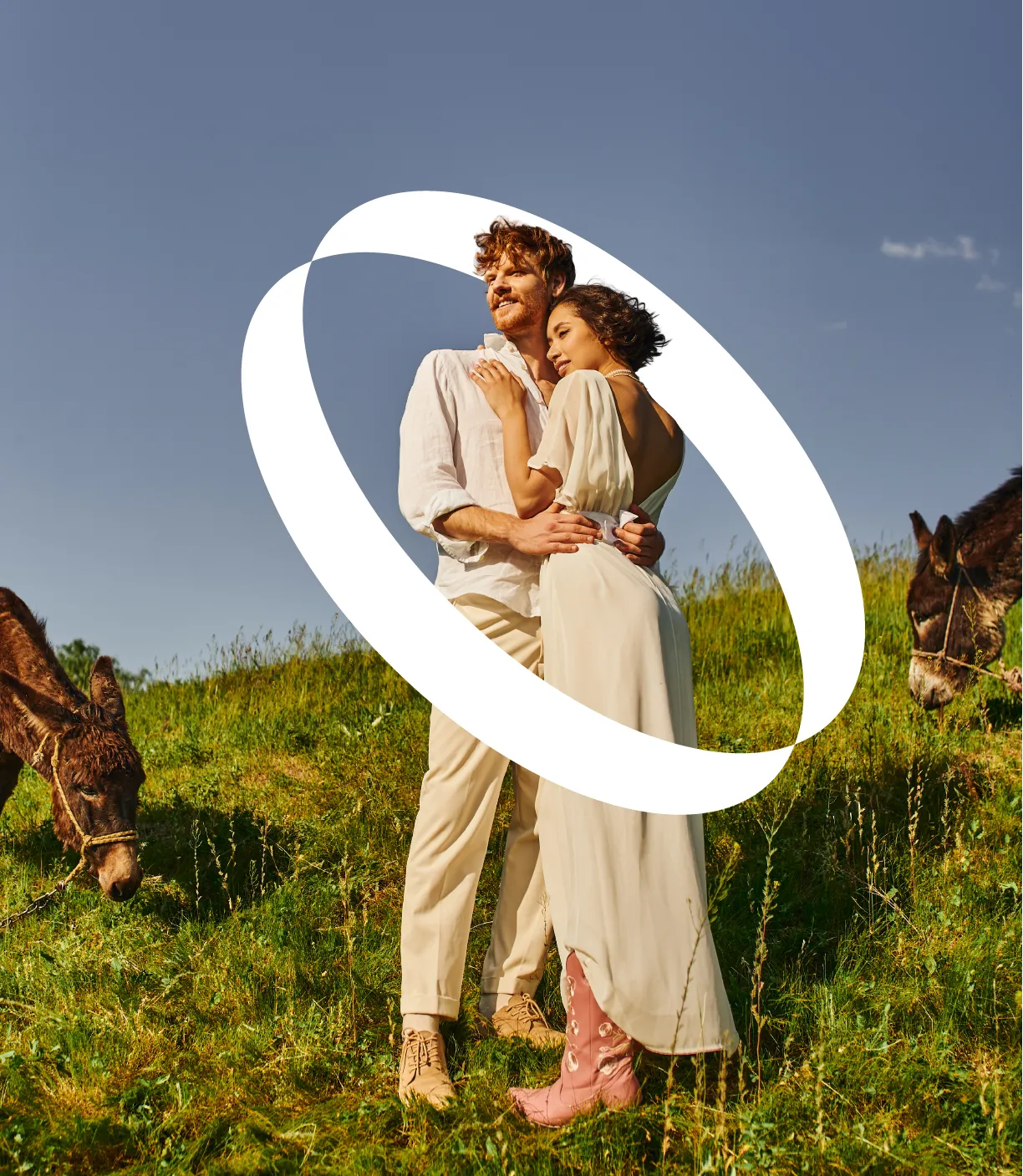
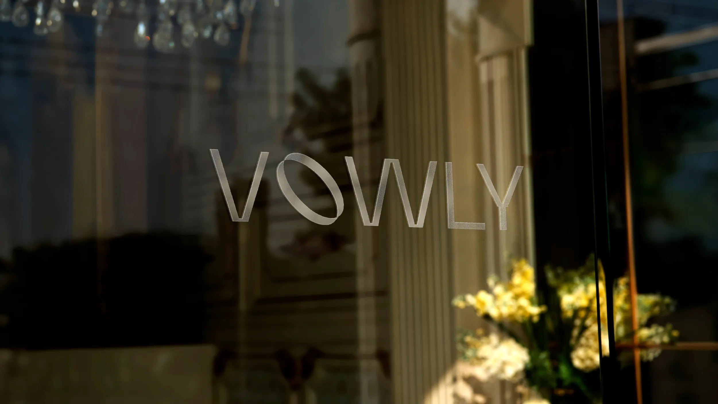
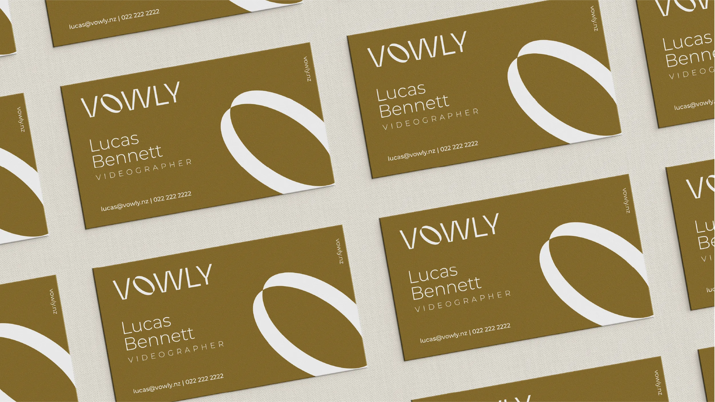
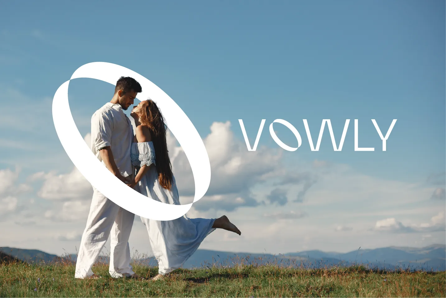
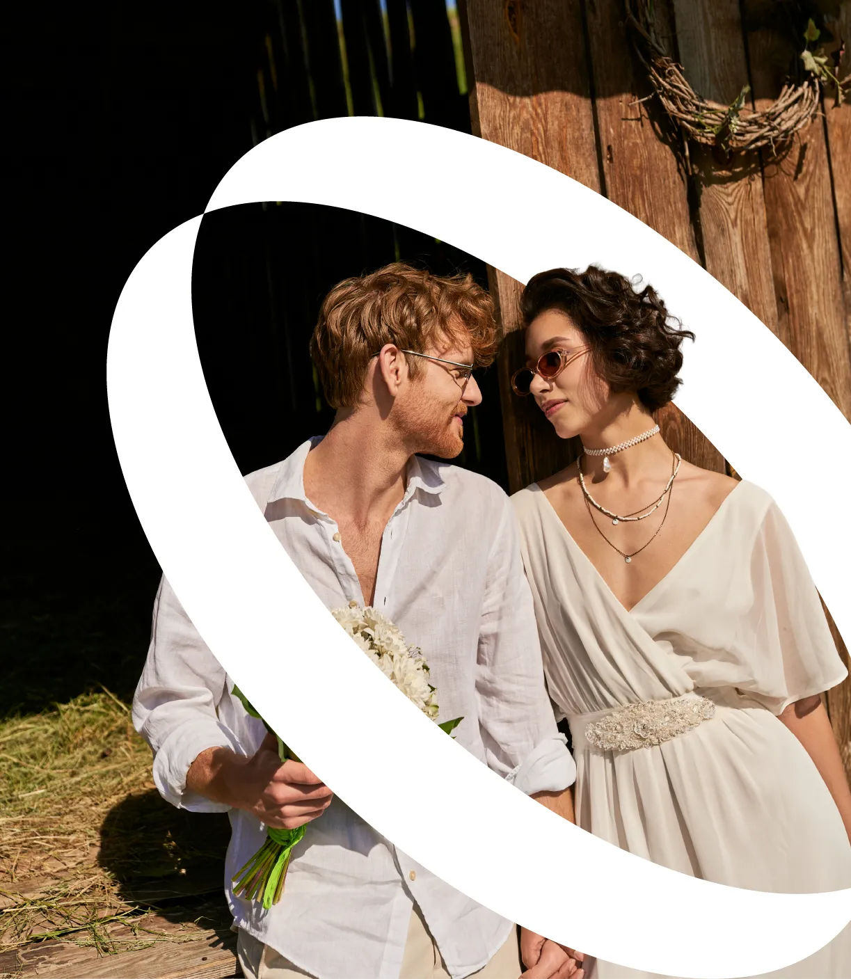
The ring as a logo is the most resonant form available in the wedding world. The challenge is using it in a way that feels specific and intentional rather than obvious. The Vowly mark derives its form from the ring, aligns it with the studio's name and the concept of the vow, and gives it a treatment that is contemporary and precise rather than ornamental. It is a mark that is immediately right for the context and nothing like what you would expect.

Velvet Gold #8D752F
Ivory Silk #F4EEE1
Pure White #FFFFFF
Obsidian #000000
Blend

#8D752F

0%

Velvet Gold

#8D752F

Ivory Silk

#F4EEE1

Golden as a primary colour runs against the current of contemporary wedding photography branding, which has moved largely toward clean white and pale neutral aesthetics. Vowly's Velvet Gold is richer and more confident than that, and it communicates something specific: depth, warmth, and the particular quality of light in the late afternoon of a great wedding day.

Vowly Spinning Asset
A new brand identity and visual system for a New Zealand wedding photography and film studio built on honesty. Designed by POV - www.pov.nz

A wedding photograph is not a portrait of how things looked. It is a portrait of how things felt. The Vowly brand was designed to hold that distinction, communicating luxury and warmth simultaneously without letting either one cancel the other. Every colour choice, every typographic decision, every page of the website asks the same question: does this feel as honest as the work it represents?

A new brand identity and visual system for a New Zealand wedding photography and film studio built on honesty. Designed by POV - www.pov.nz

The New Zealand wedding photography market is saturated with a particular kind of visual language: blush tones, cursive scripts, soft-focus romanticism, and a visual sameness that has come to feel less like a style choice and more like an industry default. For a studio that built its reputation on something different, that visual environment was a problem. Vowly photographs and films weddings with an emphasis on natural light, honest emotion, and real moments. The work is beautiful without being overproduced. The brand needed to reflect that distinction clearly and immediately.

Best Apisit Uthakhamkong approached the brief as a problem of restraint. The instinct in wedding photography branding is often to reach for maximum romance: heavy serifs, ornate lettering, a softness that tips into sentimentality. Vowly needed none of this. The studio’s value was in its honesty, and the brand needed to carry that quality visually without stating it explicitly.

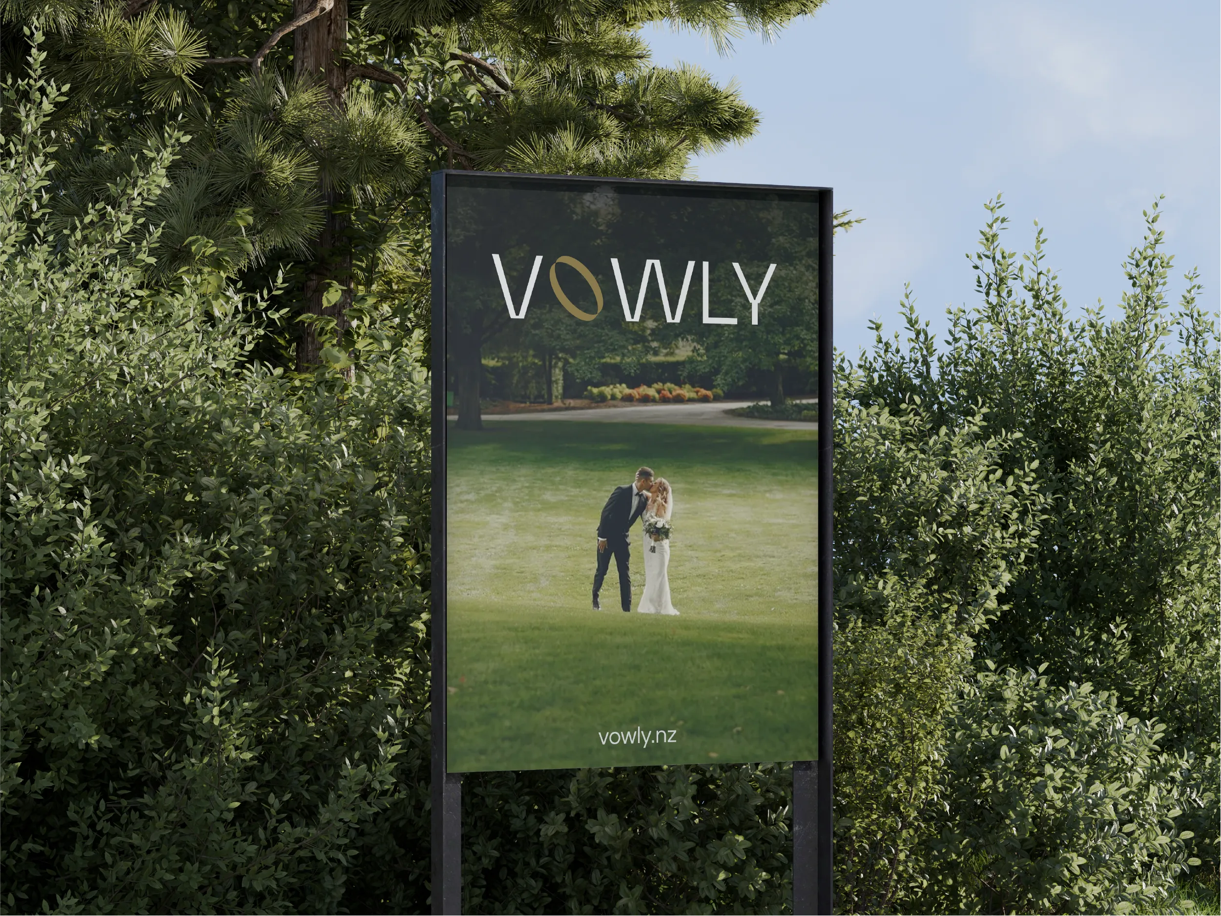
The visual identity was built around a refined wordmark with careful, considered typography. The letterforms are clean and modern, carrying warmth through proportion and weight rather than through decorative detail. The result is a mark that feels personal without feeling handmade, elegant without feeling precious. It is the kind of identity that sits beside exceptional photography without competing with it.

The colour palette was drawn from the tones of natural light at golden hour, capturing the particular quality of warmth that characterises the conditions in which the studio’s work is most alive. Muted ochres, warm off-whites, and gentle browns that evoke the feeling of late afternoon light without being literal about it. The palette is designed to disappear into the photography, to frame it rather than rival it.

Typography was selected to complement the wordmark across all applications. The type hierarchy is simple and purposeful: a primary display face for the studio name and key headings, and a secondary body face for all written communications. Both were chosen for legibility across screen and print, with particular attention to how the system would read on mobile, where the majority of prospective clients would encounter Vowly for the first time.

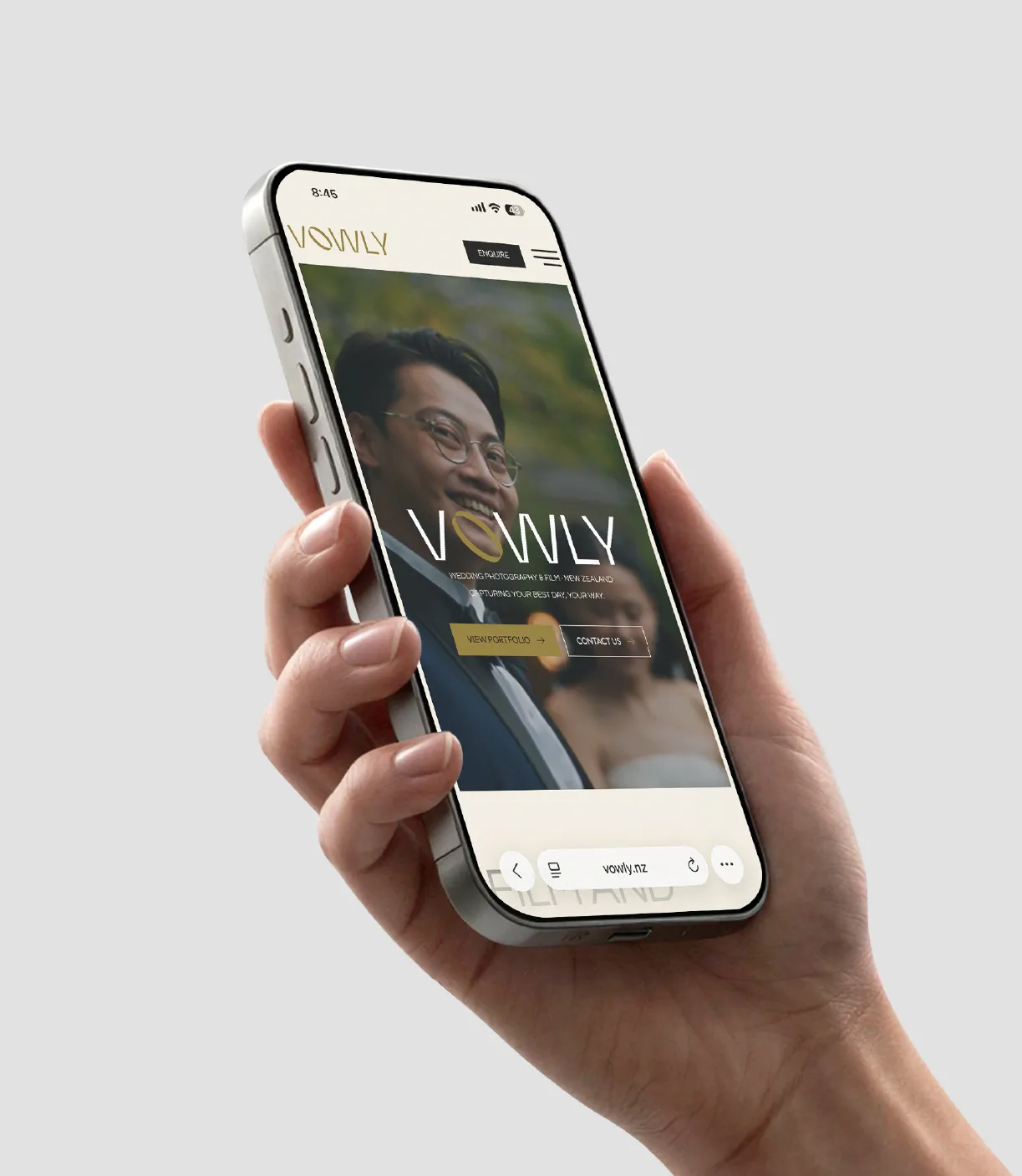
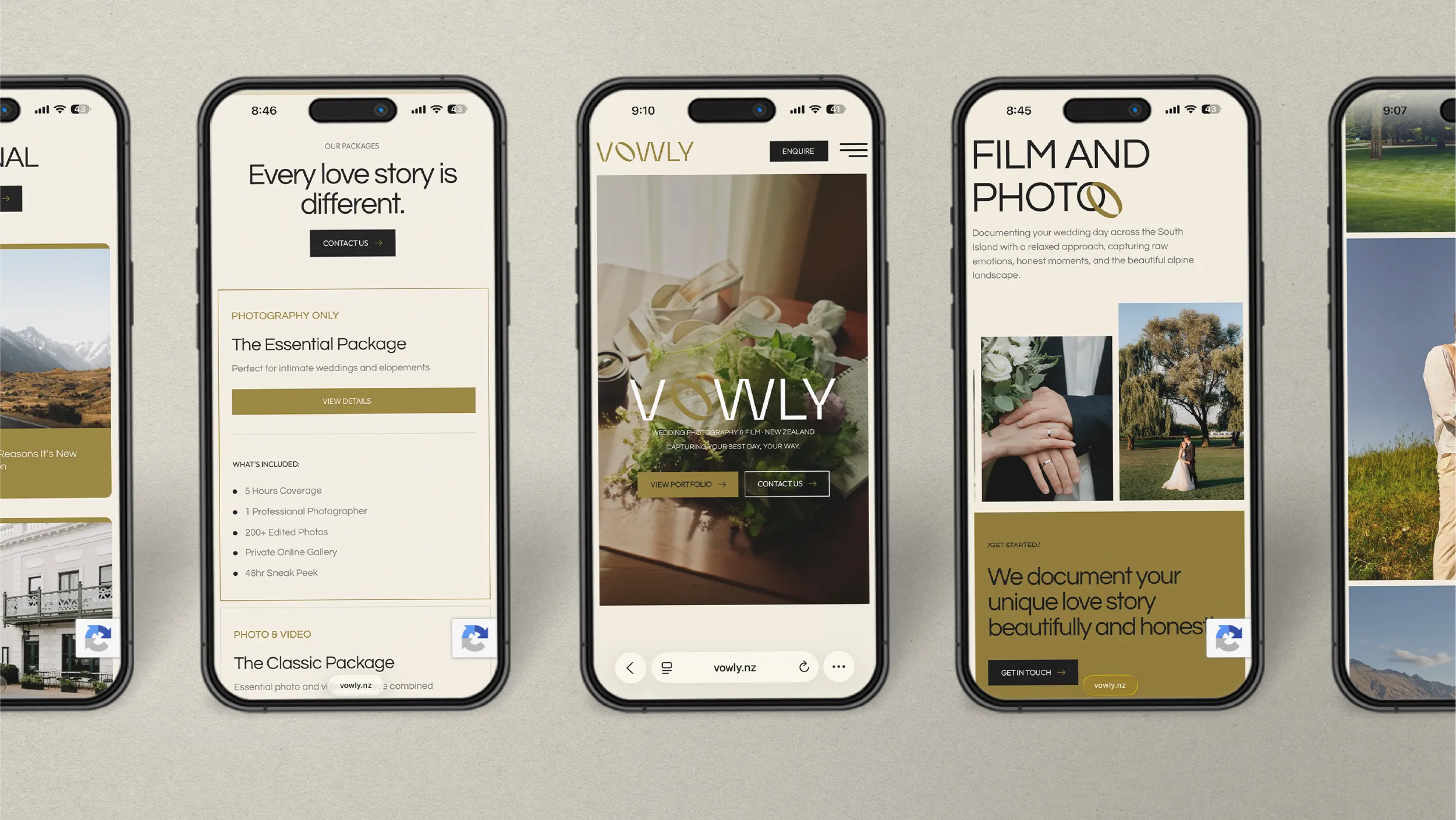
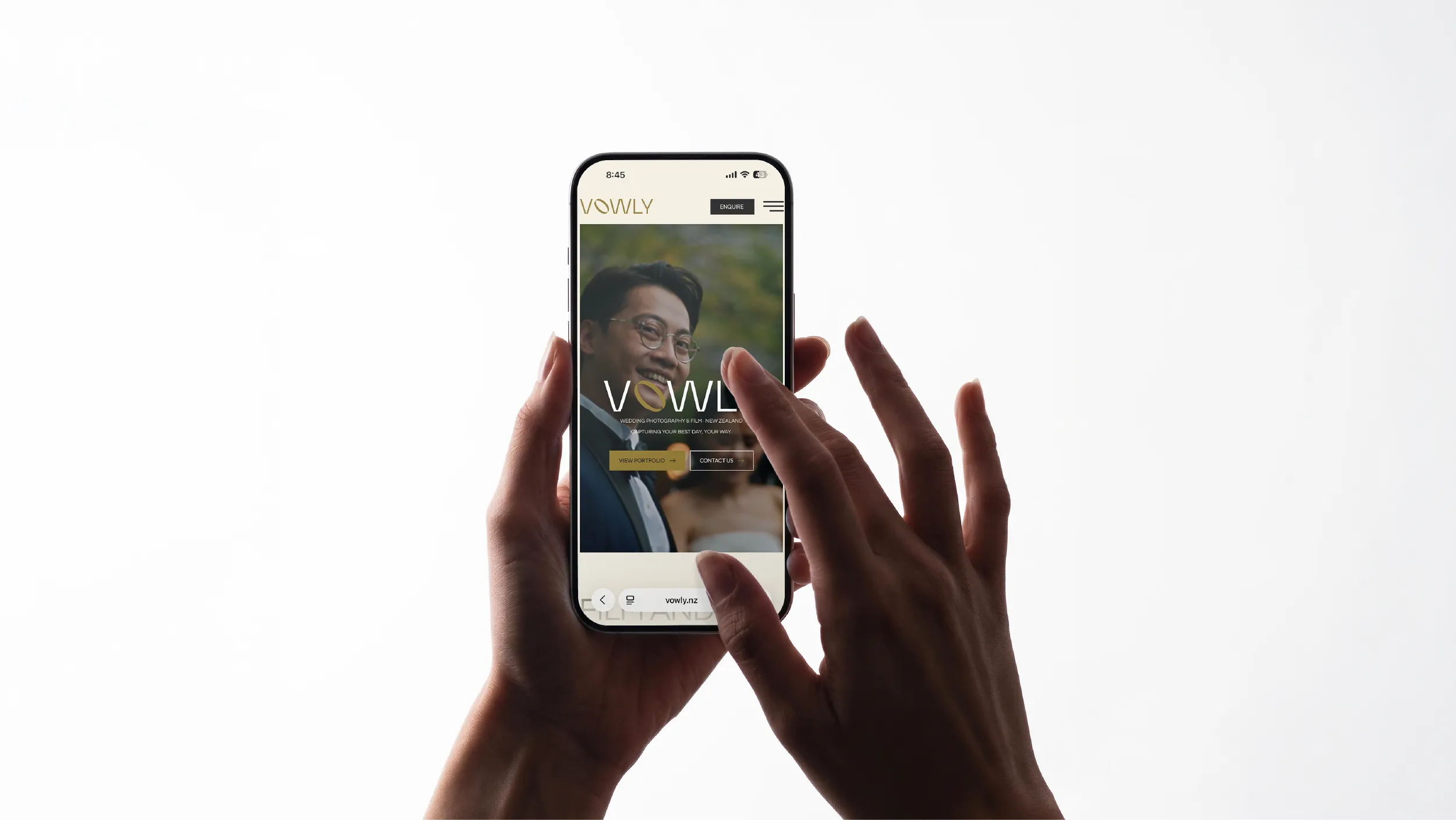
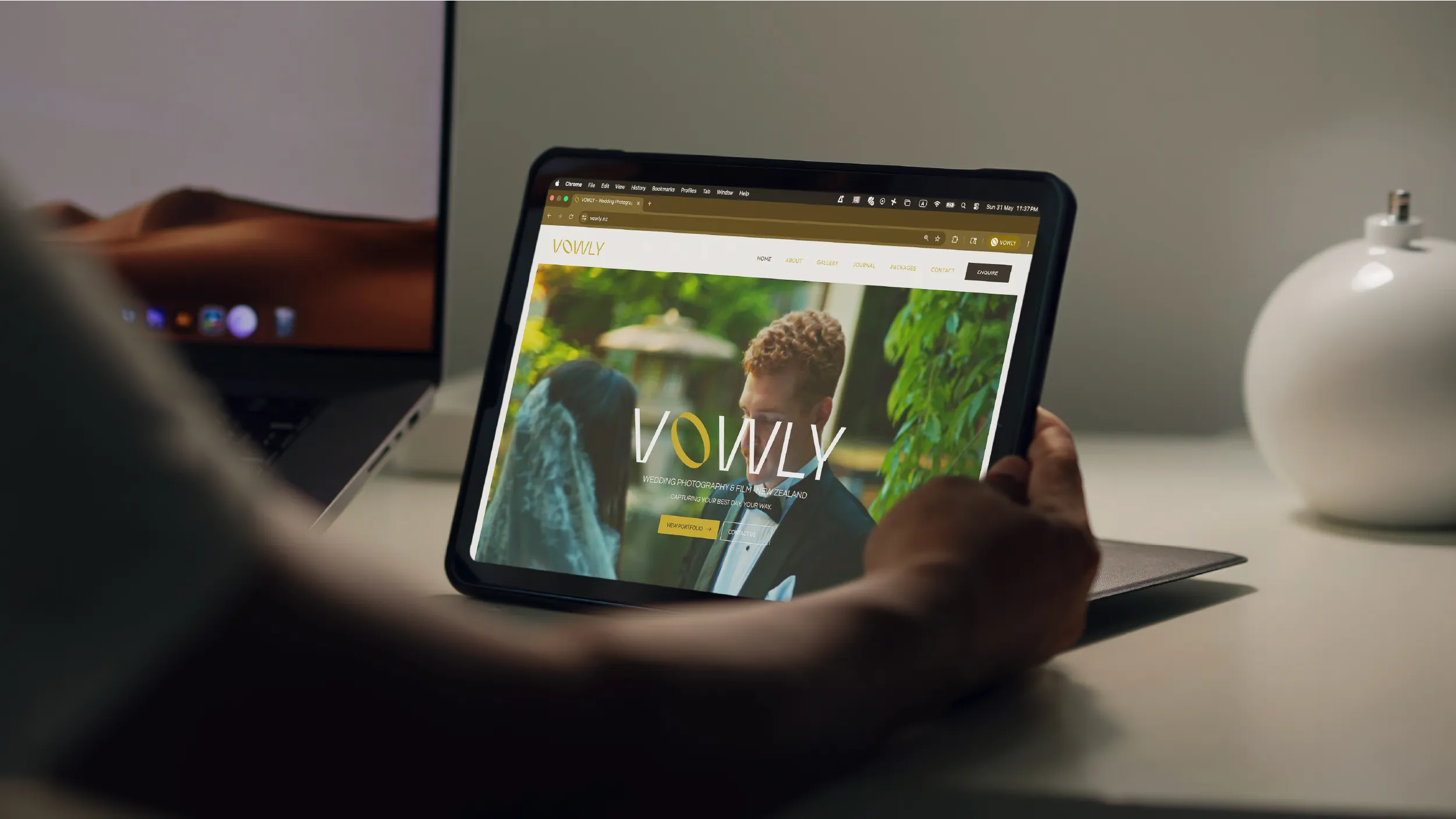
The website was designed to foreground the photography from the first frame. Every structural decision, from margin width to gallery pacing to where enquiry flows are positioned, serves one objective: to let couples looking at the work feel immediately that they have found someone who will understand them. That feeling comes from the photography. The design’s job is not to get in the way.

Every layout decision was made with that purpose in mind. Generous image space. A minimal interface that collapses to nothing on mobile. Navigation that does not compete for attention. A structure that guides prospective clients through the portfolio, through the studio’s approach, and toward an enquiry in a sequence that feels natural rather than directed.

The site was built on WordPress with a fully responsive layout and a CMS setup that allows the studio to update galleries and manage content independently, without requiring a developer for routine changes. The handover process included documentation and a training session, ensuring that the studio could maintain the standard of the site long after delivery.

Brand guidelines were produced alongside the website, giving the studio a clear reference for typography, colour, image treatment, and tone of voice across all channels. Social media, email communications, packaging materials, and print collateral were all addressed, giving Vowly the infrastructure to maintain a consistent visual presence as the business grows.

What Uthakhamkong built for Vowly is a brand that does exactly what the studio does: it makes space for something genuine. It does not perform warmth or manufacture romance. It creates the conditions in which real feeling can be seen clearly. That is a harder thing to design than it looks, and the result is a system that is quietly exceptional precisely because it never tries to be obvious about it.

Client
Vowly New Zealand

Sector
Professional Services
Corporate Consulting

Disciplines
Brand Identity
Visual Identity
Website Design