The Peace Club (Trust)
A brand identity and website for a youth-led Dunedin charitable trust whose logo speaks peace in two visual languages at once.
The Peace Club is a registered charitable trust doing real community work in Dunedin, and its brand needed to carry that weight. As founder, president, and designer, Uthakhamkong approached this differently from client work. Every element of the identity is an expression of the same values that brought the organisation into being.





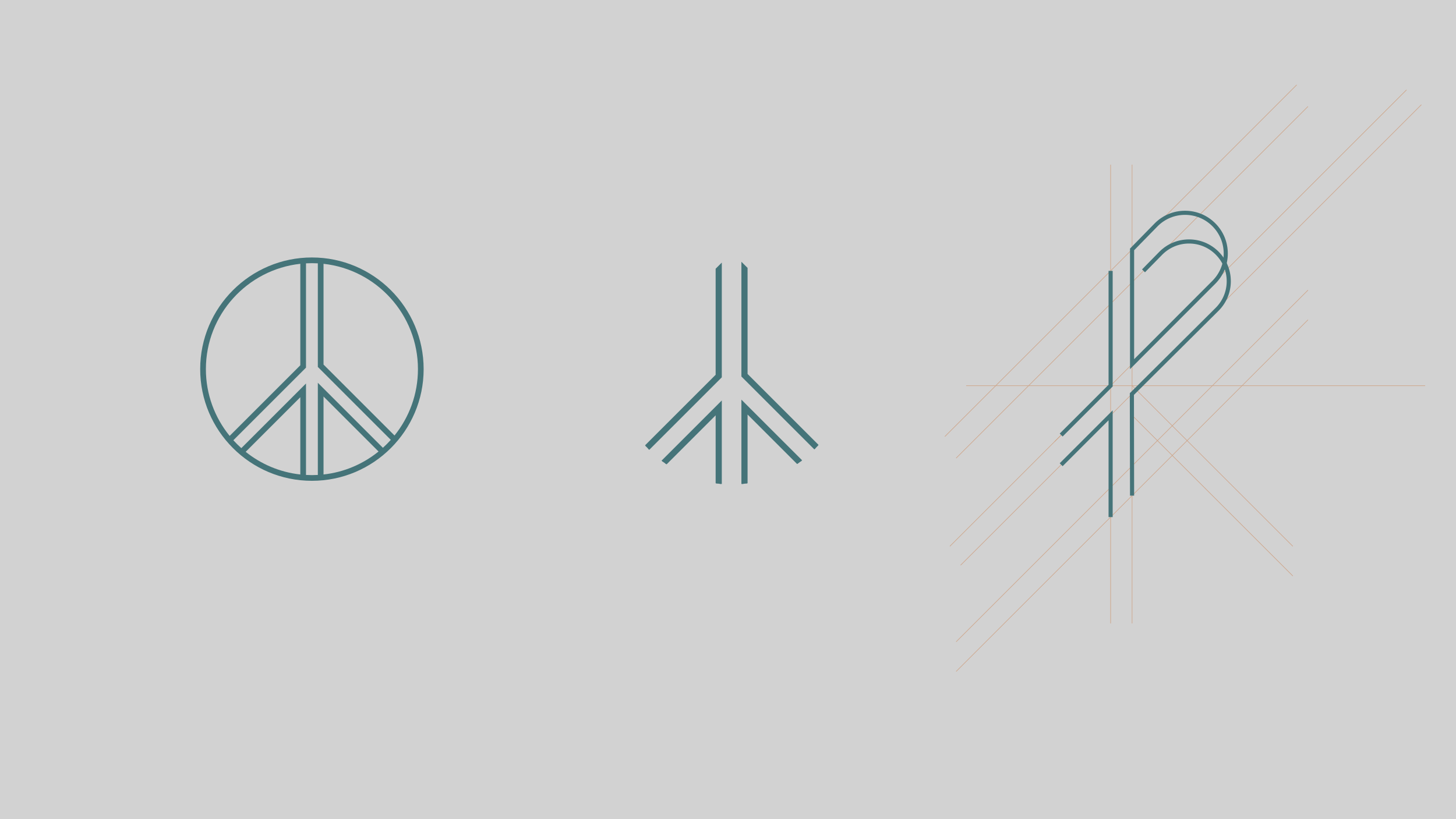
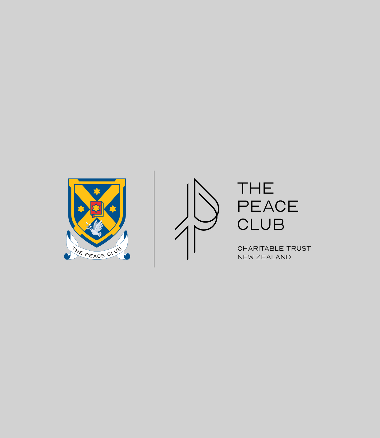
The logo resolves two visual ideas into one mark: the peace sign and the capital letter P. The peace sign carries one of the most universally recognised meanings in visual culture, and the P anchors it to the specific name and character of the organisation. Combining them into a single form that reads as both simultaneously required careful geometric work, but the result is a mark that communicates its purpose the moment someone sees it, without needing any explanation.

Midnight Teal
HEX #1C3E43
#1C3E43
RGB(28, 62, 67)Storm Teal
HEX #457479
The colour palette was built to feel like the space The Peace Club creates: deep enough to hold serious intention, warm enough to be genuinely welcoming. The deep teal family moves between dark and light without ever feeling cold. The sandy warm tones bring a human presence to the system. Together they create a palette that is unlike anything in the typical community organisation visual landscape, which is exactly the point.

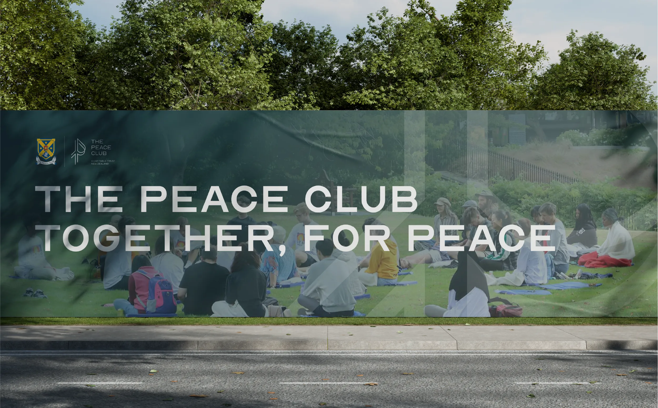

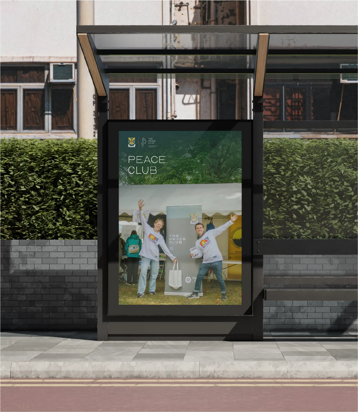

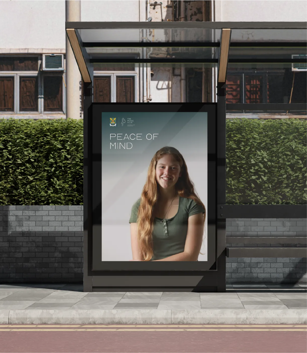



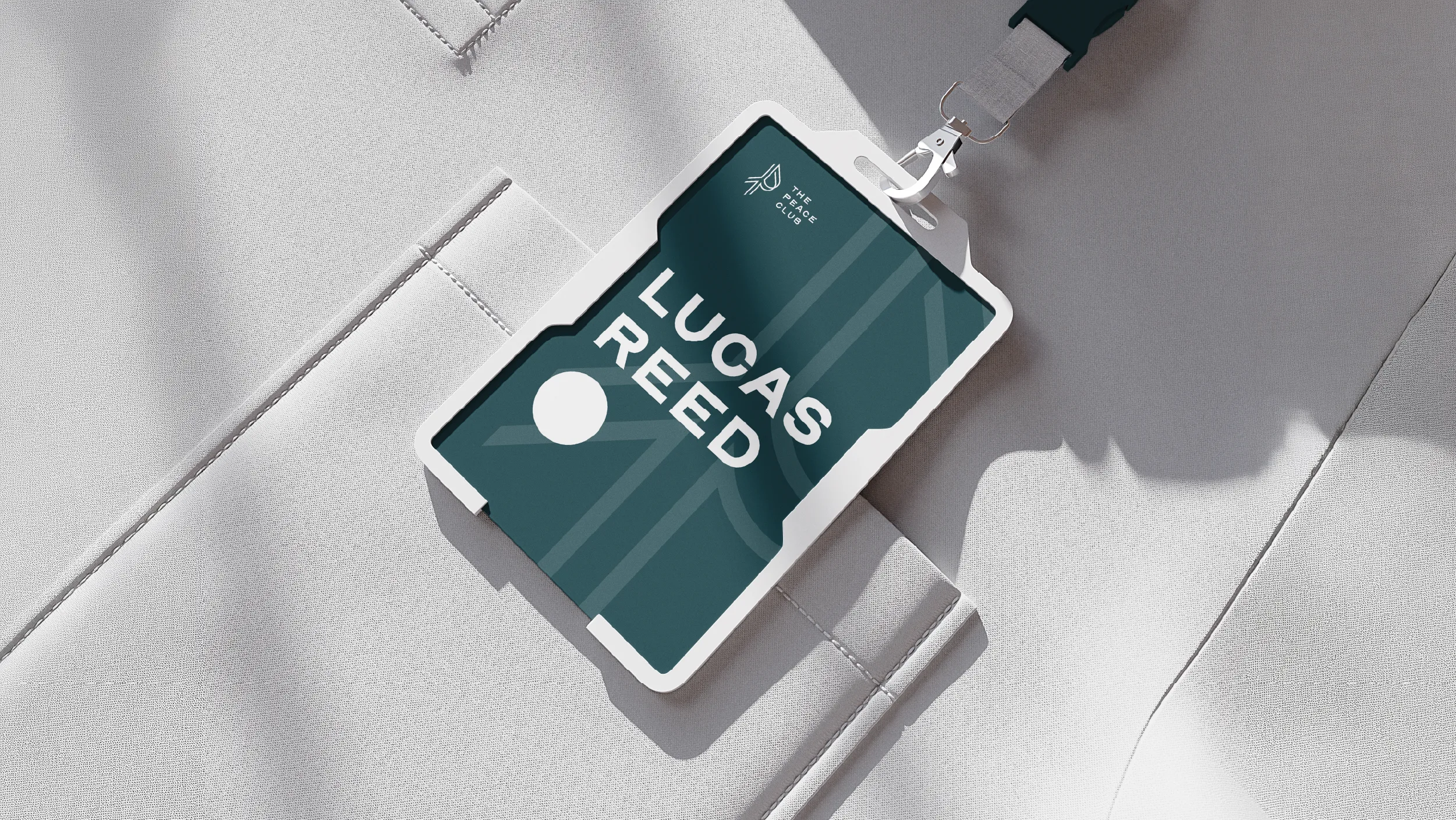
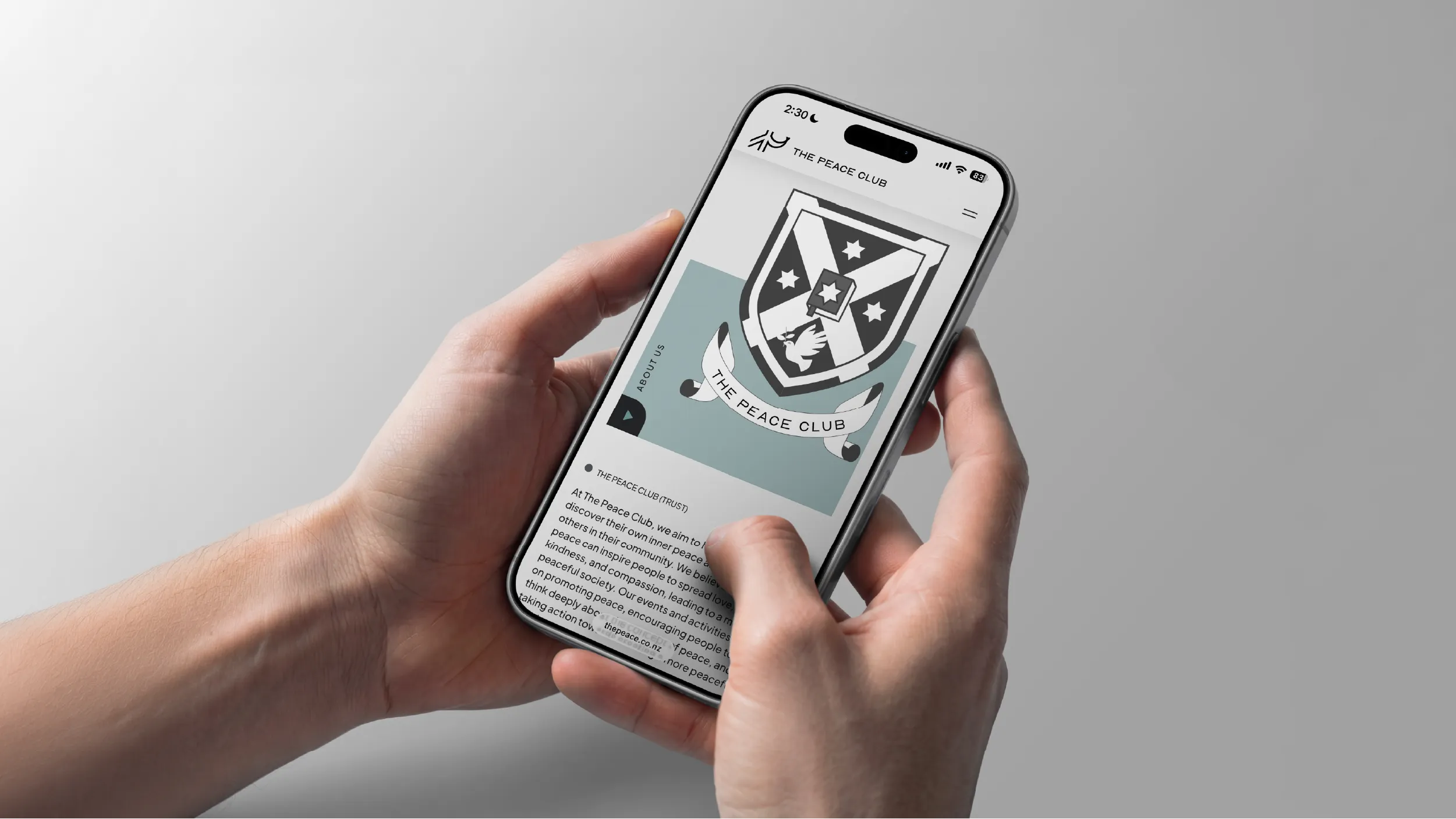
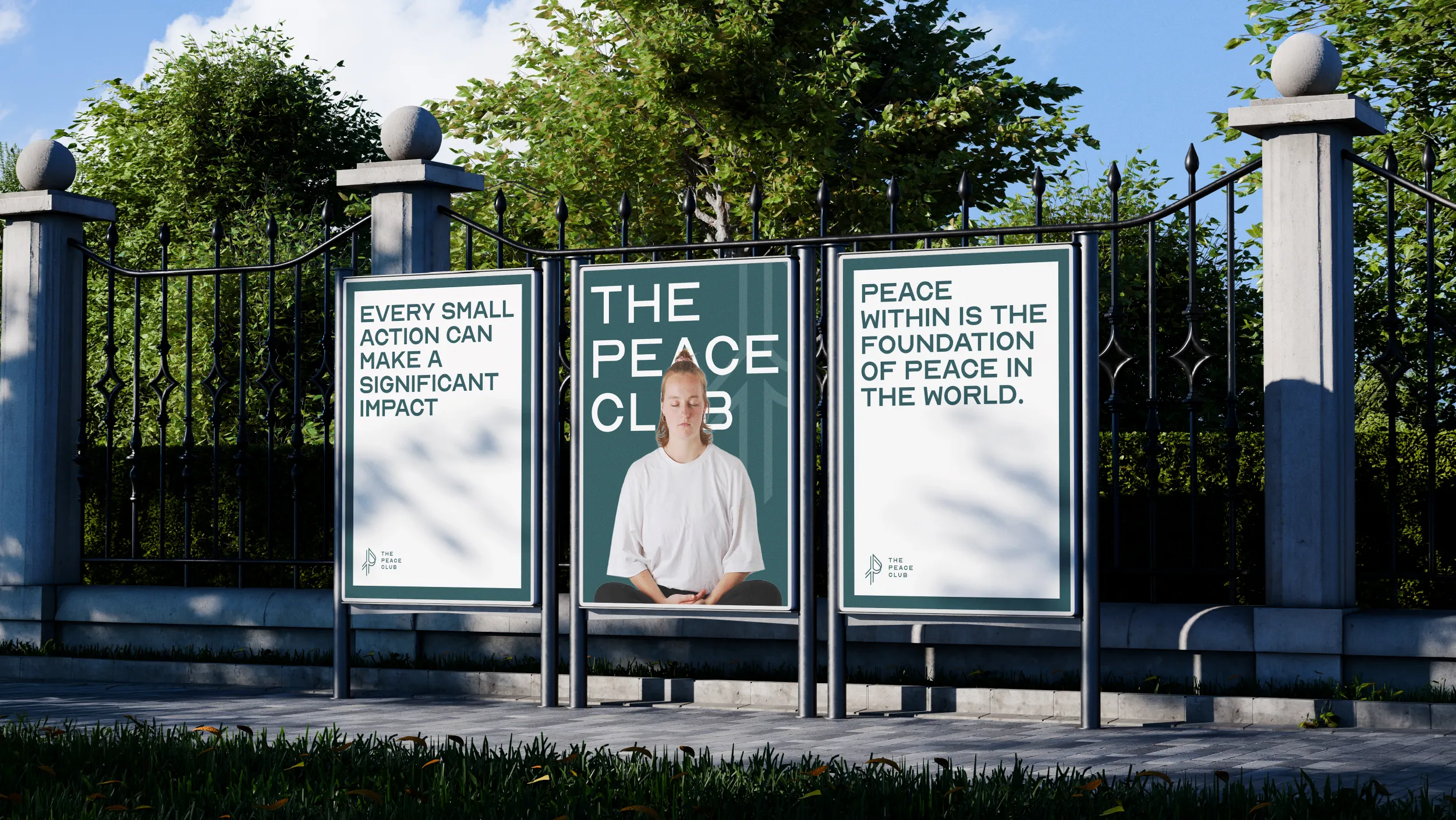
A website for an organisation whose work is as visual and creative as The Peace Club's had to foreground that creativity rather than describe it. The design philosophy was to clear the stage and let the work speak. Clean layouts with generous image space, clear navigation, and a visual warmth that communicates welcome from the first moment of arrival.
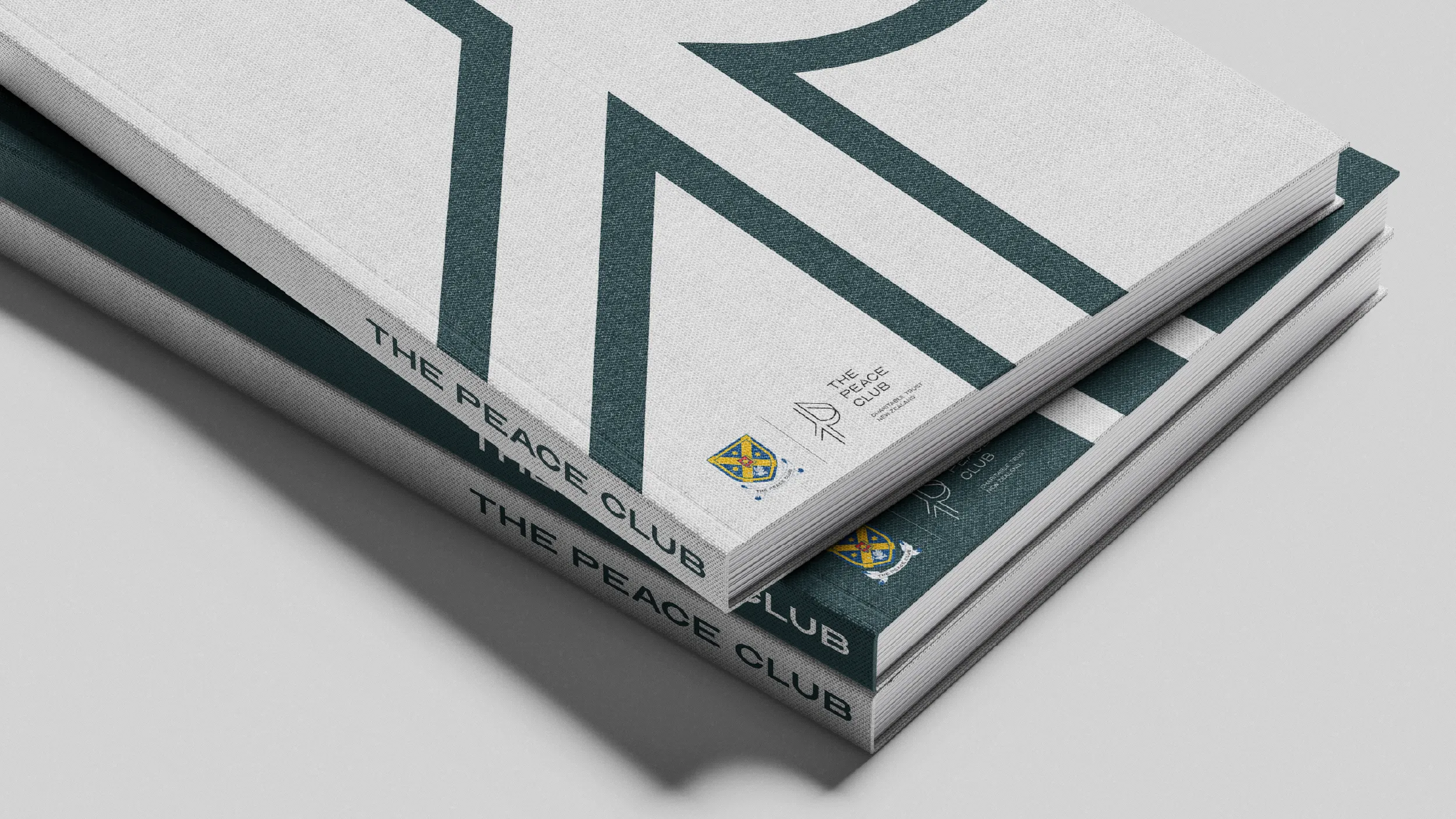
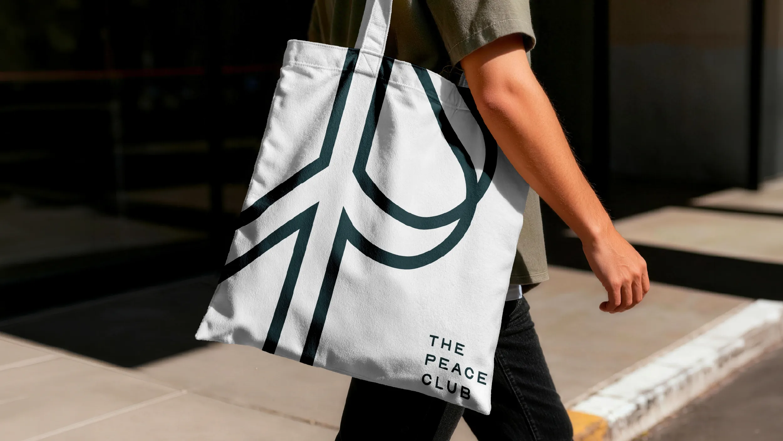
The Peace Club is a youth-led registered charitable trust based in Dunedin, primarily operating within and around the University of Otago community. Best Apisit Uthakhamkong founded it in 2019. The organisation promotes inner peace, mindfulness, compassion, and diversity through community events, meditation sessions, art projects, social justice advocacy, and music. It is an organisation built on creative practice and visual communication, which made the design challenge both more significant and more personal.
As founder, president, and designer, Best Uthakhamkong had to create a brand identity for an organisation whose values he understood from the inside. This is a different kind of design problem from most client work. The brief was not received from an external party. It was arrived at through the same process of conviction and reflection that produced the organisation itself. The result needed to carry genuine belief without becoming earnest or heavy-handed.
The logo concept draws from two visual sources simultaneously. The peace sign is one of the most universally recognised symbols in human visual culture. Designed by Gerald Holtom in 1958 for the British nuclear disarmament movement, it has accumulated decades of meaning across protest, art, and popular culture. Its readability is instant and global. The capital letter P is the organisation’s initial, the most direct visual reference to its name, and a form that carries its own distinct visual weight.
The design challenge was to combine these two forms into a single mark that reads as both at once, without requiring the viewer to consciously perform the combination. That kind of dual reading is one of the harder problems in logomark design. The mark needs to be geometrically resolved: the two forms have to be genuinely integrated, not placed beside each other or overlaid awkwardly. The Peace Club mark achieves this through careful geometric resolution that works with the structural similarities between the two forms. The descending vertical of the P and the central stem of the peace sign occupy the same visual space. The circular bowl of the P and the enclosing circle of the peace sign are made one. The result is a mark that is modern and slightly playful without sacrificing the sense of genuine intention that the organisation’s purpose demands.
The colour palette was developed to reflect the emotional quality of the spaces The Peace Club creates. The deep teal family carries weight and intention, communicating that the work is substantive. This is not a casual wellness brand or a feel-good club. It is a registered charitable trust doing serious work in the community. The depth of the primary teal establishes that seriousness without allowing the palette to become cold or institutional.
Warm grey and a sandy skin tone balance the teal family with human warmth, preventing the palette from becoming cool or austere. The combination is unusual in the non-profit sector, where branding often defaults to either cheerful primaries or institutional navy. The five-tone system gives The Peace Club a visual language that is distinctive without being eccentric, and warm without being naive.
The website was designed to serve three distinct audience groups simultaneously. First-time visitors arriving from social media or a search result need to understand immediately what The Peace Club is and feel invited in. Regular community members looking for upcoming events need clear, accessible information quickly. Potential partners, funders, and university affiliates need to assess the organisation’s credibility and scope. Most websites for organisations of this kind serve one of these audiences well and the others poorly. The Peace Club’s website was architecturally designed to serve all three.
Photography from the organisation’s events is given prominent placement throughout the site, letting the community life of The Peace Club be visible rather than merely described. This was a deliberate editorial decision. The most powerful evidence of an organisation’s character is documentation of it actually functioning. People at events, in conversation, in the environments The Peace Club creates. The design makes space for that documentation to do its work.
The site was built on WordPress with a fully responsive layout, and CMS training was provided at completion, ensuring that the volunteer team managing the organisation could maintain and update it independently. For an organisation running on limited resources, the practical sustainability of the digital infrastructure is as important as its design quality.
Uthakhamkong produced the complete brand system and website for The Peace Club as a founder designing for his own organisation. What makes this case study notable is not only the quality of the work but the clarity of conviction behind it. Every element of the identity is an expression of the same values that produced the organisation. The logo speaks peace in two visual languages at once because The Peace Club speaks to more than one kind of community at once. That is not a design metaphor. It is a precise description of what the work does.
Client
The Peace Club (Trust)
Sector
Non-profits
Arts and Culture
Civic and Public
Disciplines
Brand Identity
Visual Identity
Website Design