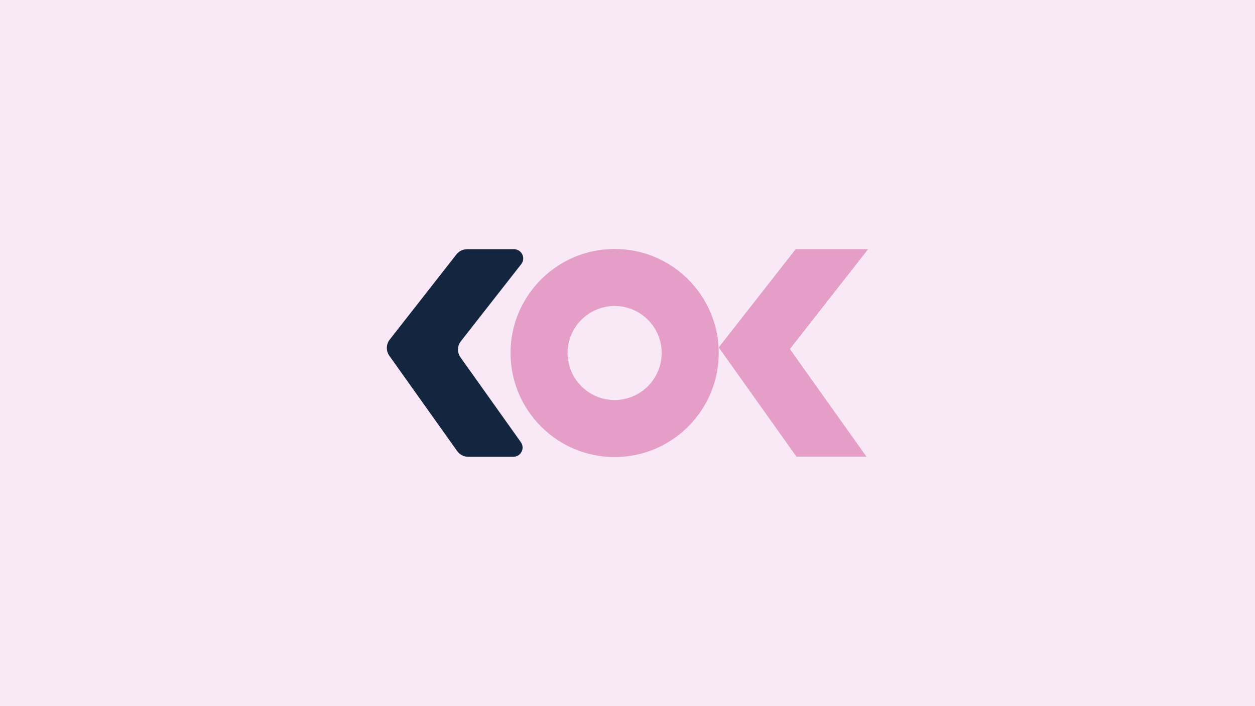
KOK Consultancy
New brand identity for a New Zealand employment relations consultancy, with an arrow hidden in the lettermark and empathy built into the colour palette.
Employment relations sits at the intersection of legal precision and genuine human stakes. KOK Consultancy needed a brand that communicated expertise and reliability without the cold formality of a law firm. The brief asked for something that felt like a trusted adviser rather than a default professional services mark.

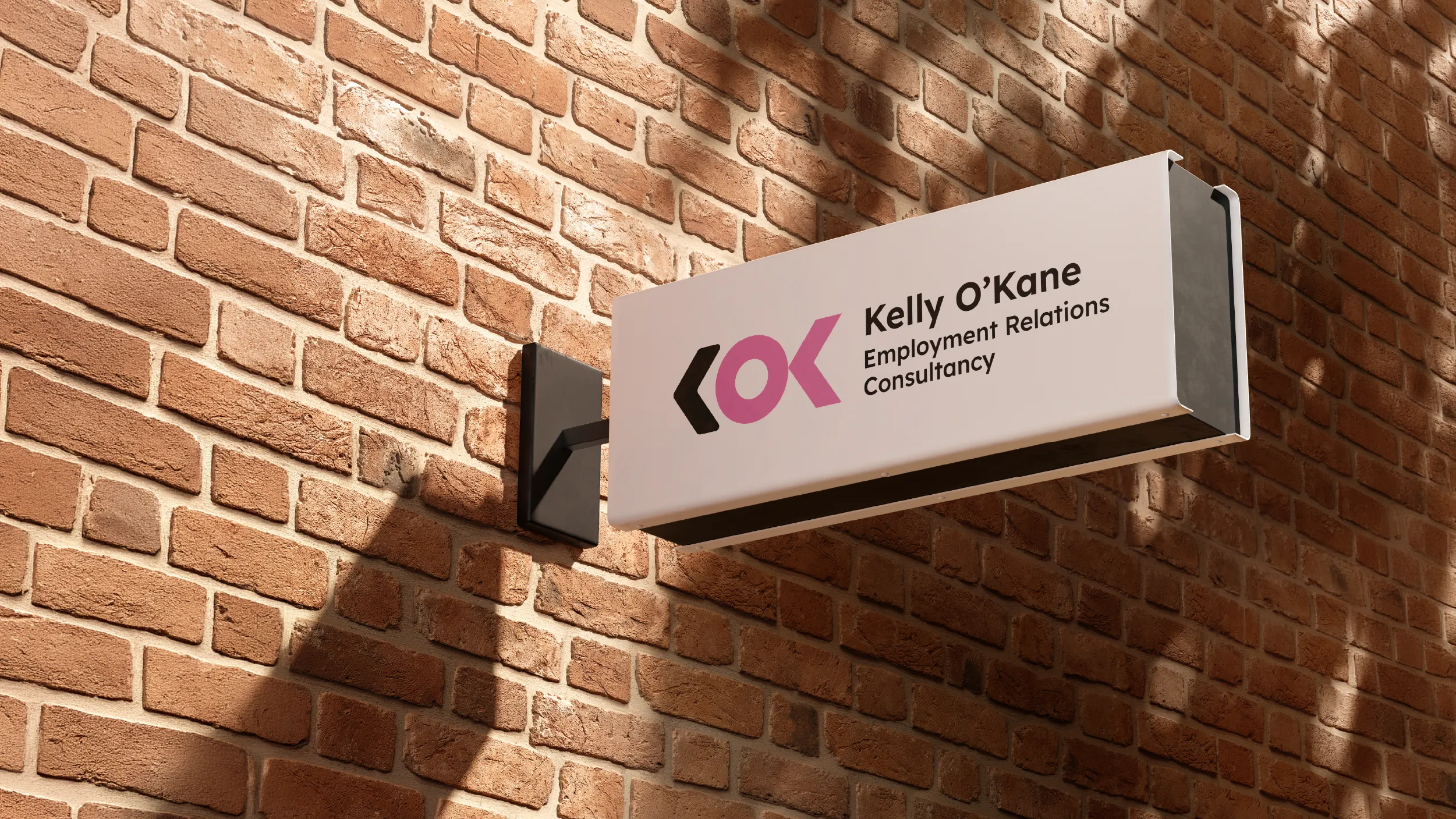

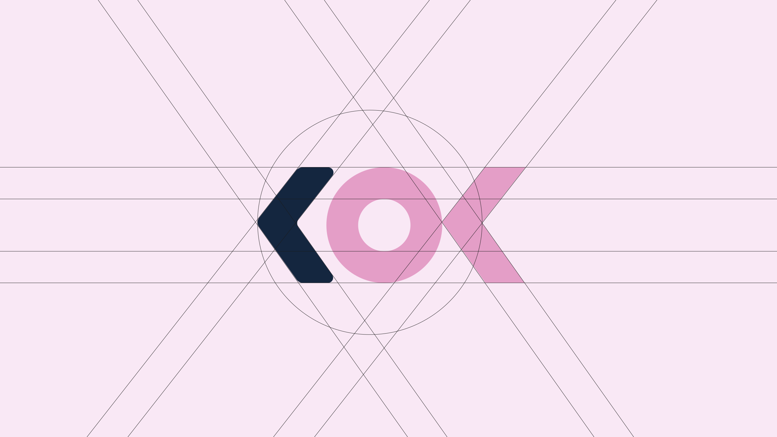
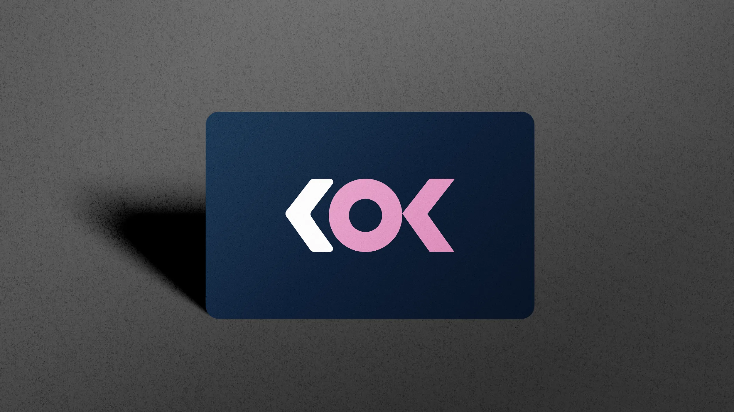
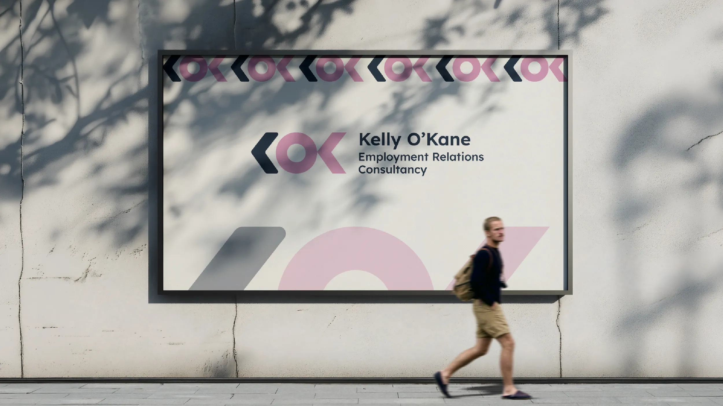
The K in the logo is not just a letter. The stylised form of the lettermark carries an arrow within its geometry, pointing forward and outward in a way that is subtle enough to read as a natural part of the letterform and deliberate enough to communicate direction and momentum to anyone who looks closely. Employment relations work can feel like a situation that is stuck. The brand communicates from the first visual contact that KOK's role is to move things forward.
#142640
0%Midnight Blue
#142640Orchid Pink
#E39EC7Pink and dark blue is an unusual combination for a professional services practice, and that is precisely the point. Dark Midnight Blue provides the professional foundation: credibility, authority, the visual weight of serious legal and commercial expertise. Orchid Pink brings something that most professional services brands are afraid to claim explicitly: warmth, empathy, and the recognition that the people on the other side of employment relations situations are human beings in difficult circumstances.
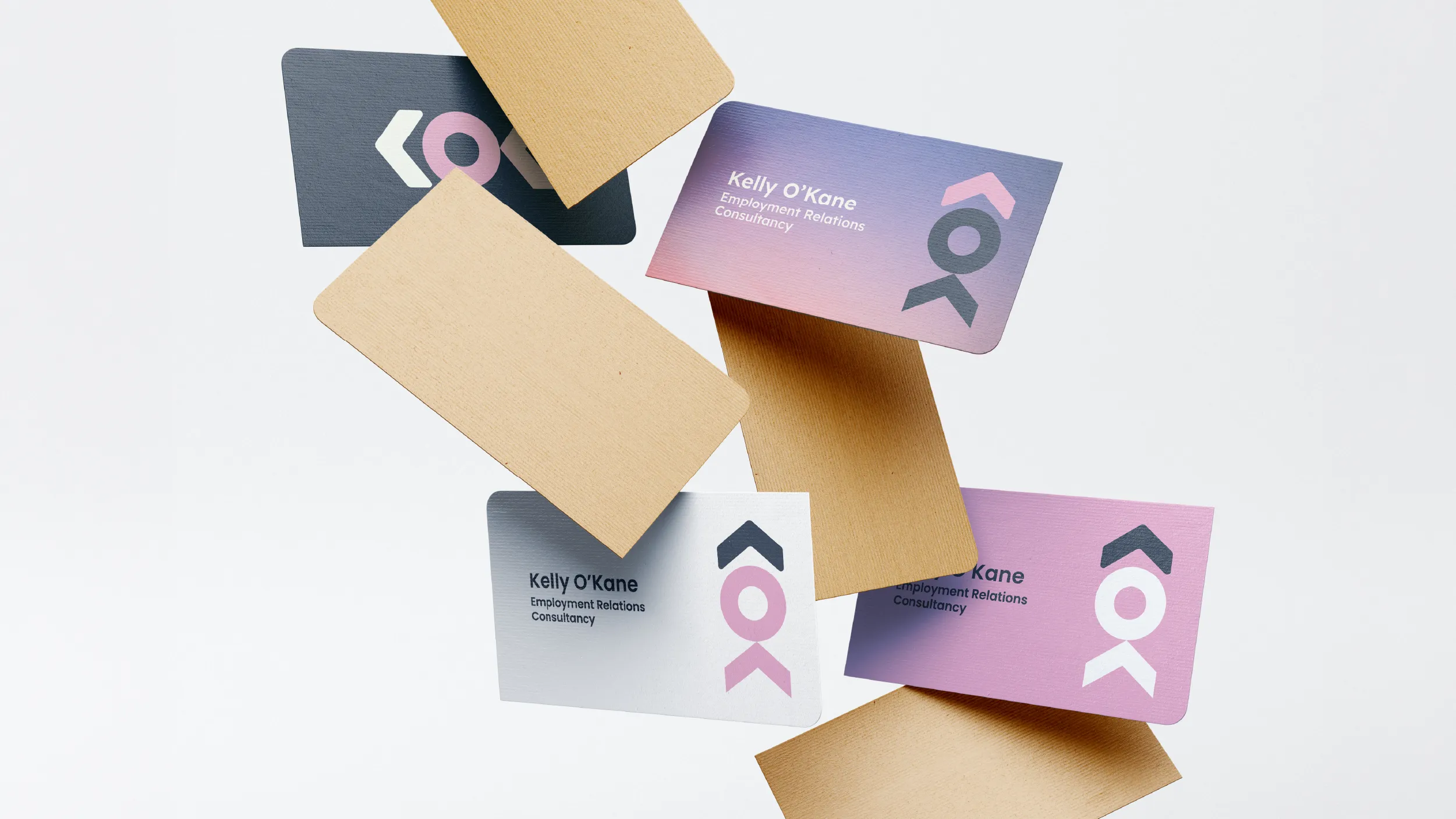
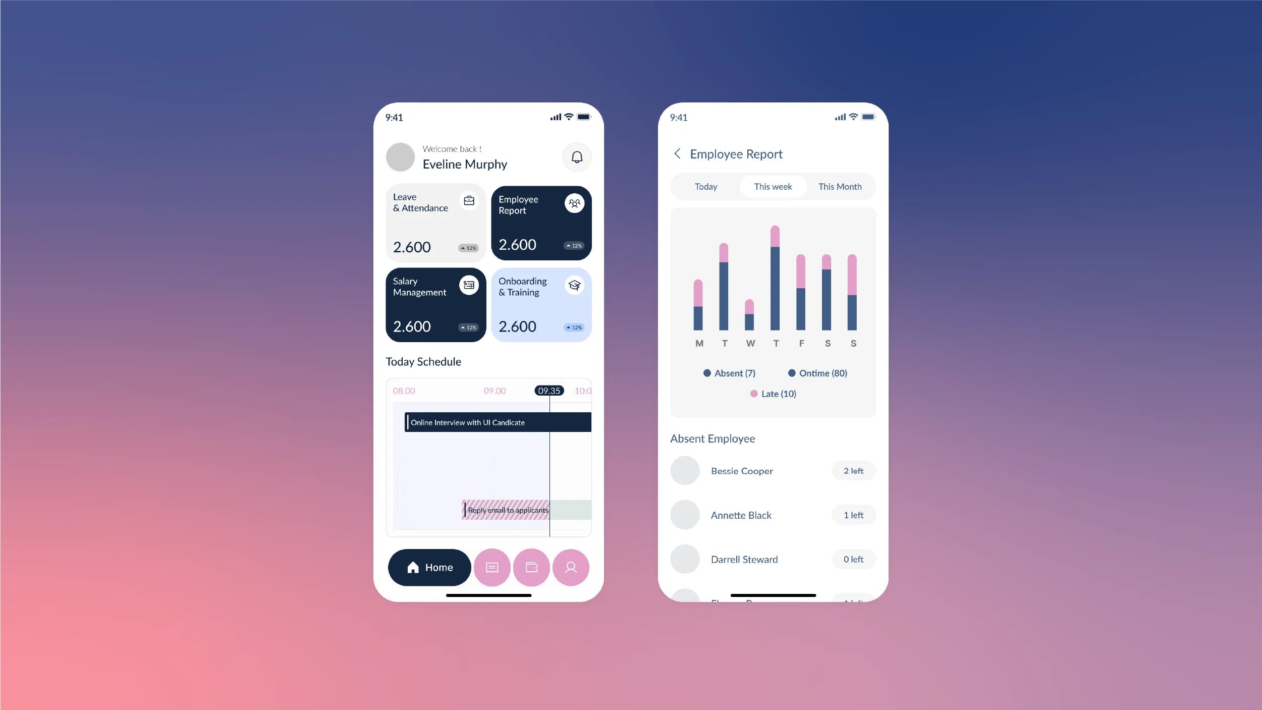
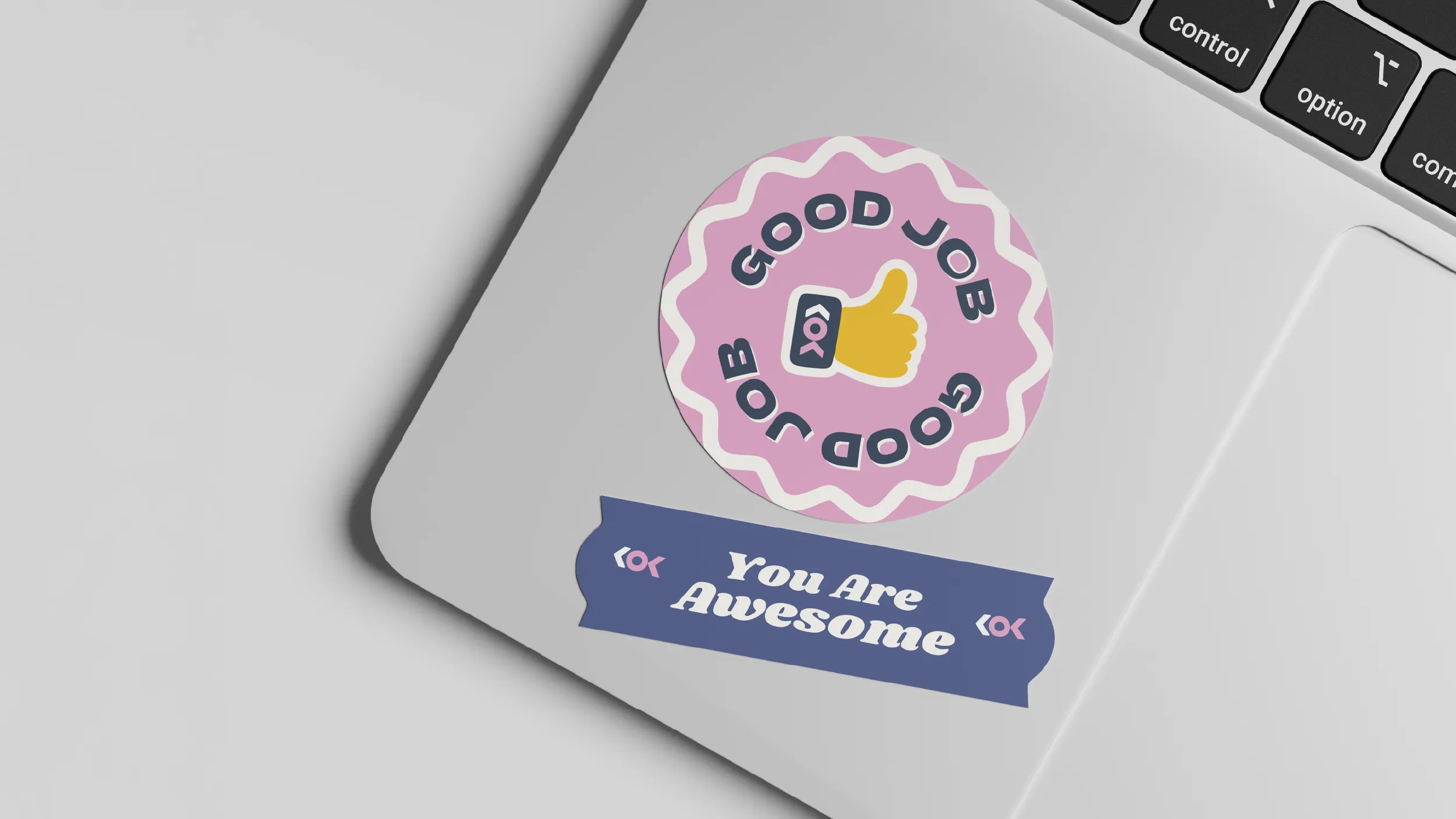
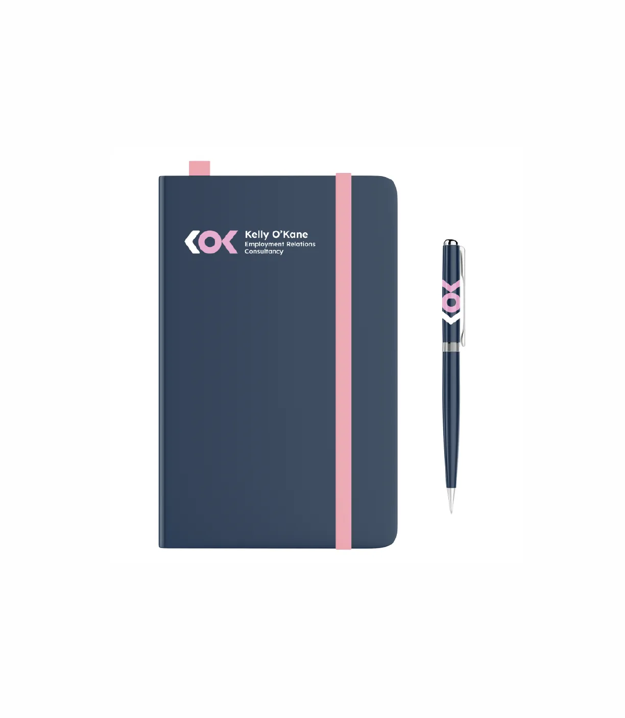
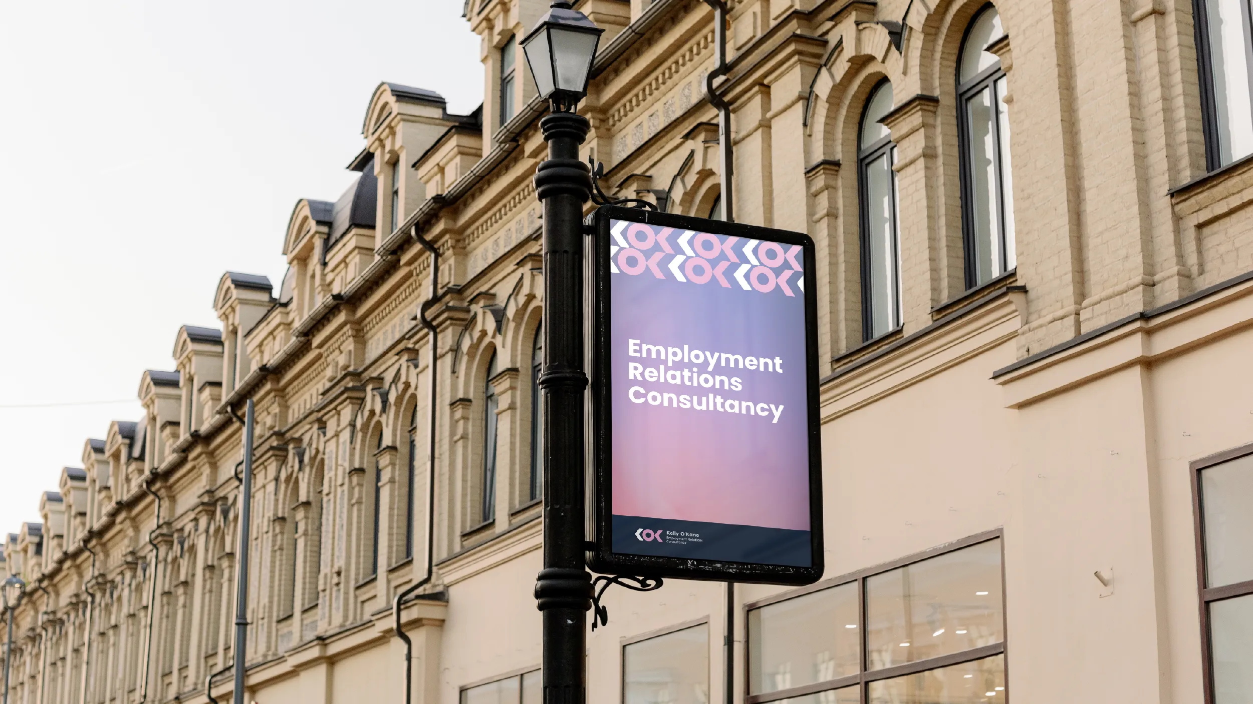
The brand was designed to be versatile across every medium from a business card to a billboard, from a digital platform to a branded notebook. Modern, minimalist, and immediately legible at any scale. The minimalist approach ensures it remains timeless while the colour system ensures it remains distinctive.
Employment relations is a field that sits at the intersection of legal precision and genuine human stakes. It is not abstract work. When a business navigates a performance management process, a restructure, or a personal grievance, real people’s livelihoods and professional futures are directly affected. The practitioners who do this work well understand both dimensions: the technical requirements of New Zealand employment law and the human reality of the situations that law governs. KOK Consultancy is a firm that brings both to the table.
The brand that Best Apisit Uthakhamkong developed for KOK needed to communicate expertise and reliability without the cold formality of a law firm. Employment relations is not litigation. It is, at its best, a practice of guidance, prevention, and resolution that keeps organisations and their people out of adversarial situations altogether. The brief was for a brand that projected professional competence while also communicating the empathy and genuine care for outcomes that distinguishes the best HR and ER practitioners from those who treat the work purely as process.
The lettermark was developed around the initials KOK. Working with an unusual three-letter combination in which the outer letters are identical is a specific design challenge: the natural risk is that the mark becomes visually repetitive or that the central O is overwhelmed by the two Ks flanking it. Uthakhamkong resolved this through a structural intervention: an arrow embedded within the letterform combination that reveals itself to attentive viewers but does not announce itself to casual ones.
The arrow is not applied to the lettermark. It is resolved within it, a product of the geometric relationship between the letters’ forms. It reads as a directional marker pointing forward and to the right, referencing progress, resolution, and the forward movement that clients are looking for when they engage an employment relations consultancy. The brief had been specific that the brand needed to feel less like a law firm and more like a trusted professional adviser: the hidden arrow rewards the kind of close, attentive looking that characterises a relationship of genuine trust.
The decision to make the arrow a hidden rather than explicit element was intentional. An obvious arrow would have been generic. Directional graphic devices appear in professional services logos across every sector. By embedding the form so that it only becomes visible once a viewer has spent time with the mark, the design creates a moment of discovery that shifts the relationship between the viewer and the brand. It becomes something you notice rather than something you are shown. That distinction matters for a firm whose work depends on building lasting client relationships rather than attracting high volumes of transactional enquiry.
The colour palette was built around the dual requirements of the brief: warmth and authority held together without either undermining the other. The primary tones are deep and assured, in the purple-grey range that communicates expertise and stability in professional services branding without defaulting to the predictable navy that dominates the sector. The secondary tones introduce warmth through a terracotta-adjacent accent and a lighter neutral, ensuring that the palette does not read as severe.
Employment relations work has an emotional dimension that most professional services branding systematically ignores. The situations that bring a business to a firm like KOK are rarely comfortable. They involve people in difficult circumstances, organisations under pressure, and decisions with real consequences. A brand that looks purely clinical does not serve clients well in those moments. The warmth built into KOK’s palette is not decorative. It is a communication about the kind of practitioner the firm is.
Typography and brand application guidelines were produced alongside the logomark, covering all the touchpoints relevant to a consultancy of this kind: proposals and formal correspondence, presentations and workshop materials, digital communications, and the professional profiles and directories through which clients typically find employment relations advisers. The system was designed to be consistent without being rigid, giving KOK the flexibility to adapt its communications to different contexts while maintaining visual coherence.
The completed brand for KOK Consultancy is a case study in the specific value of design thinking applied to a professional services brief. The decisions that produced this identity, including the use of initials rather than wordmark, the embedded rather than explicit arrow, and the warm rather than cold professional palette, are not default choices. They are considered answers to a specific brief about a specific kind of practice. The result is a brand that communicates exactly what KOK is: technically rigorous, genuinely human, and worth looking at more closely.
Client
KOK Consultancy Limited, Kelly O’Kane
Sector
Professional Services
Employment Relations
Disciplines
Brand Identity
Logo Design
Visual Identity
Colour System
Brand Style Guide