HelmHR
Visual identity and corporate brand framework for an award-winning human resources executive and consultancy in Otepoti Dunedin.
The brief called for something grounded and specific to Dunedin, not a generic professional services template. Laura Constantine Warren needed a brand that could sit in front of a chief executive without apology, while still carrying the warmth that defines her coaching practice. Uthakhamkong built an identity that does both at once.
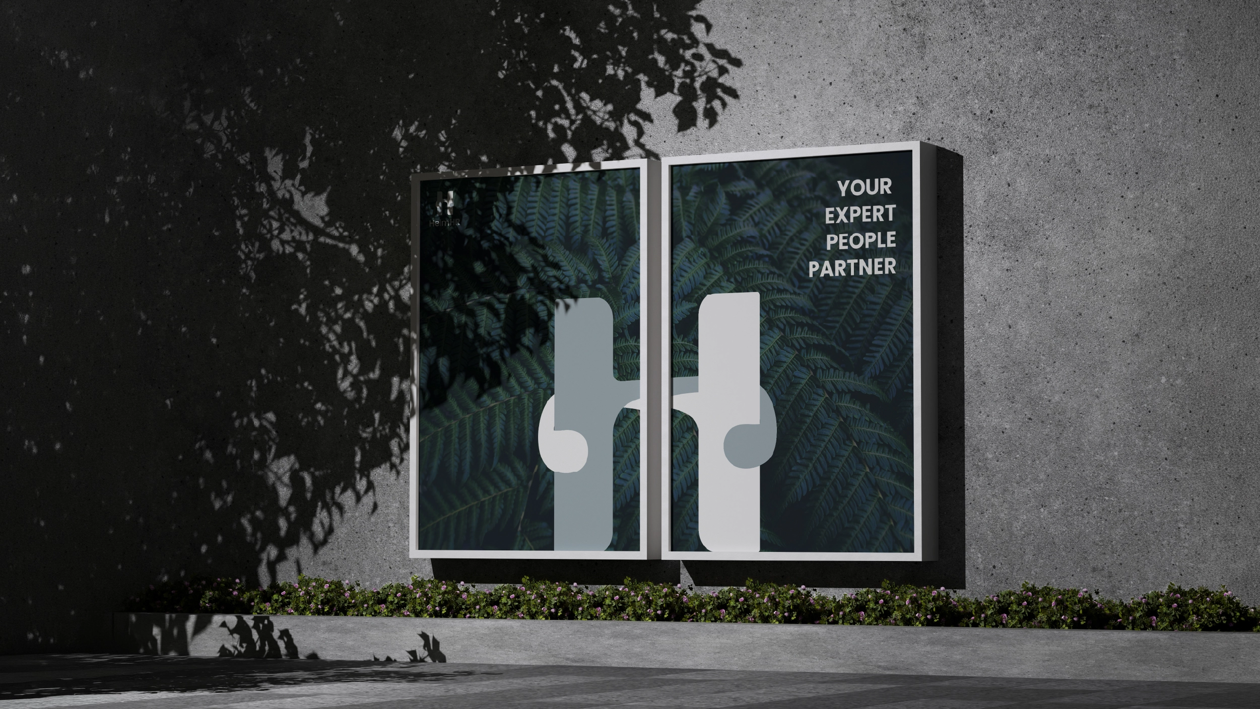

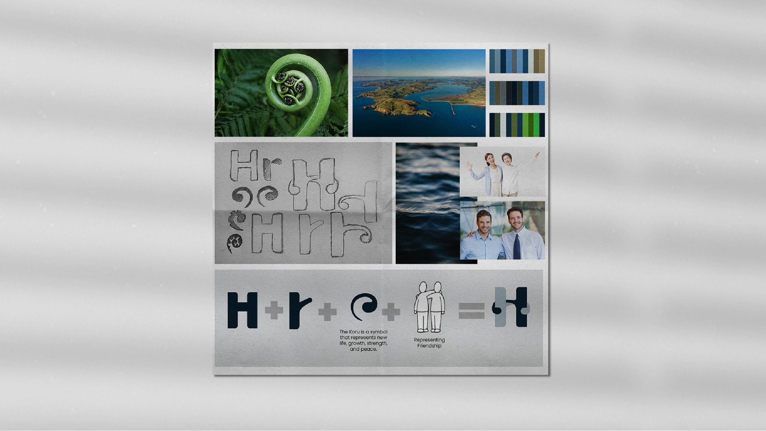
The logo does three things simultaneously. It connects the letters H and r in a minimalist mark that rewards close attention. It holds the form of a Koru, the Maori symbol of new life, growth, partnership, and strength, because those values are genuinely central to what HelmHR does.

Midnight Ocean
HEX #0D2433
#0D2433
RGB(13, 36, 51)Fiordland Mist
HEX #A4B2BA
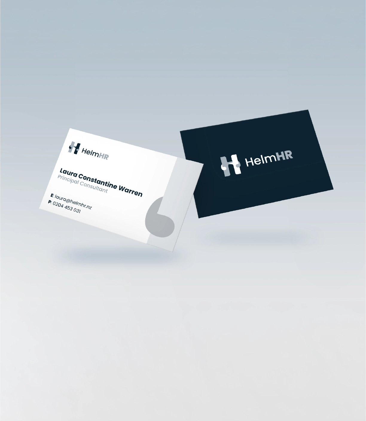


Laura Constantine Warren is an award-winning human resources executive based in Dunedin. She founded HelmHR to offer boutique HR consultancy services to New Zealand businesses, providing tailored support across employment relations, leadership development, and change management for organisations at moments of real transition. The work is serious. The clients are senior. The brief that Laura brought to Best Apisit Uthakhamkong reflected both.
The challenge was to build a brand identity for a sole practitioner who had spent years earning a reputation that a generic professional services logo would immediately undermine. Laura wanted something that felt like her: not a default template, not a copy of every other HR firm operating in the New Zealand market. The brand had to be capable of sitting in front of a chief executive without apology, while also carrying the warmth and human quality that characterises her coaching and mentoring work. Red, pink, and orange were explicitly ruled out. The direction was clear: grounded, credible, and calm.
Uthakhamkong began with the name itself. The word helm carries a precise, useful meaning. It is the wheel of a ship, the mechanism through which a vessel’s direction is set and its course is maintained. For a human resources consultancy whose entire value proposition is helping organisations navigate complexity through their people, the metaphor is exact. It is not ornamental. It describes exactly what the work is.
The resulting logomark works on several levels simultaneously. The primary form is a clean, considered mark that reads clearly at any scale, from a business card to a presentation slide to a LinkedIn avatar. Within that same form, the letters H and r are woven together, a hidden connection that reveals itself to viewers who look closely. The relationship between the two letterforms is geometrically precise and visually satisfying without announcing itself.
Also embedded in the same mark is the koru, the unfurling frond of the silver fern used in Maori culture for centuries as a symbol of new life, growth, partnership, and ongoing strength. For a consultancy whose work is fundamentally about helping organisations adapt and grow through people, the koru is not a decorative New Zealand reference. It is the central idea of HelmHR’s practice, expressed in visual form at the heart of the mark itself. The triple reading of helm, letterforms and koru is achieved without visual noise or compromise to any of the three.
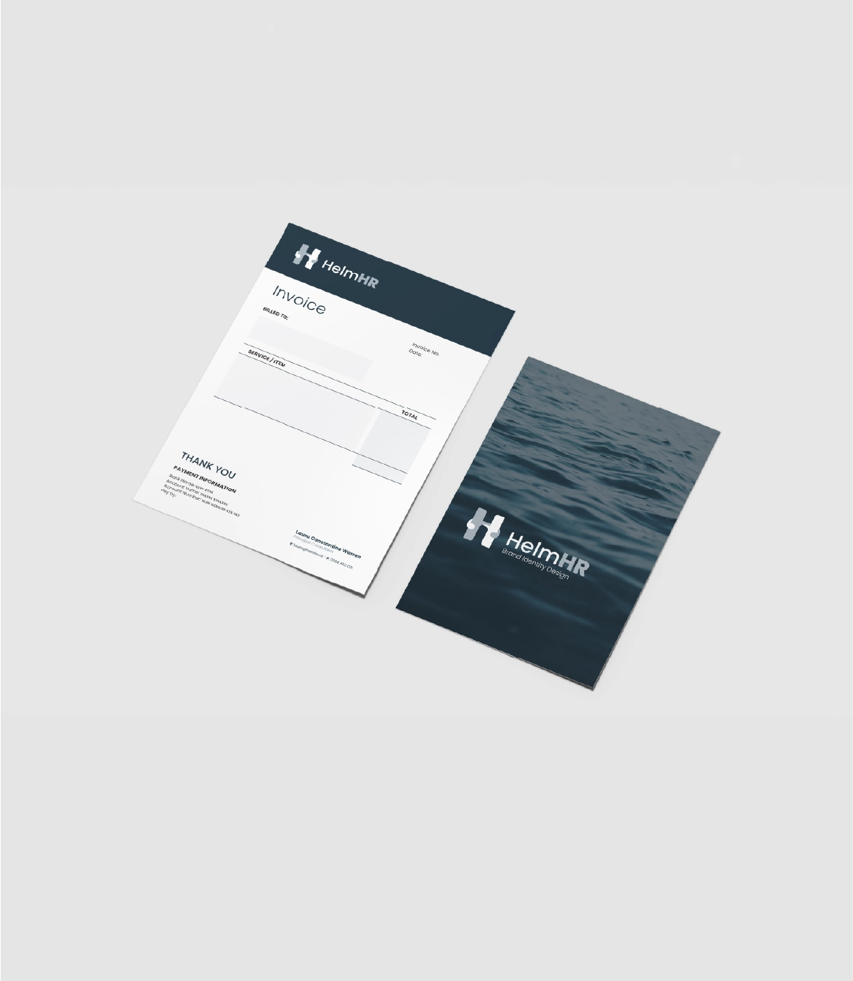
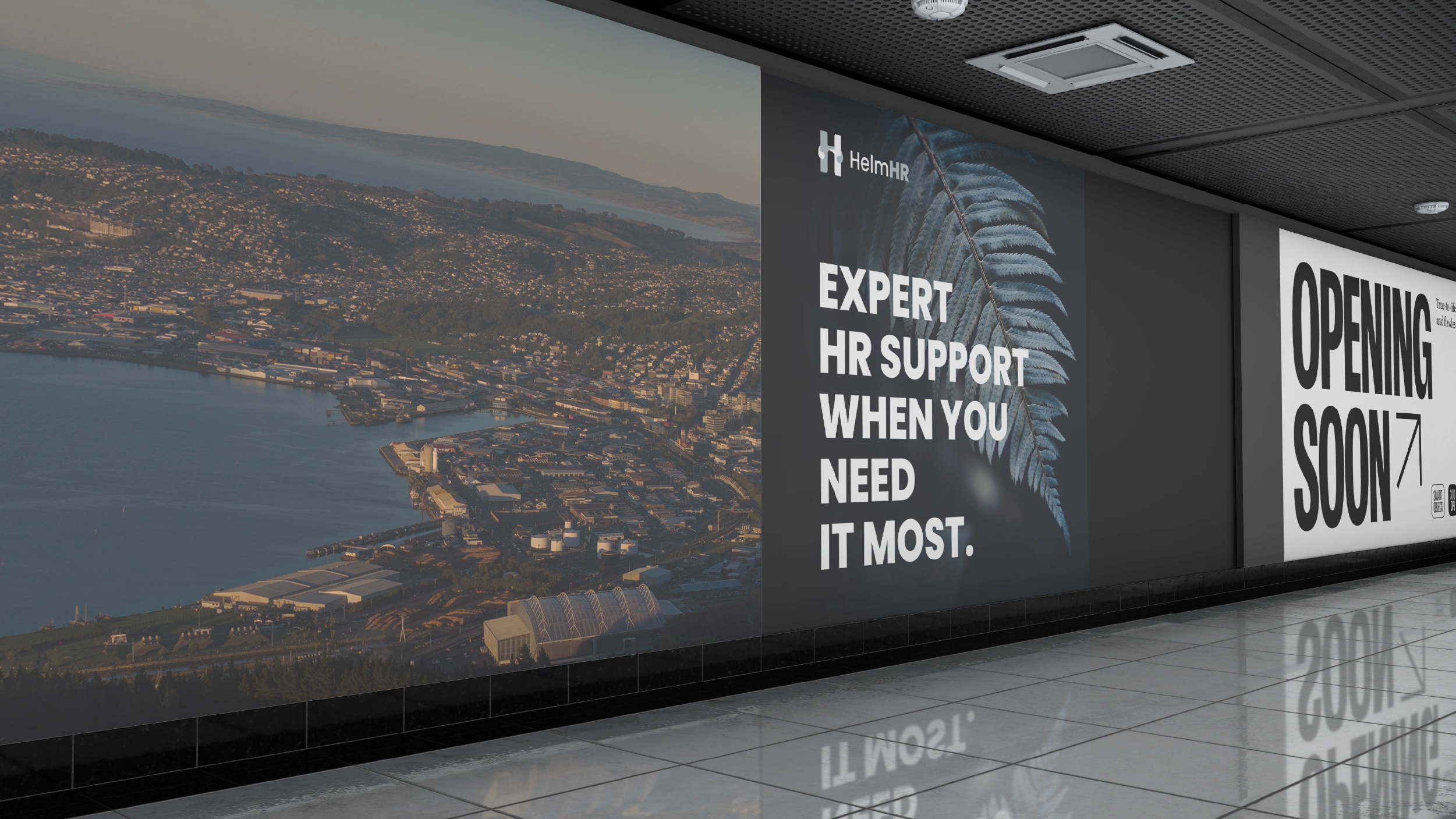
The colour palette was developed from a specific and direct source: the aerial view of Otago Harbour. The harbour produces a distinctive combination of deep navy blue and soft, slightly warm grey that is entirely characteristic of Dunedin’s light and landscape. These tones carry the emotional register the brand required: trust and stability without coldness, competence rather than corporate posture. The palette feels rooted in a specific place, which is appropriate for a consultancy whose founder is embedded in the Dunedin business community.
Tasman Blue was added to the primary palette as an active accent, present in the letterforms of the mark, carrying energy without disrupting the overall calm. Alabaster Frost serves as the light background tone, ensuring the identity works as well in print as on screen.
Typography and a complete brand style guide were developed alongside the logo. The system was built to be manageable by a sole practitioner across every application Laura uses in her day-to-day practice: client proposals, board presentations, her website, email signature, and LinkedIn profile. The design decisions are all made. The guide explains how to apply them. Laura can produce professional, consistent communications without needing to call a designer for each one.
The completed HelmHR identity is a demonstration of what a considered, closely researched design process produces for a professional services client. It is not a logo that could belong to anyone. It belongs specifically to a Dunedin-based HR executive who steers organisations through complexity, draws from the harbour she works beside, and has built a reputation serious enough that her visual identity needed to match it. Uthakhamkong delivered exactly that.
Client
HelmHR (Laura Constantine Warren)
Sector
Professional Services
Human Resources
Disciplines
Brand Identity
Visual Identity