DIRI NZ & Australia
Brand identity and website for an ancient manuscript research institute in partnership with the University of Otago and the University of Oxford.
DIRI’s fundamental design problem was one of register. The institute’s subject matter is ancient; its methods are thoroughly modern. Uthakhamkong served as Brand and Content Manager from 2016 to 2020, building a system that held both qualities with equal credibility across four years of sustained creative and strategic work.
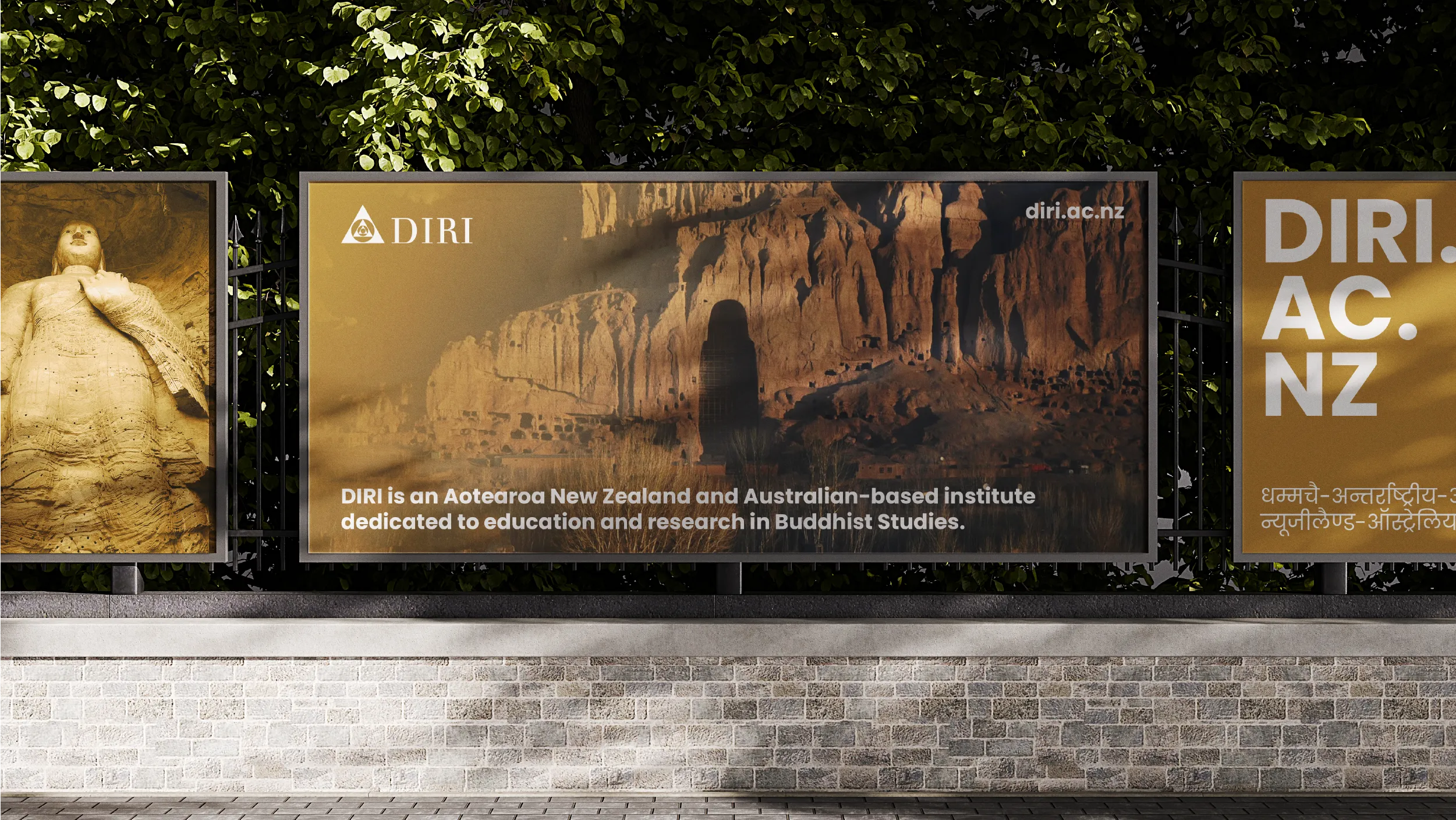
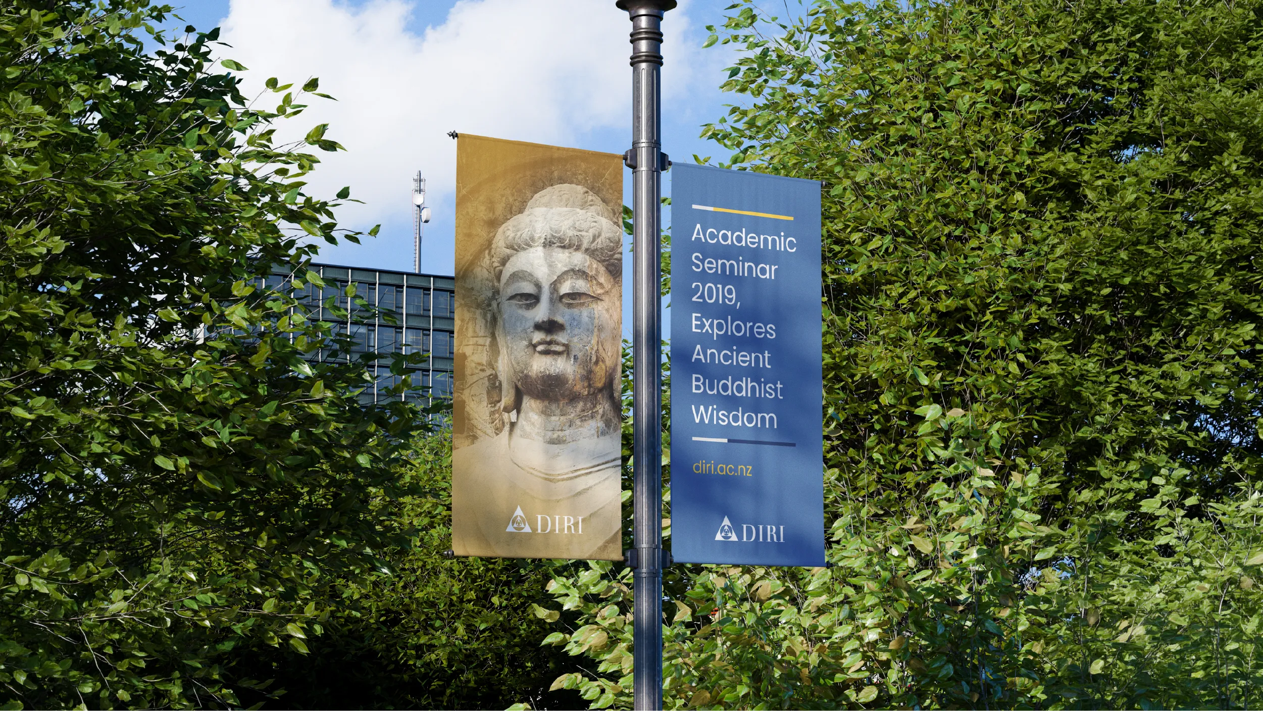
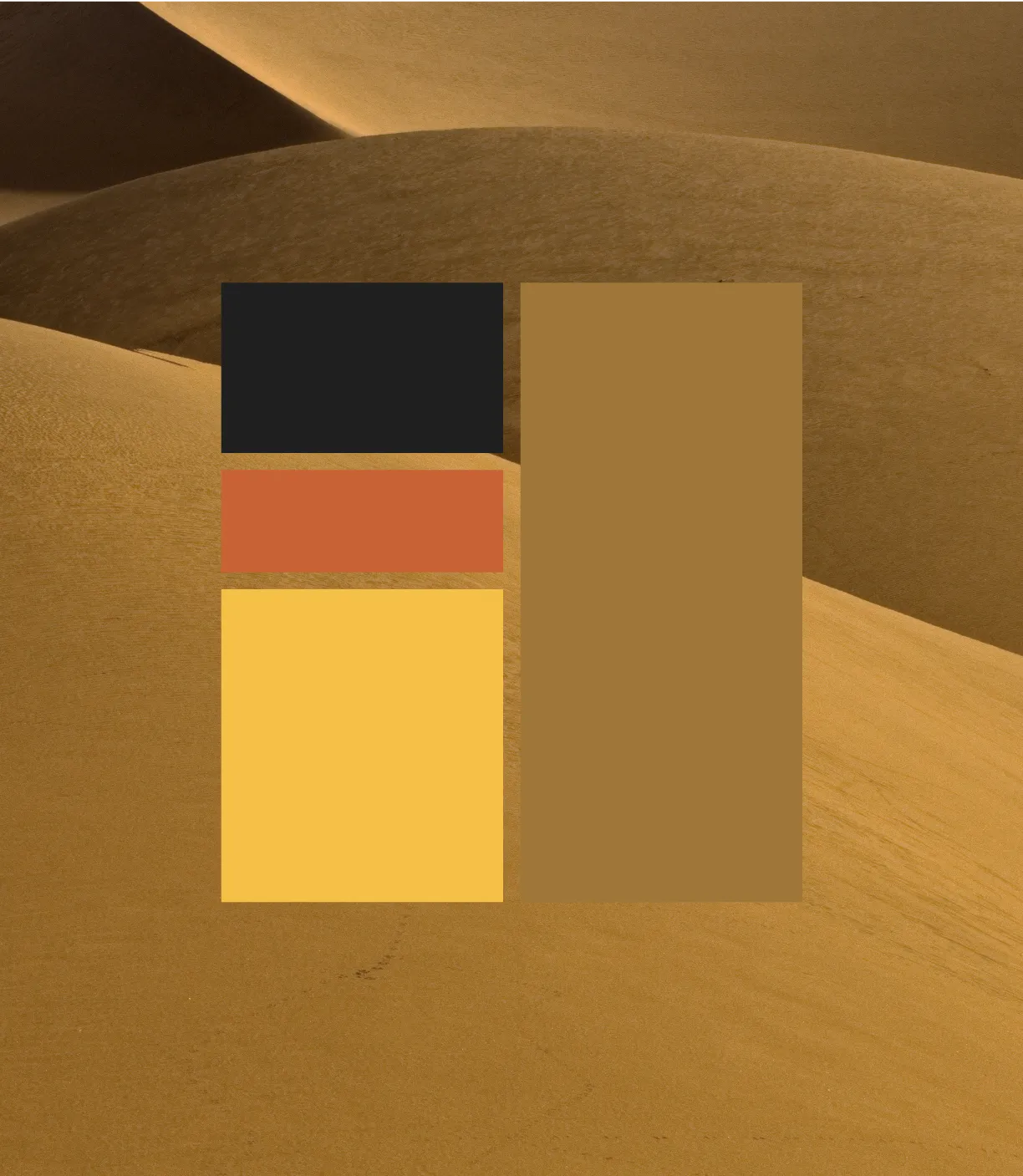


The primary brand colour, Ancient Gold, was not selected from a palette library. It was drawn from the desert sands of Central Asia where many of the ancient Buddhist manuscripts the institute studies were discovered, preserved in sealed clay vessels for more than two thousand years. That colour carries a specific and irreplaceable history. When it appears in the institute's communications, it connects everything DIRI does to the physical origin of the knowledge it is devoted to studying.

#1E3056
0%Denim Blue
#1E3056
Yale Blue
#466796
Academic institutions face a particular visual communication challenge: they need to be credible to specialists while remaining accessible to a broader public audience. The DIRI brand navigates this by using a visual language that is unambiguously scholarly in its seriousness and warmth, refusing the cold institutional aesthetic that many academic organisations default to. The result is a brand that welcomes the general public without condescending to the academic community.
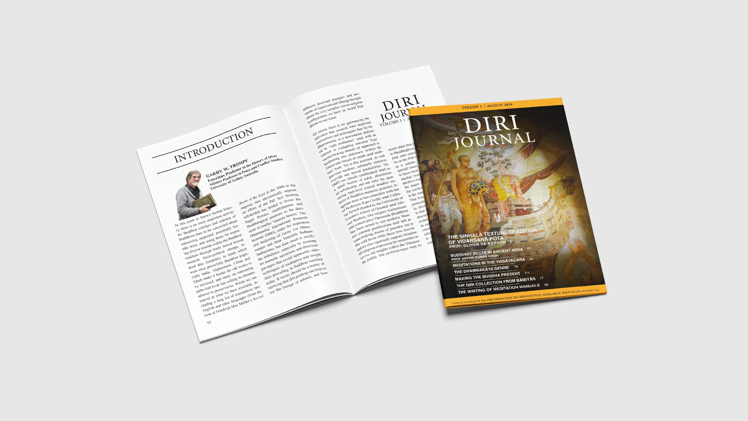
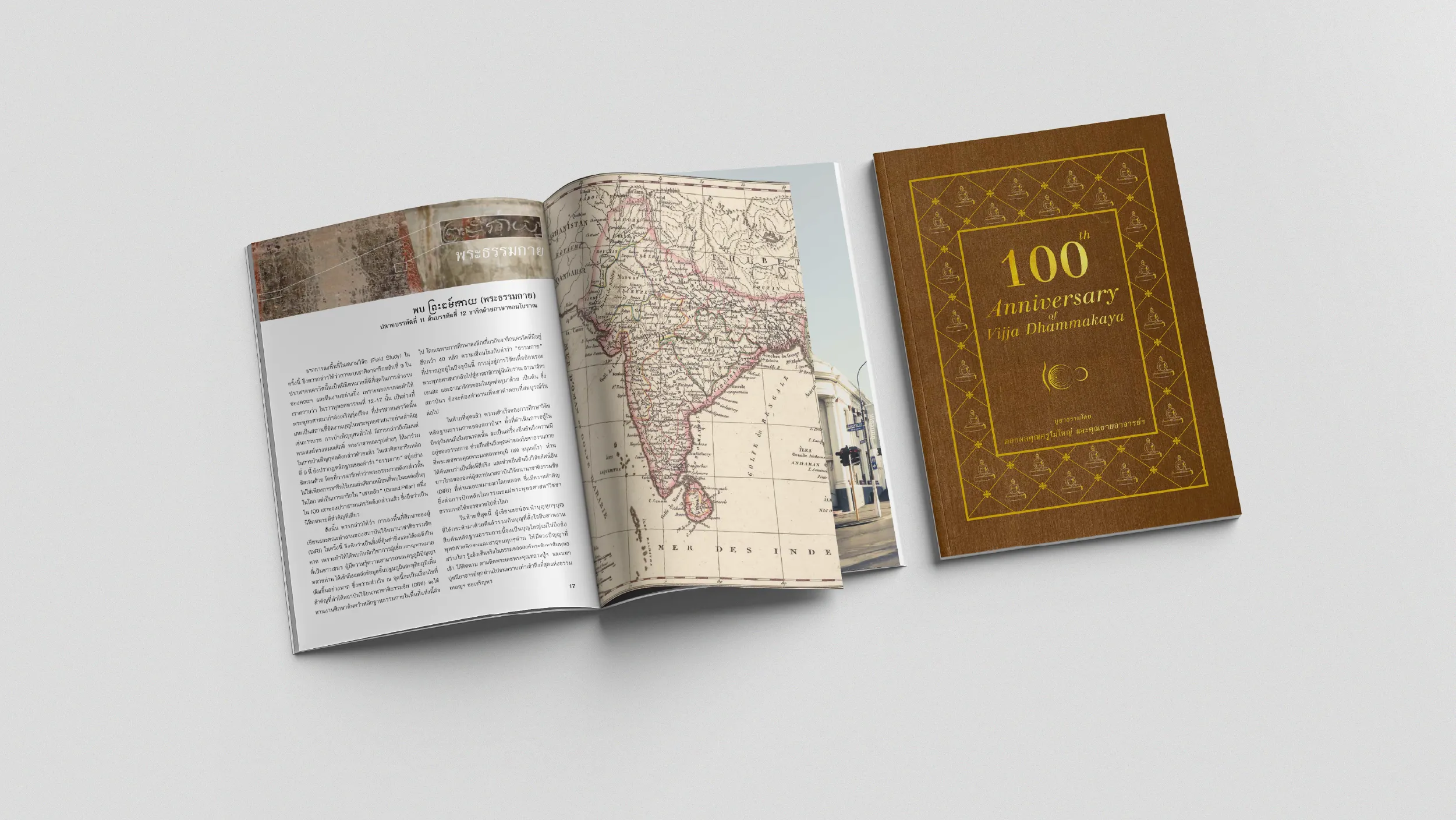



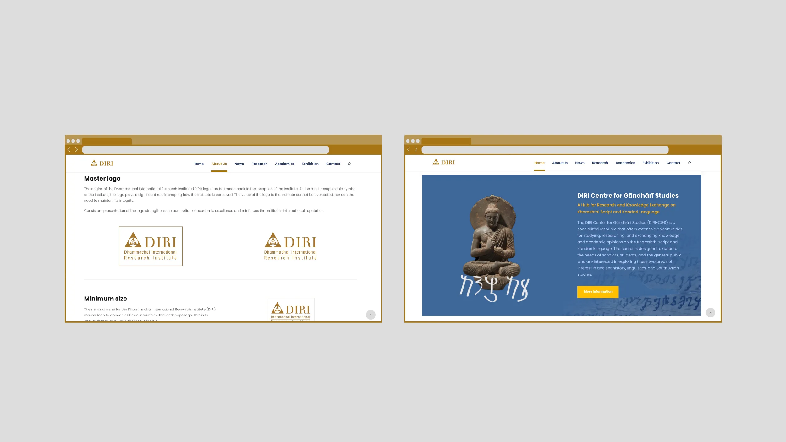
The website was designed with two audiences in its architecture simultaneously: the international scholarly community engaging with DIRI's research outputs, and the Dunedin public interested in Buddhism, meditation, and the history of ancient manuscripts. These are very different readers with very different needs, and the site serves both without forcing either to navigate through the other's content first.

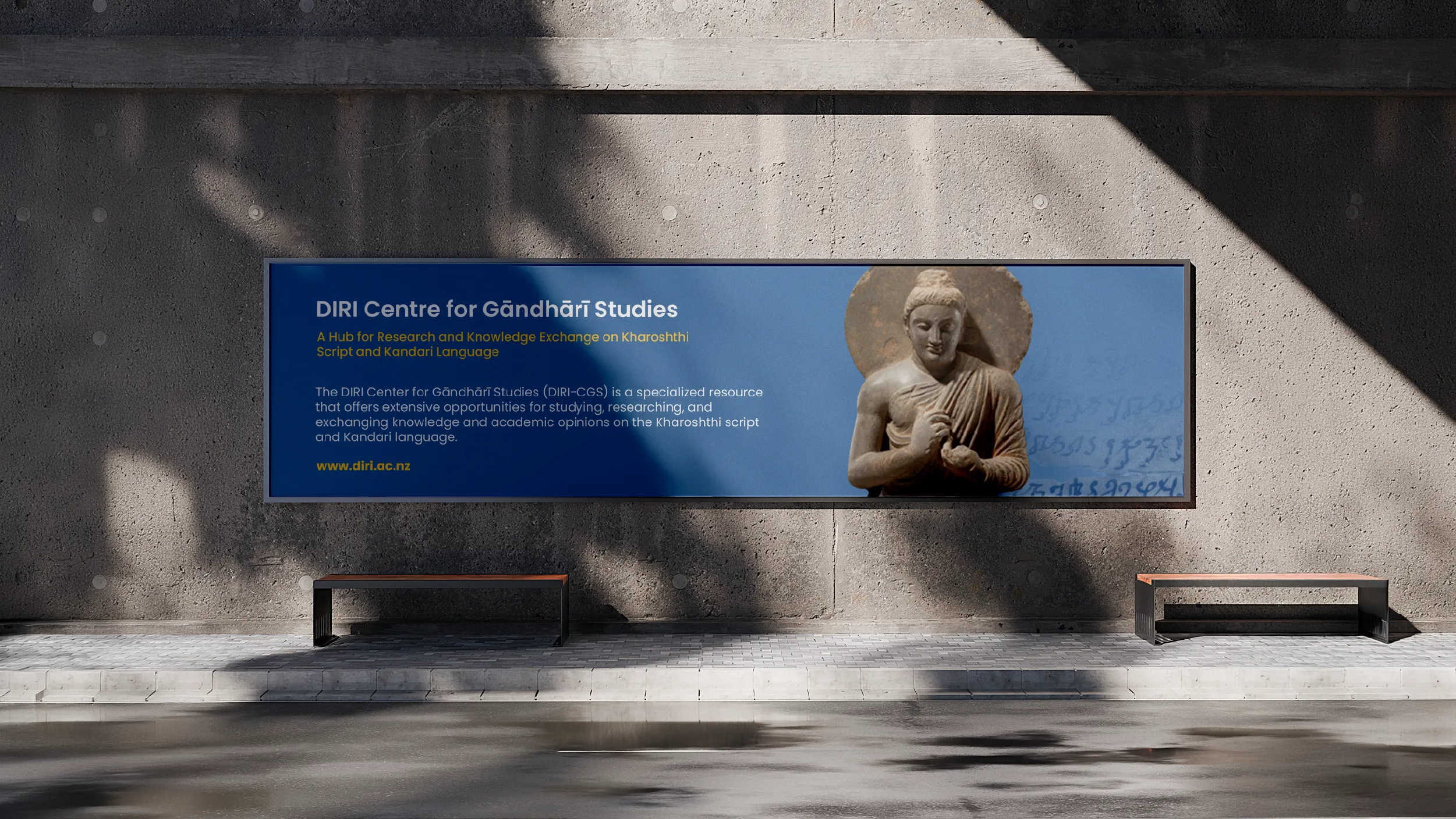
The Dhammachai International Research Institute is a research organisation dedicated to the study of ancient Buddhist manuscripts, a practice that sits at the intersection of scholarship, cultural preservation, and religious history. DIRI works to locate, digitise, catalogue, and interpret ancient texts of significant cultural and spiritual importance, in partnership with some of the world’s most distinguished academic institutions. In New Zealand and Australia, those institutional partnerships include the University of Otago in Dunedin and the University of Oxford.
Best Apisit Uthakhamkong served as Brand and Content Manager for DIRI NZ and Australia from 2016 to 2020, leading the development of brand strategy, producing a unified brand identity, building the organisational website, and delivering digital campaigns that strengthened stakeholder engagement across the region. The engagement was long-term and substantive: four years of embedded creative and strategic work for an organisation navigating the specific communication challenges of ancient scholarship in a modern context.
The fundamental design problem for DIRI was one of register. The institute’s work is ancient: manuscripts that predate the modern era by centuries, texts of genuine historical and spiritual significance. Its methods are thoroughly modern: digital scanning technologies, academic research protocols, international scholarly collaboration, and peer-reviewed publication. The brand needed to bridge these two registers with equal credibility. Too much emphasis on antiquity and the organisation would feel like a museum. Too much emphasis on modernity and the depth of the scholarly enterprise would be lost.
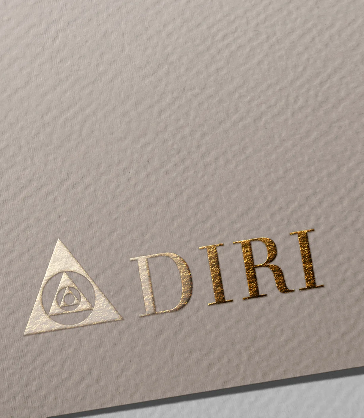
The visual identity Uthakhamkong developed draws from the visual language of scholarship and documentation: the precision and restraint of academic publication, the weight and authority of institutional communication. The logomark is clean and dignified, appropriate to an organisation whose standing in the research community depends on the quality of its scholarly credentials. It is not a mark that announces itself through visual novelty. It is a mark that communicates gravitas through economy of form.
Colour and typography were chosen to communicate heritage and rigour without looking antiquated. The palette draws from warm earth tones and deep neutrals, the tonal register of aged parchment and natural light in a reading room, the physical materials of scholarship before digital reproduction. These associations are evoked indirectly, through tone and warmth, rather than through literal historical reference. The result is a palette that feels rooted in the subject matter without being pastiche.
Typography was selected to carry the dual register required by the brief. The primary display typeface is classical in its proportions and authority, appropriate for publication covers, formal headers, and the kind of institutional materials that represent DIRI to academic partners and funding bodies. The secondary typeface is modern and highly legible, designed for the extended reading that the institute’s publications and digital content require.
The website was built to serve three clearly defined audiences. Researchers and academic partners need to understand the scope and rigour of the institute’s work, locate relevant publications and project documentation, and assess whether DIRI would be a credible collaborator on a research project. Institutional funders, including foundations, universities, and cultural heritage organisations, need to understand the significance of the work and the scale of the network supporting it. Members of the public with an interest in Buddhist scholarship or cultural heritage need to be welcomed rather than excluded by the academic register.
The information architecture of the site was developed to serve all three audiences through a single coherent structure. The primary navigation leads with the research, covering manuscripts, projects, and publications, establishing scholarly credibility immediately. Secondary navigation addresses the organisation’s relationships with partner institutions, providing the institutional context that funders and academic collaborators require. A news and events section maintains a living record of the organisation’s ongoing activity, demonstrating that this is an active research enterprise rather than a static archive.
Content strategy was a significant component of the engagement alongside design. For an organisation working in a specialist field with a non-specialist public audience, the challenge of writing about ancient manuscripts in terms that are both accurate and accessible is substantial. Uthakhamkong developed a content approach that respected the scholarly depth of the work without assuming that every reader arrived with specialist knowledge, using clear language and contextual explanation to bridge the gap.
The DIRI engagement demonstrates the range of creative and strategic work that Uthakhamkong brings to a long-term institutional relationship: brand strategy, visual identity, website architecture, content strategy, and digital communications all developed in sustained collaboration over four years. It is the kind of engagement that produces work of genuine depth, because the creative decisions are informed by an accumulated understanding of the organisation’s character, its audiences, and what it is trying to achieve in the world.
Client
DIRI NZ & Australia
Sector
Education
Research
Non-profits
Disciplines
Brand Strategy
Logo Design
Visual Identity
Colour System
Brand Style Guide
Website Design
WordPress Development