Convergence Consulting
Brand identity and website for a Canberra project management consultancy serving the Australian Government.
Working in the Australian Government consulting market means operating inside a very specific visual register. Convergence Consulting needed to fit that environment credibly while standing apart from firms making identical claims. The solution came not from departing the register but from the quality of the choices made within it.

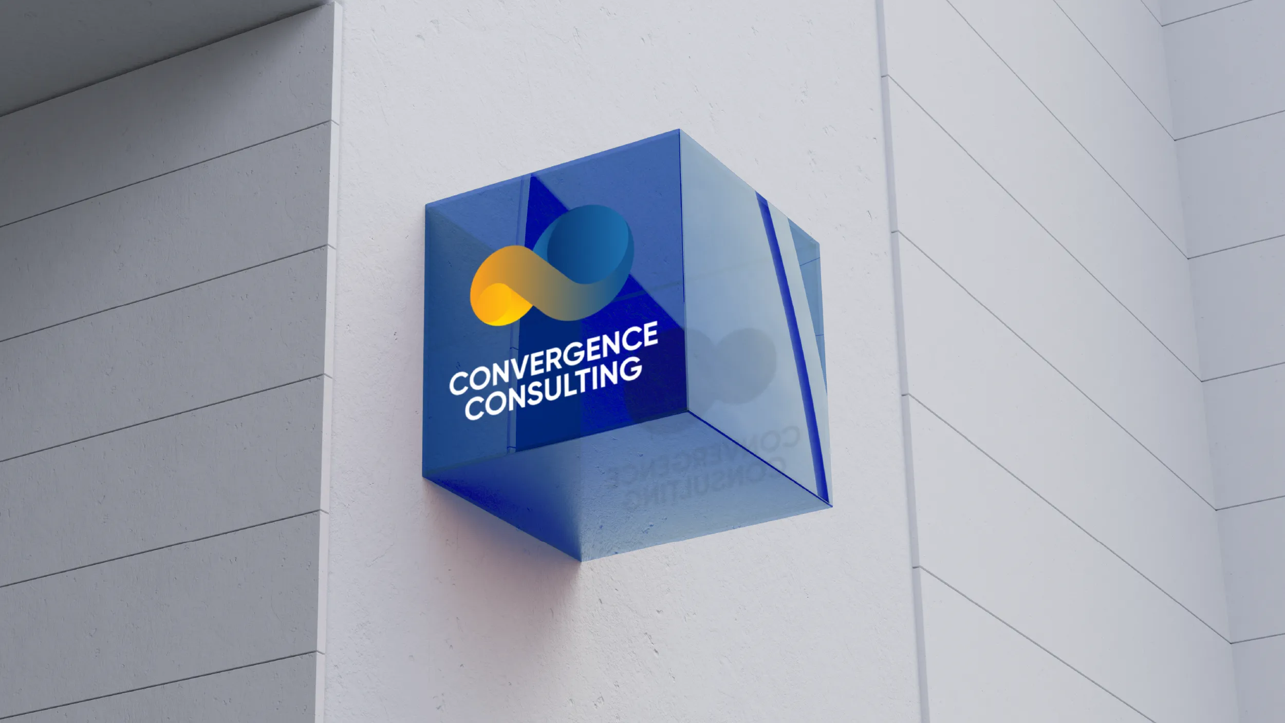
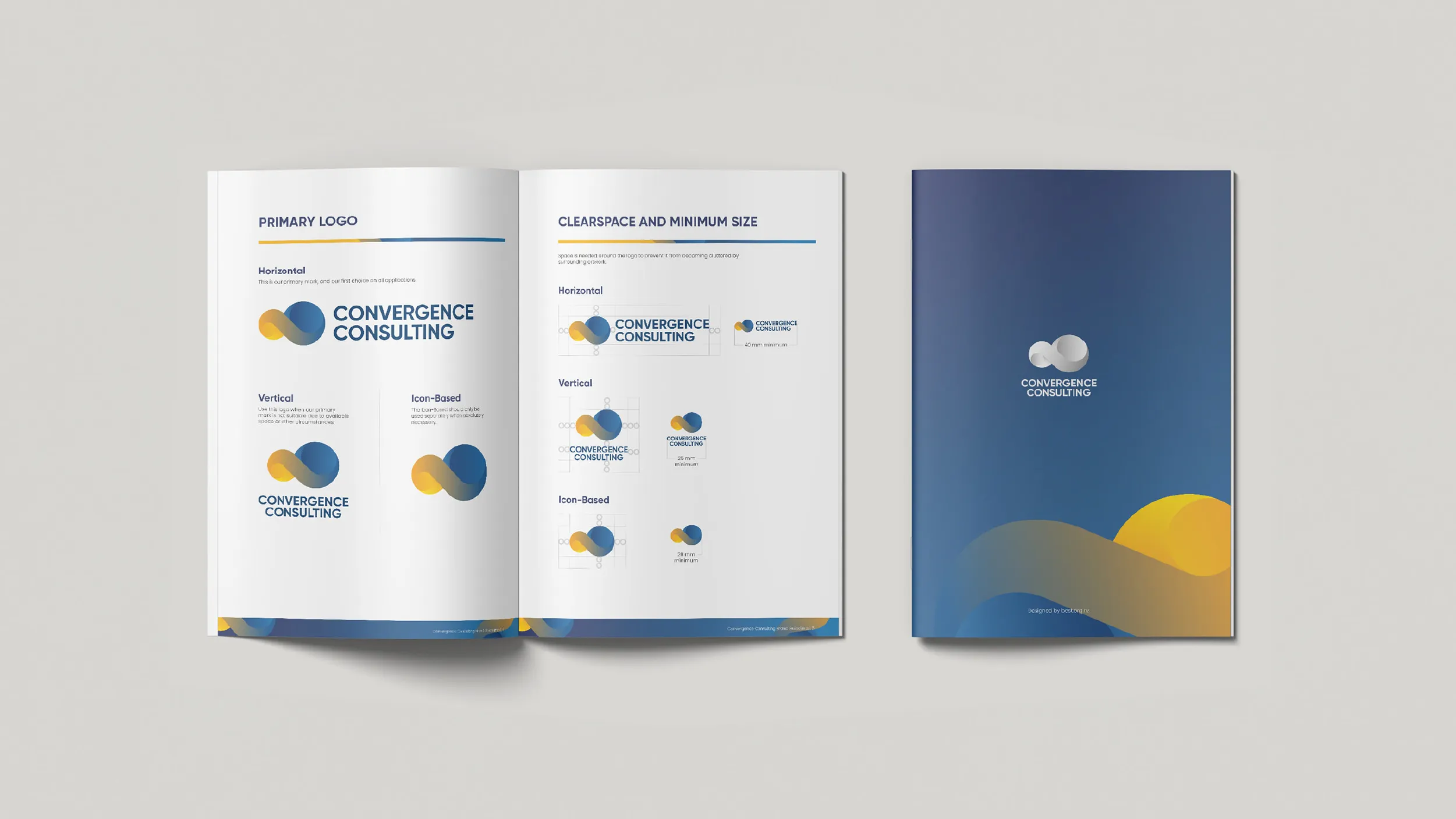
The two-sphere logo mark embodies convergence physically: two distinct forms, each complete in itself, coming together into a unified whole that is more than either could be separately. It is a mark about collaboration and synthesis, which describes exactly what Convergence Consulting does for the organisations it serves. The geometry is precise and three-dimensional, giving the mark a visual presence and solidity that communicates the rigour the firm brings to every programme it delivers.

#01235F
0%Midnight Navy
#01235F
Sky Blue
#1F73B2
Move cursor to distort fluid. Click to drop a swatch.
#01235F
0%
Interact with the core liquid bodies. Watch them interact upon contact.
0%
#1F73B2 / #FA9F1B
The two blues in the Convergence palette do different work. Dark Navy at #01235F carries the authority and professional weight the government sector expects. Light Blue at #1F73B2 opens that weight up, giving the brand range and approachability without sacrificing the credibility that dark blue provides. Together they create a palette that can be serious and energetic within the same communication.





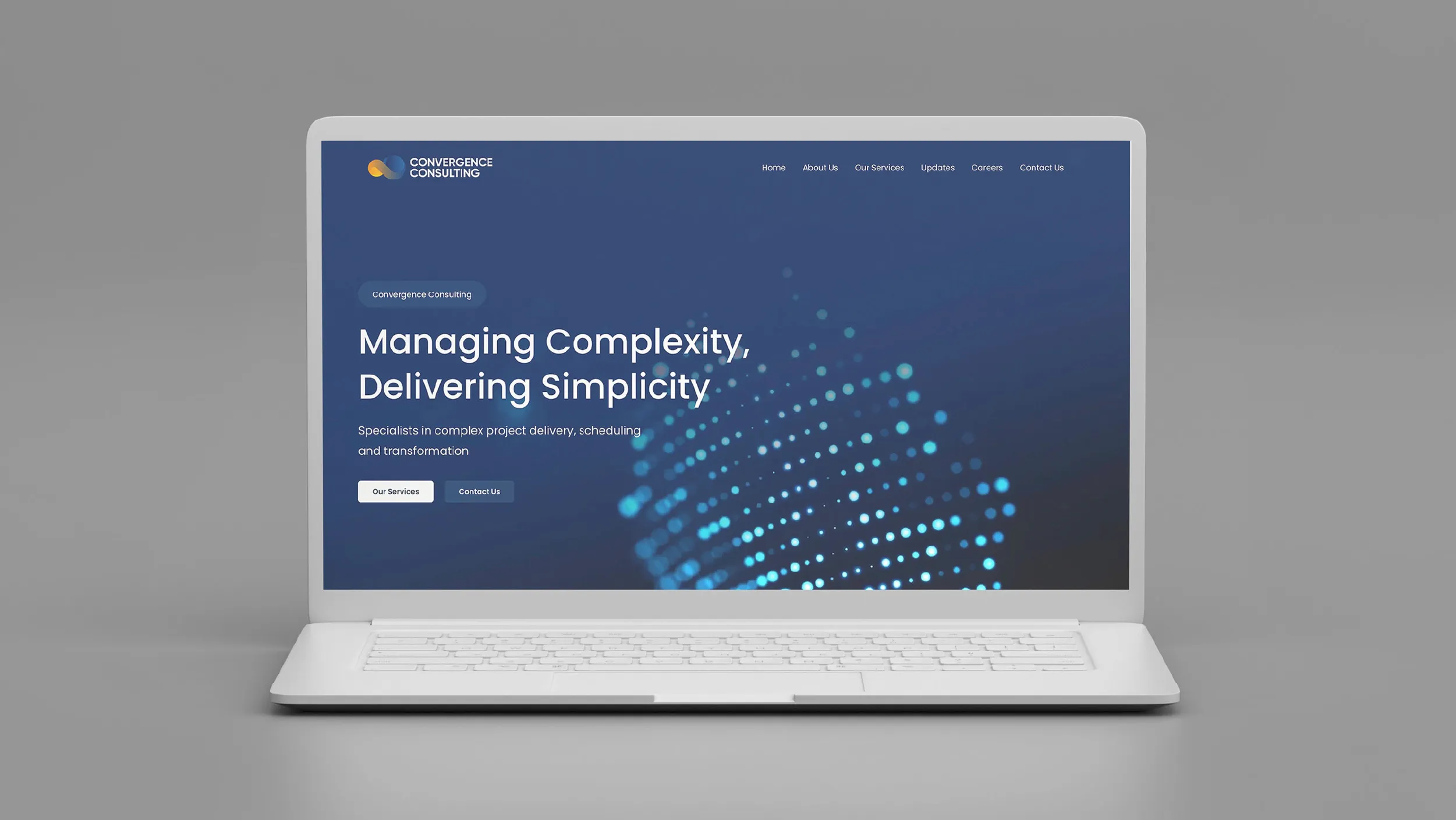

The website was designed to do one thing above everything else: give a prospective client, whether a government procurement officer or a private sector programme director, enough confidence in the quality and capability of the firm to make an initial contact. Every page, every section, every line of copy, and every design decision was measured against that outcome.

Working with the Australian Government requires a specific kind of credibility. It is not the credibility of disruption or of novelty. It is the credibility of rigour, consistency, and demonstrated competence across complex, high-stakes projects. Convergence Consulting is a Canberra-based project management consultancy that specialises in exactly this environment, working primarily with government agencies on large, multi-workstream projects where the cost of failure is significant and the expectations of professionalism are unambiguous.
The brand that Best Apisit Uthakhamkong developed for Convergence had to operate at that level without becoming bureaucratic. Government sector branding has its own default visual vocabulary, one that communicates safety through familiarity and trustworthiness through conventional form. The brief was to work within that register while differentiating Convergence from the many firms competing in the same space. Differentiation through deviation from convention was not available. The differentiation had to come from within the register itself, through the quality of the choices made inside it.
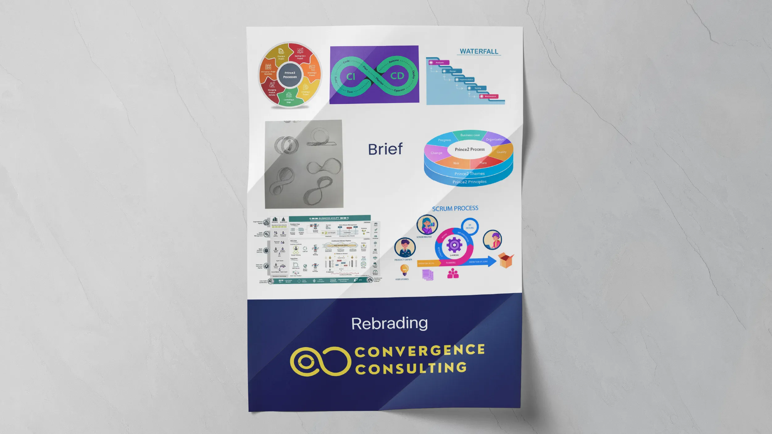
The starting point was the name. In project management, convergence has a precise technical meaning: it describes the point at which separate workstreams, timelines, or dependencies come together into a unified outcome. For a firm that manages exactly these moments of integration for complex government projects, the name is not incidental. It is the description of the service. Uthakhamkong used this as the generative idea for the visual identity.
The logomark is built around the concept of separate lines or directions arriving at a single resolved point. The visual logic mirrors the intellectual logic of the practice: multiple elements, carefully managed, brought together precisely. The mark is clean and geometric, with a deliberate economy of form that communicates efficiency alongside authority. It is a mark that reads well at the scale of a conference badge and at the scale of a tender document cover sheet.
The colour palette sits deliberately within the blue and neutral register that is common to government sector work in Australia. This was a considered decision. Departing sharply from this palette would have created a brand that felt out of place in the environments where Convergence’s clients operate. For a consultancy whose credibility depends on fitting comfortably within formal government contexts, that would have been counterproductive. The differentiation comes instead from the precision of the selections: a specific, slightly warmer navy, a precise mid-blue accent, and a neutral system with enough warmth to prevent the palette from feeling cold.
The result is a brand that signals government sector credibility immediately while sitting at the better end of the visual register. Clients assessing Convergence alongside competitors are unlikely to consciously articulate why the brand feels more considered, but the work is designed to produce exactly that impression through accumulated visual quality rather than through any single obvious differentiator.
The website was designed to perform a specific function: to position Convergence clearly within the Australian Government consulting market, give prospective clients confidence in the quality of the firm’s work, and make the process of initiating contact feel appropriately professional. Government procurement involves formal tender processes as well as informal referrals, and the website needed to serve both channels: credible enough for due diligence, substantive and responsive for clients who arrive through a recommendation.
The site architecture was developed with input on the types of clients Convergence typically works with and the questions they most commonly bring to an initial engagement. Service descriptions were written to be specific rather than generic, addressing the actual complexities of project management in the government sector rather than defaulting to the broad language that most professional services websites use. The distinction matters in a market where clients have seen many firms claim the same capabilities.
Navigation and information hierarchy were structured around a single primary question that most government clients want answered first: has this firm done this kind of work before, with organisations like mine, at the scale I am working at? The site answers that question directly, without requiring the visitor to hunt for it. Credentials and relevant experience are surface-level rather than buried.
What Uthakhamkong produced for Convergence is a brand identity and digital presence that does exactly what a government-facing professional services brand needs to do: it communicates seriousness, precision, and a clear understanding of the environment the firm operates in, without any of the visual noise that undermines credibility. For a consultancy whose work is about bringing clarity to complex situations, that alignment between the work and its representation is itself a form of proof.
Client
Convergence Consulting
Sector
Professional Services
Government
Disciplines
Brand Identity
Visual Identity
Website Design