
CAYE Pacific
A brand identity and website built to represent eleven Pacific nations, carry Commonwealth authority, and feel genuinely rooted in Pacific identity.
By Uthakhamkong’s own assessment, CAYE Pacific was the most complex single brief he has worked with. A visual identity representing eleven nations cannot favour any one of them, and it has to function across government meetings, volunteer communications, and event banners produced from multiple countries simultaneously.
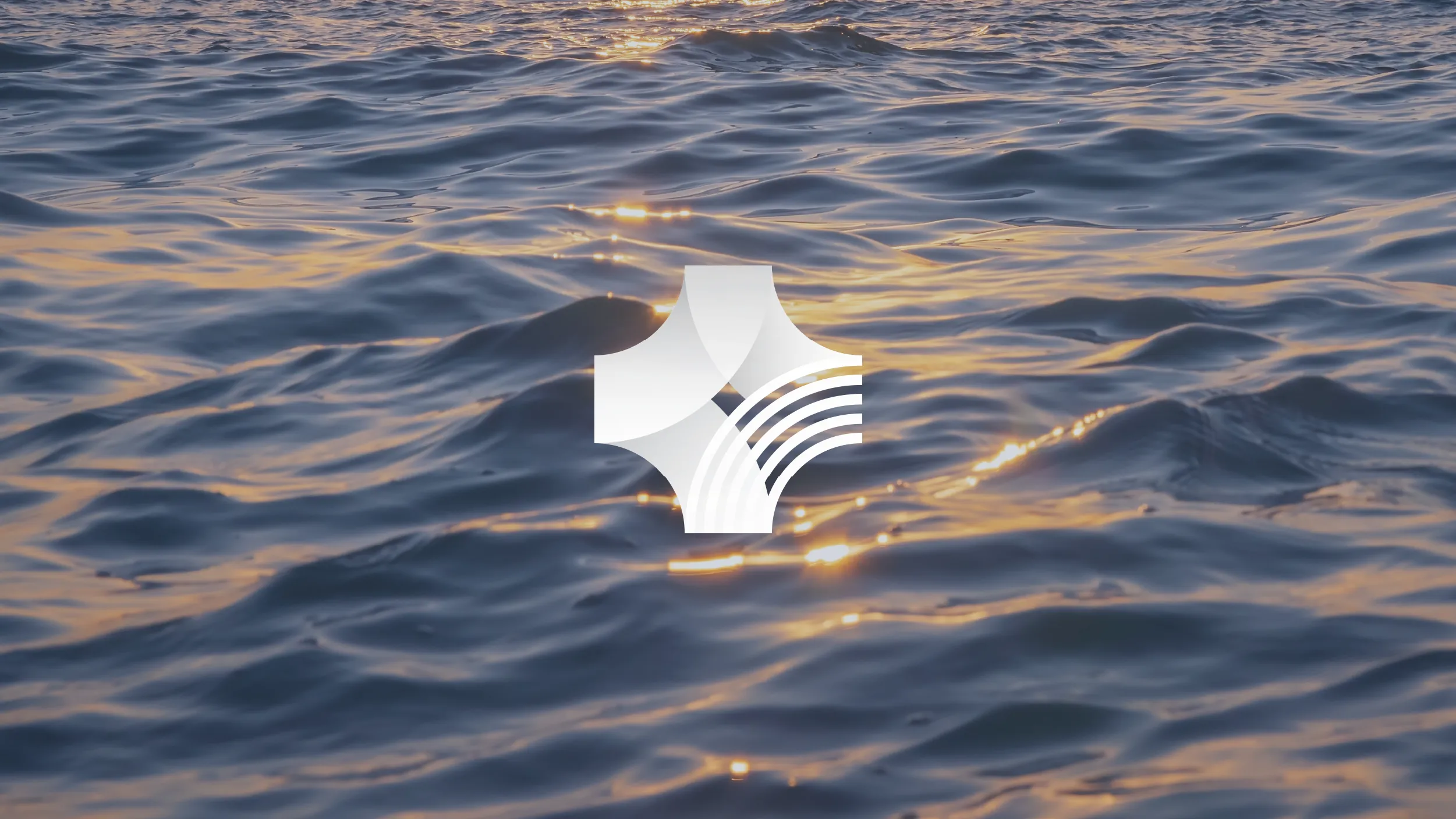
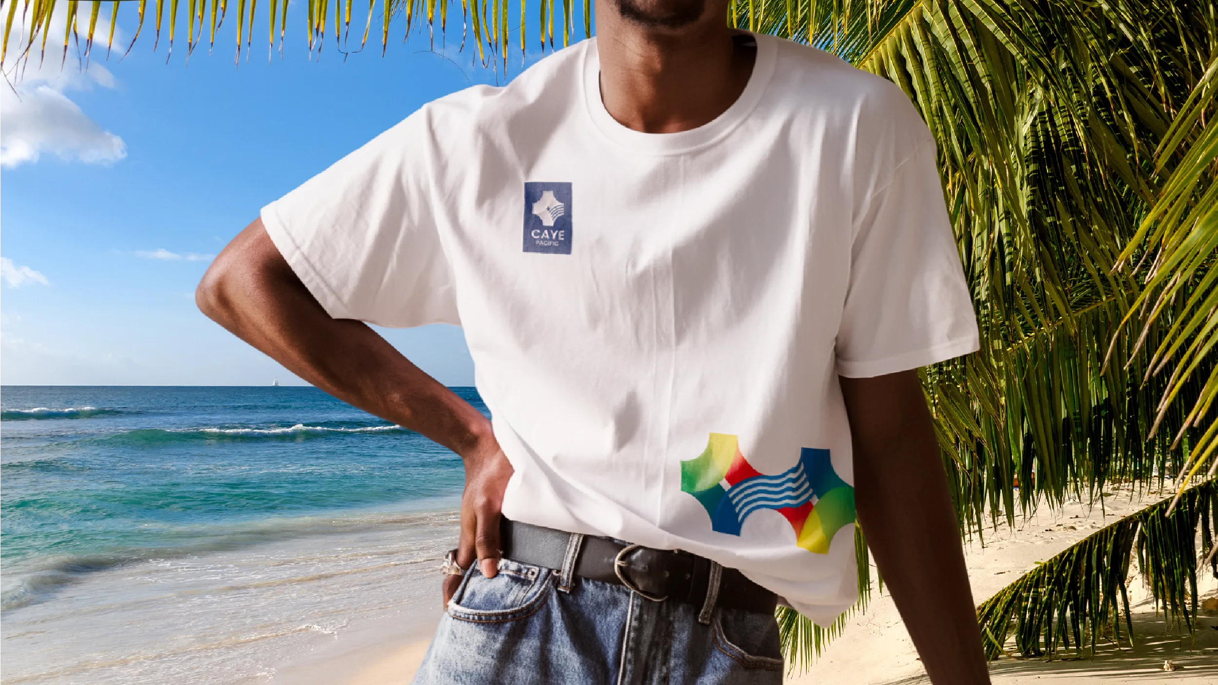
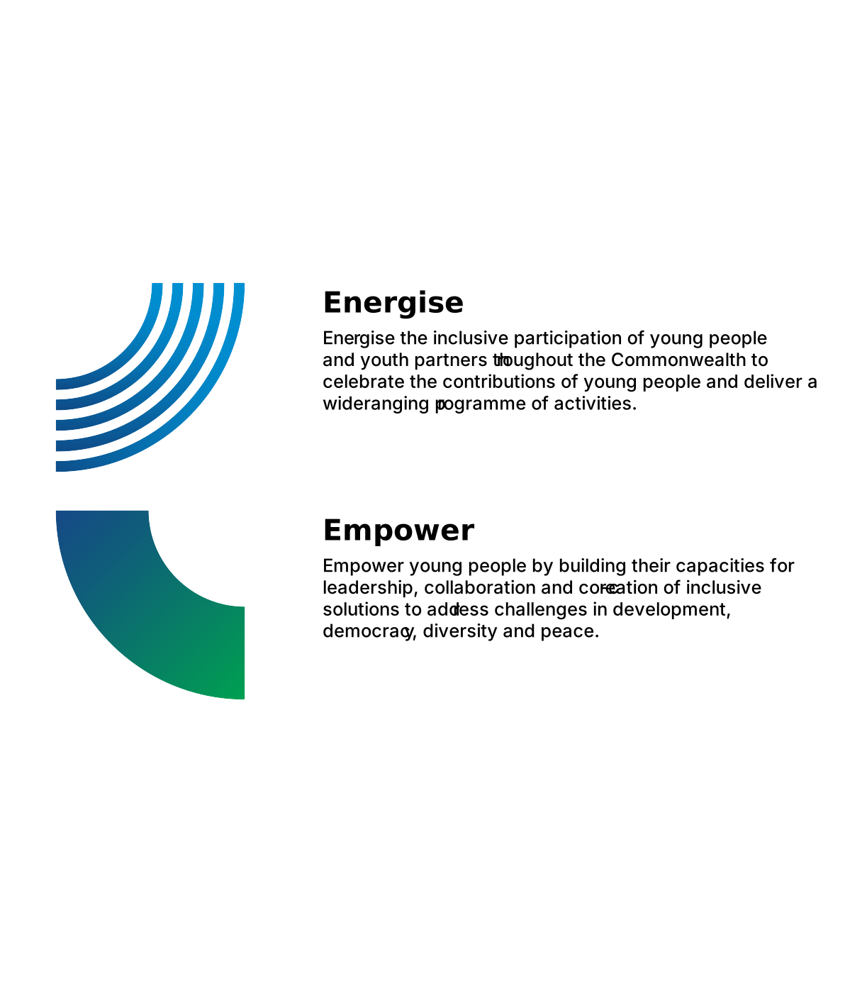
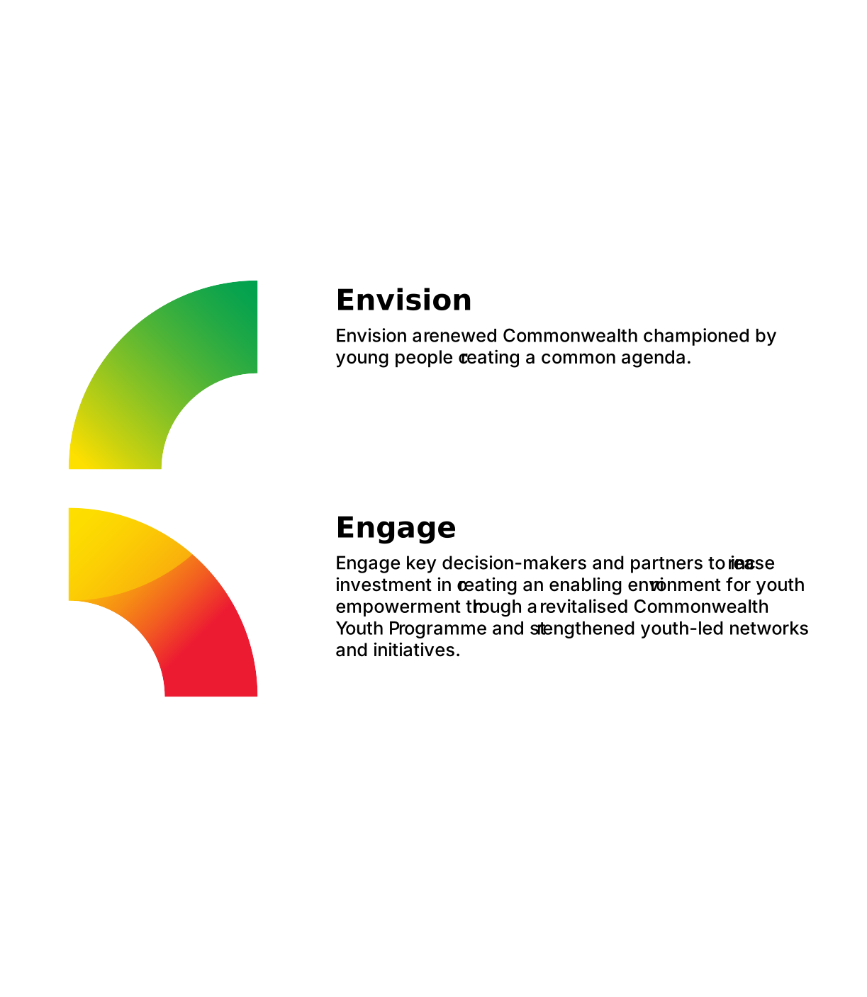
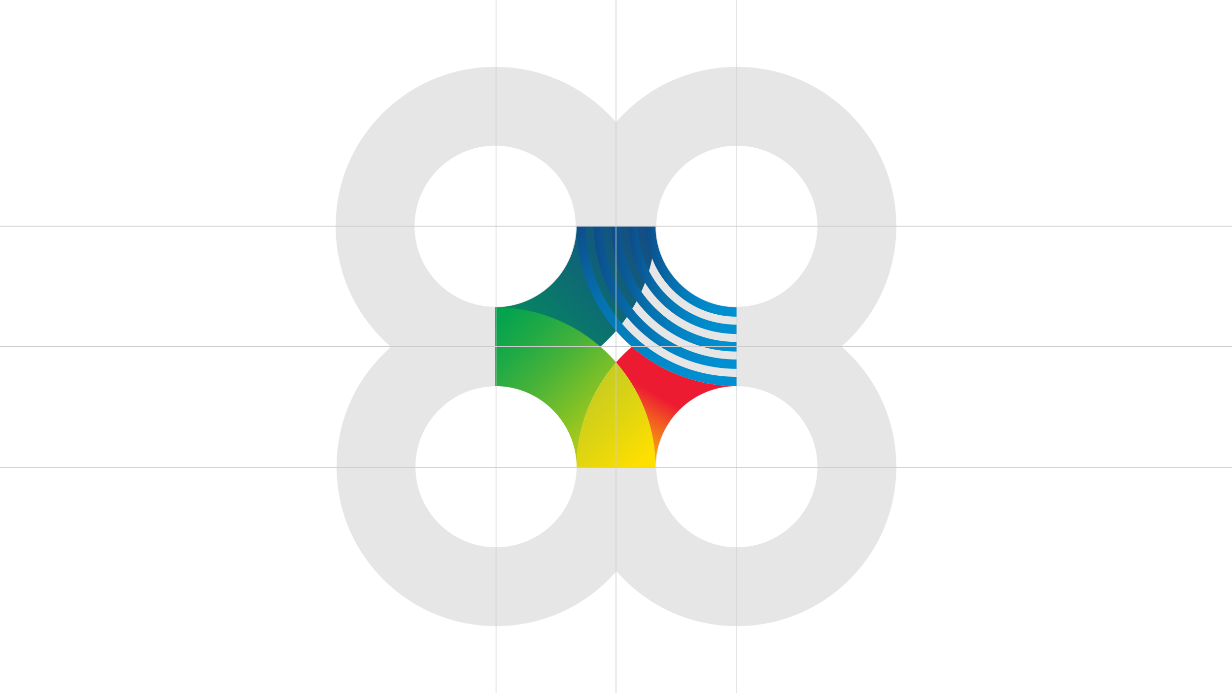
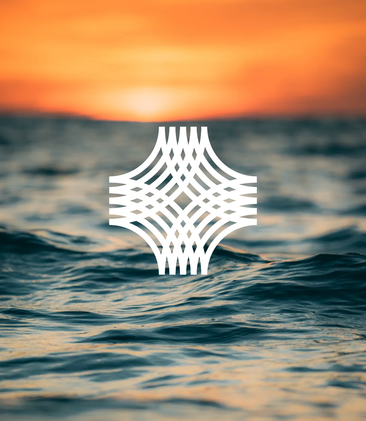
The wave and the weave. The wave is the Pacific Ocean, vast and present and connecting every nation in the network. The weave is the traditional practice found throughout the Pacific, the interlacing of different elements into something stronger than any of them separately. Both ideas are in the logo mark. Both ideas describe exactly what CAYE Pacific does and why it exists.
#E31E26
0%Crimson Red
#E31E26
Golden Yellow
#FEE000
The colours in the CAYE Pacific palette are not invented. They are drawn directly from the flags of the eleven member nations: the dark blues, greens, reds, and yellows that appear across the flags of Australia, New Zealand, Fiji, Samoa, Tonga, and the rest. Bringing those flag colours into a unified gradient system creates a palette that is simultaneously a statement of inclusivity and a visual map of the network itself.
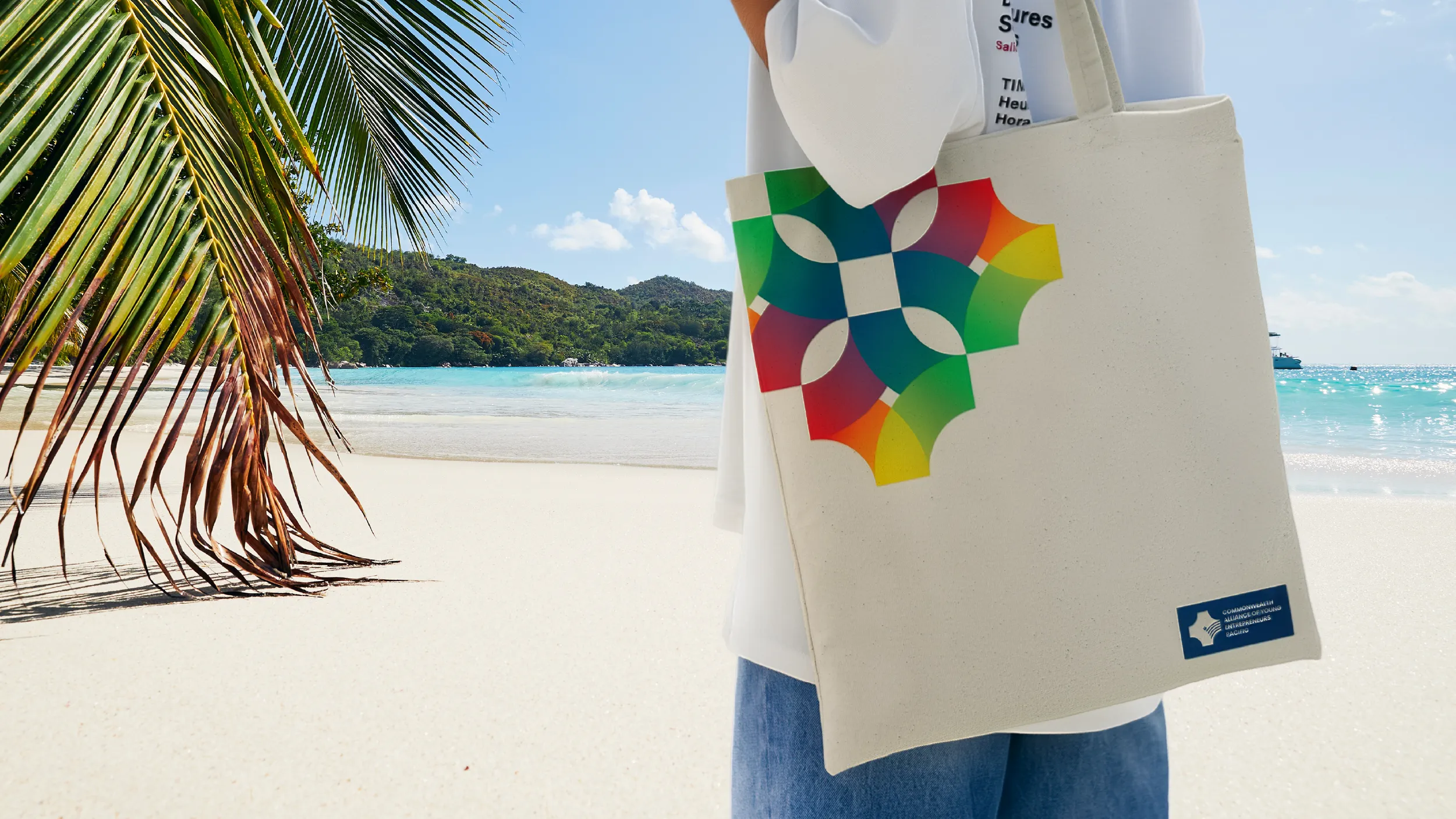
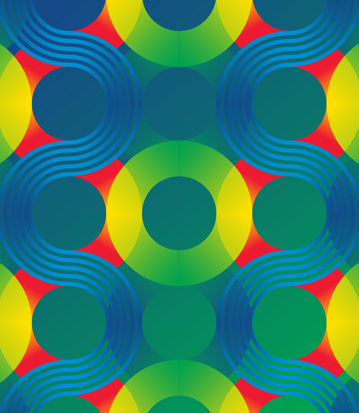



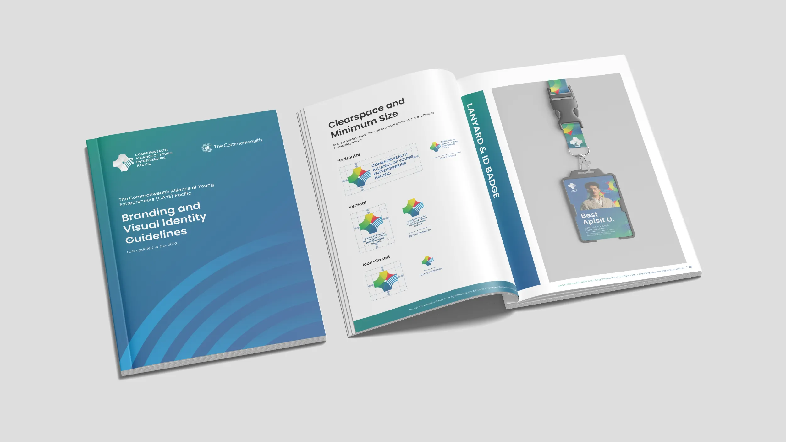

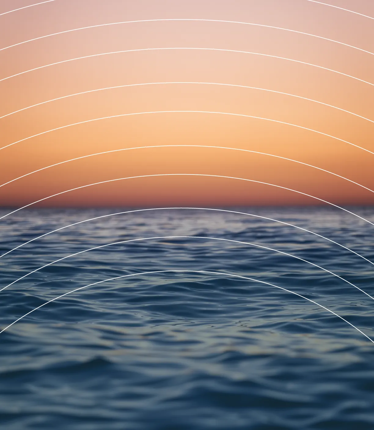
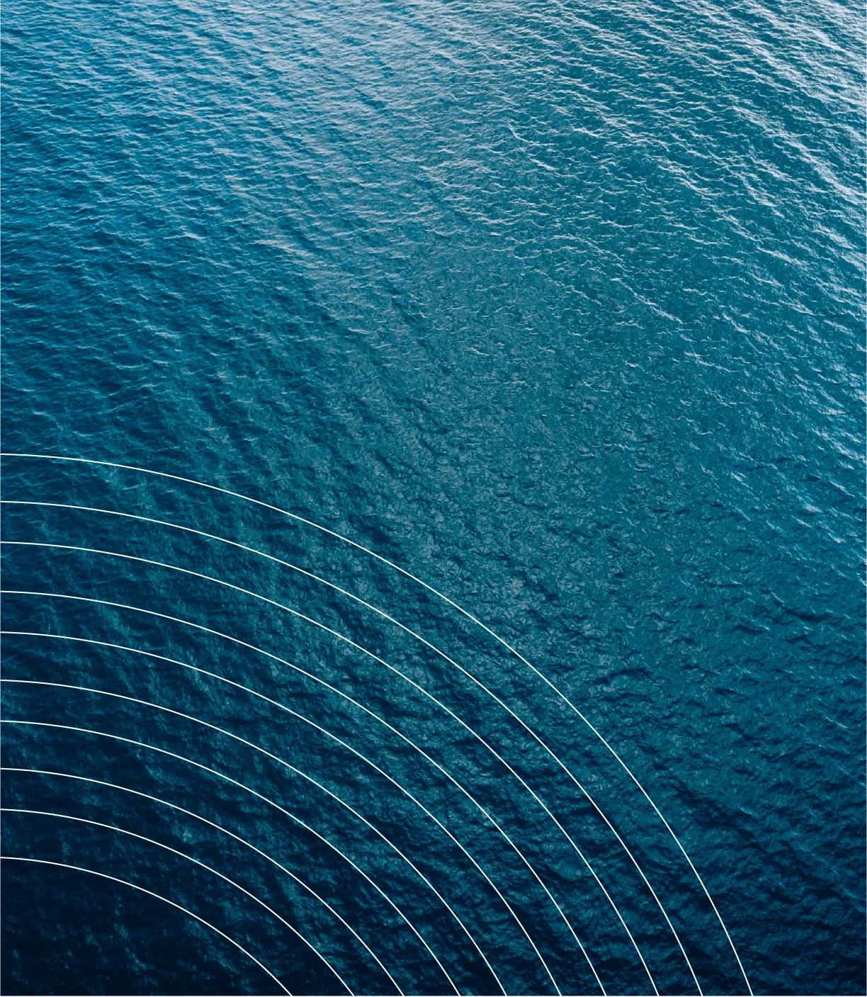
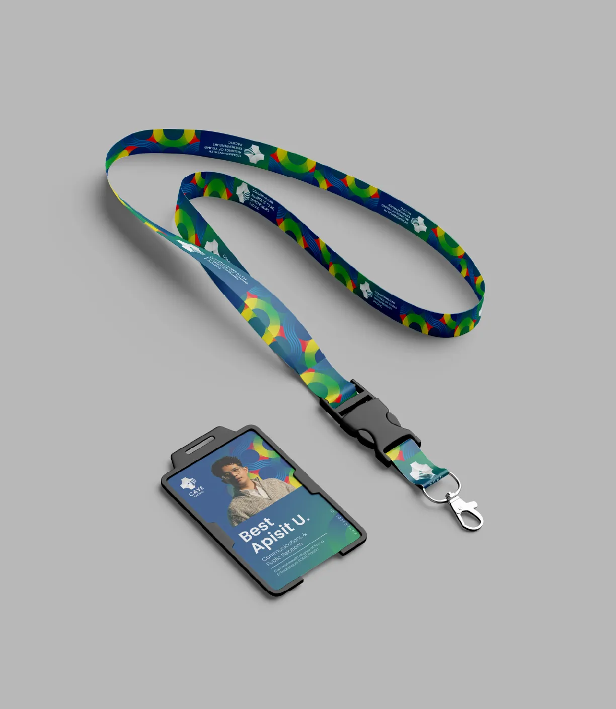
The graphic pattern system extends the visual identity beyond the logo into a rich library of wave and weave patterns inspired by Pacific textile and visual traditions. This gives the organisation the visual materials to create communications that feel genuinely Pacific at a cultural level, not just at the level of colour and symbol. Patterns named Woven Waves, Waveform, Unified Patterns, and Interwoven Threads each express a different aspect of the identity while maintaining coherence across the full system.
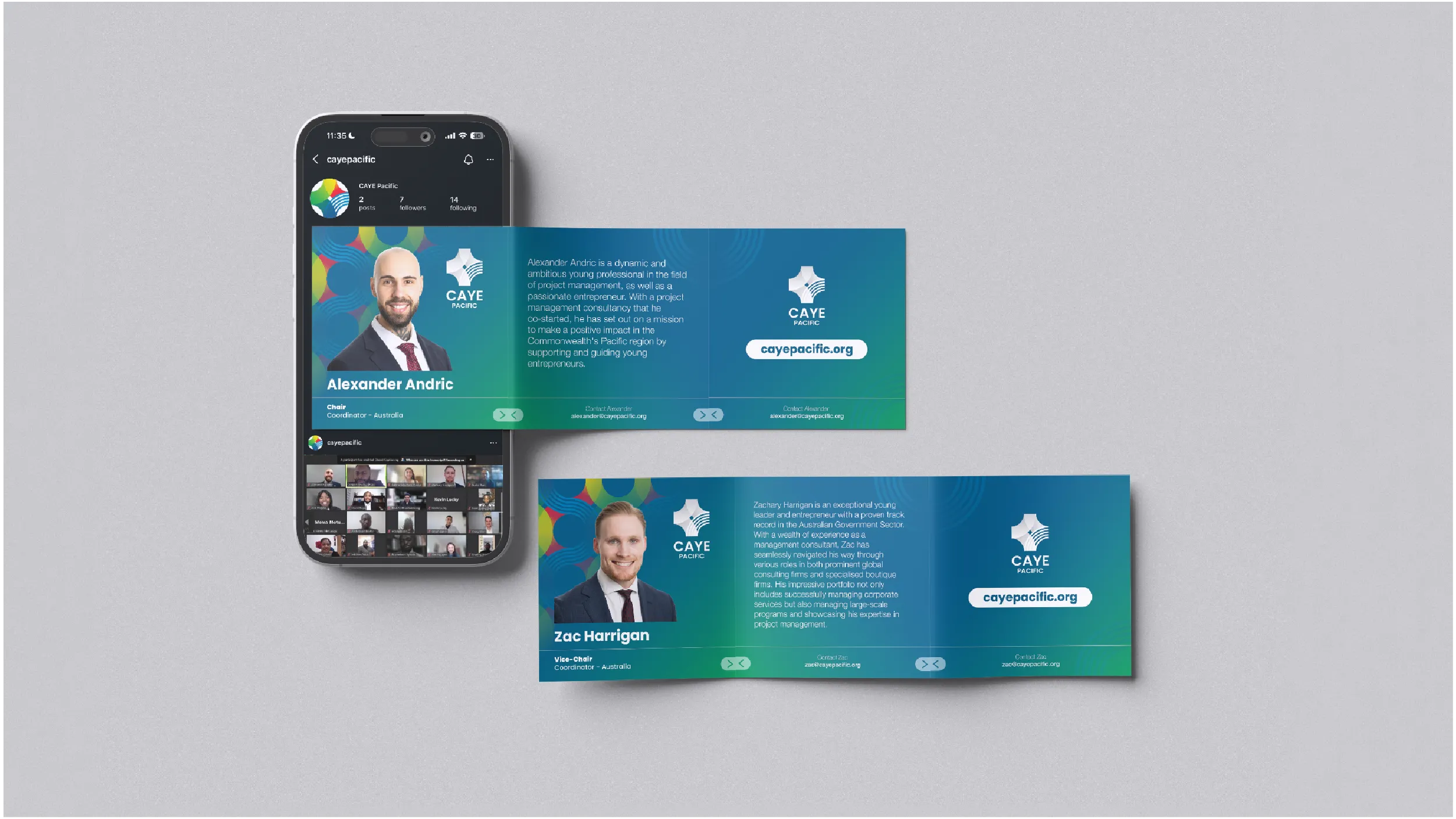
In August 2023, the Commonwealth Alliance of Young Entrepreneurs Pacific launched at an event held in collaboration with the Commonwealth Youth Programme, as part of the Commonwealth’s Year of Youth. The organisation was created to address a genuine structural gap: eleven Pacific Commonwealth member nations (Australia, New Zealand, Fiji, Papua New Guinea, Samoa, Solomon Islands, Tonga, Tuvalu, Kiribati, Vanuatu, and Nauru) lacked a dedicated regional network capable of representing young entrepreneurs at an international level. CAYE Pacific was built to be that network.
Best Apisit Uthakhamkong designed the complete brand identity, visual identity system, pattern library, and website for the organisation. He also serves on the CAYE Pacific Executive Committee as the New Zealand representative. The combination of design authorship and governance membership made this a uniquely complex engagement: the work had to be produced with the objectivity of a commissioned designer while being informed by an insider’s knowledge of the organisation’s culture, aspirations, and operational realities.
By Uthakhamkong’s own assessment, this was the most complex single brief he has worked with. A visual identity representing eleven nations is a problem without a simple solution. The identity could not favour any one nation over the others. It had to project the kind of credibility appropriate to engagement with Commonwealth institutions and government officials, while feeling authentically Pacific rather than generically international. And it had to be operationally usable by a volunteer executive committee working across multiple countries, time zones, and design capabilities.
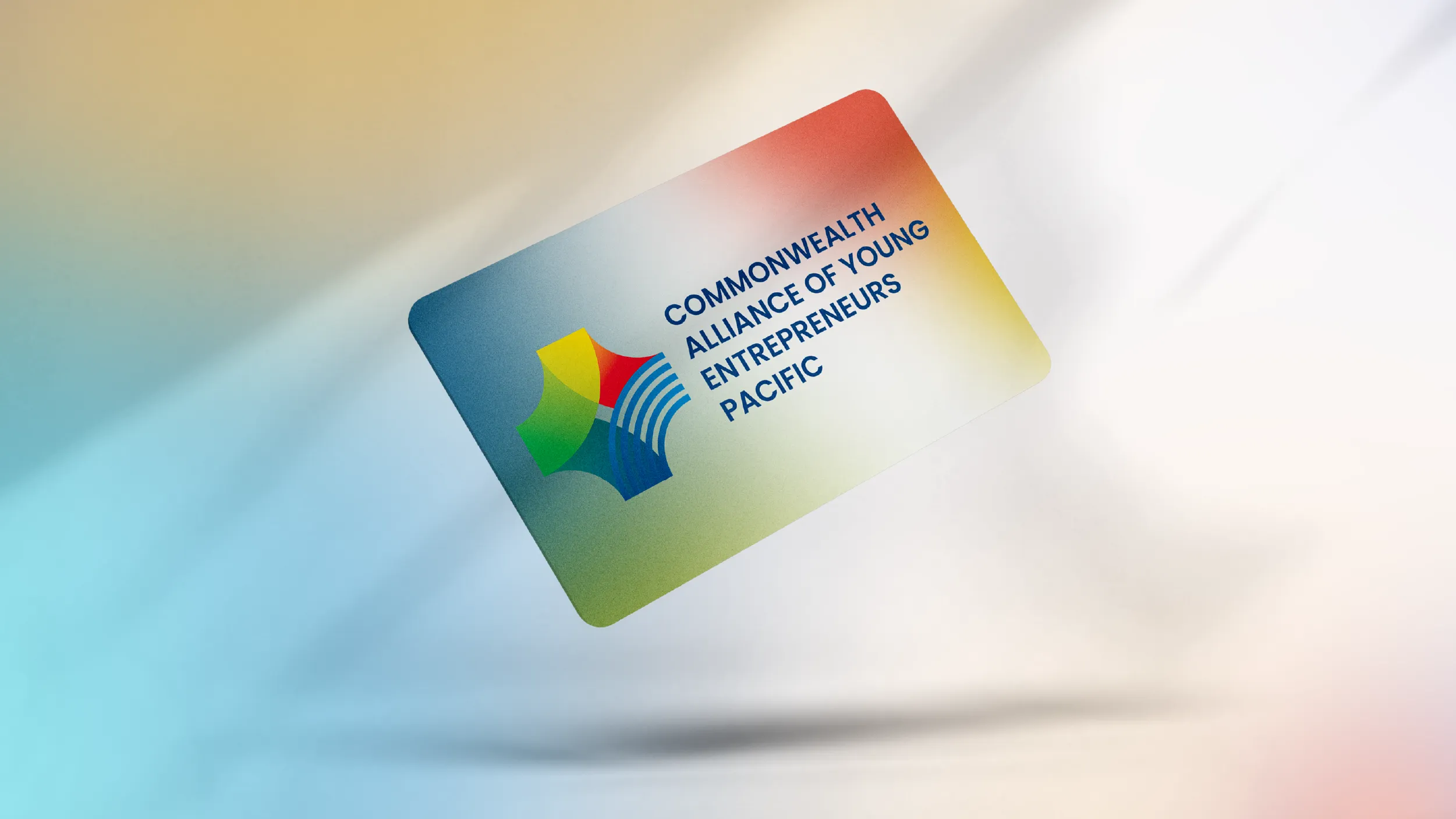
The logomark is constructed around two foundational visual ideas: wave and weave. The wave is the Pacific Ocean, the geographical reality that simultaneously separates and connects the eleven member nations. It is the most literal and most resonant symbol available for an organisation whose identity is defined by the space between its members as much as by the members themselves. The weave references the traditional craft practices found throughout the Pacific: the interlacing of distinct elements into a unified structure stronger than any of its parts individually. As a metaphor for what CAYE Pacific actually does, building a regional network from separate national communities, the weave is precise rather than decorative.
These two ideas are integrated with the star form, a symbol present in the flags of multiple Pacific member nations. The mark represents four directions of development, four nations arriving at a common centre, with the wave of the Pacific running through the structure. The geometry was worked out iteratively, ensuring that the mark reads clearly at the small sizes required for digital applications and at the large sizes required for event banners and printed materials.
The colour system was developed from a principle of direct reference. The colours used in the CAYE Pacific palette are not invented or selected for generic appeal. They are drawn from the actual flags of the eleven member nations: the dark blues, forest greens, crimons, and golden yellows that appear across the flags of Australia, New Zealand, Fiji, Samoa, Tonga, and the other members of the network.
Bringing these flag colours into a unified gradient system creates a palette that is simultaneously a statement of inclusivity and a visual map of the network itself. Every colour in the system belongs to a member nation. No colour was introduced from outside the community. The palette earns its coherence through this principle of representation rather than through aesthetic choice.
Four named graphic patterns were developed alongside the logo and palette: Woven Waves, Waveform, Unified Patterns, and Interwoven Threads. Each pattern is derived from the same wave-and-weave logic of the logomark, translated into repeating graphic forms that draw from Pacific textile and design traditions. The pattern library gives CAYE Pacific a rich visual resource for event banners, merchandise, print publications, and digital backgrounds, ensuring that communications at any scale feel culturally grounded rather than generically designed.
The website was built to serve as the organisation’s primary digital platform: an information hub, news and updates platform, and connection point for young entrepreneurs across the Pacific. It was designed with the operational constraints of a volunteer executive committee in mind: manageable by non-designers, clean on mobile connections across the Pacific, and credible enough to engage government officials, Commonwealth agencies, and international partners.
Uthakhamkong produced a brand system of genuine complexity for CAYE Pacific, solving a hard design problem with rigour, cultural sensitivity, and a clarity of visual language that the organisation can sustain and build on. It is work that required not only design skill but the kind of contextual knowledge that comes from sitting inside the organisation it serves.
Client
Commonwealth Alliance of Young Entrepreneurs (CAYE) Pacific
Sector
Non-profits
Civic and Public
Education
Disciplines
Brand Identity
Visual Identity
Website Design