DIRI NZ & Australia
Brand identity and website for an ancient manuscript research institute partnering with the University of Otago and the University of Oxford.
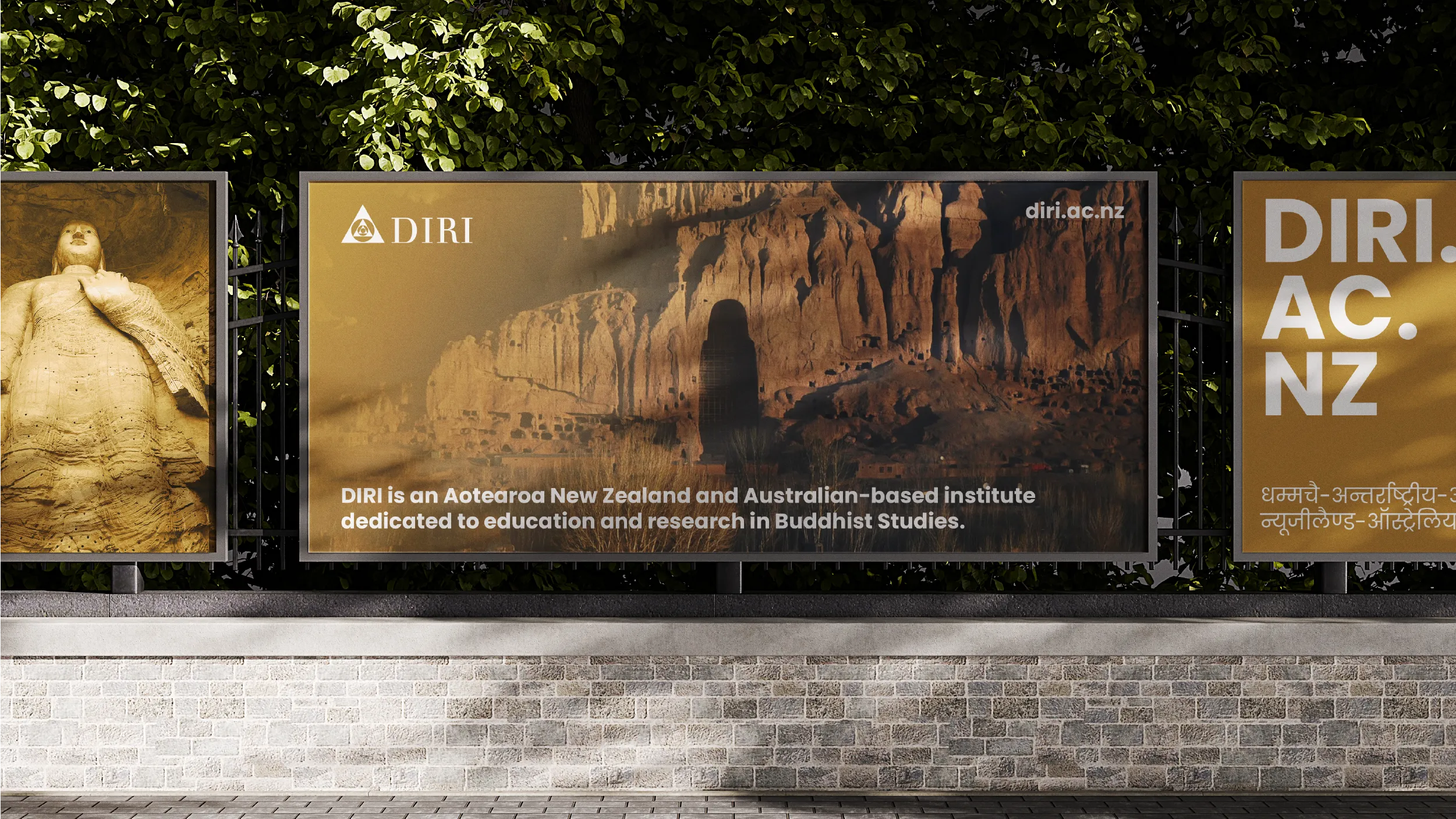
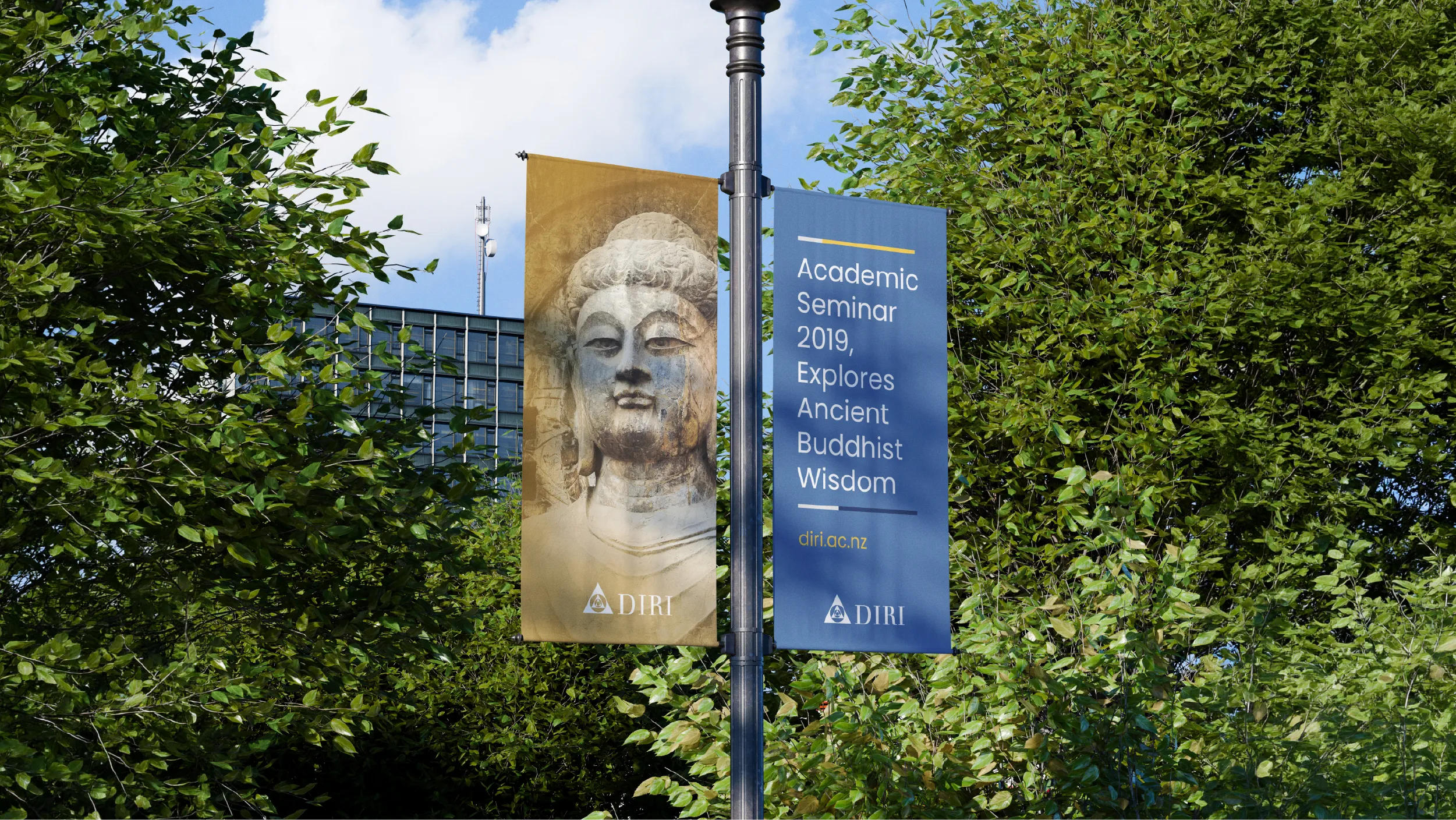
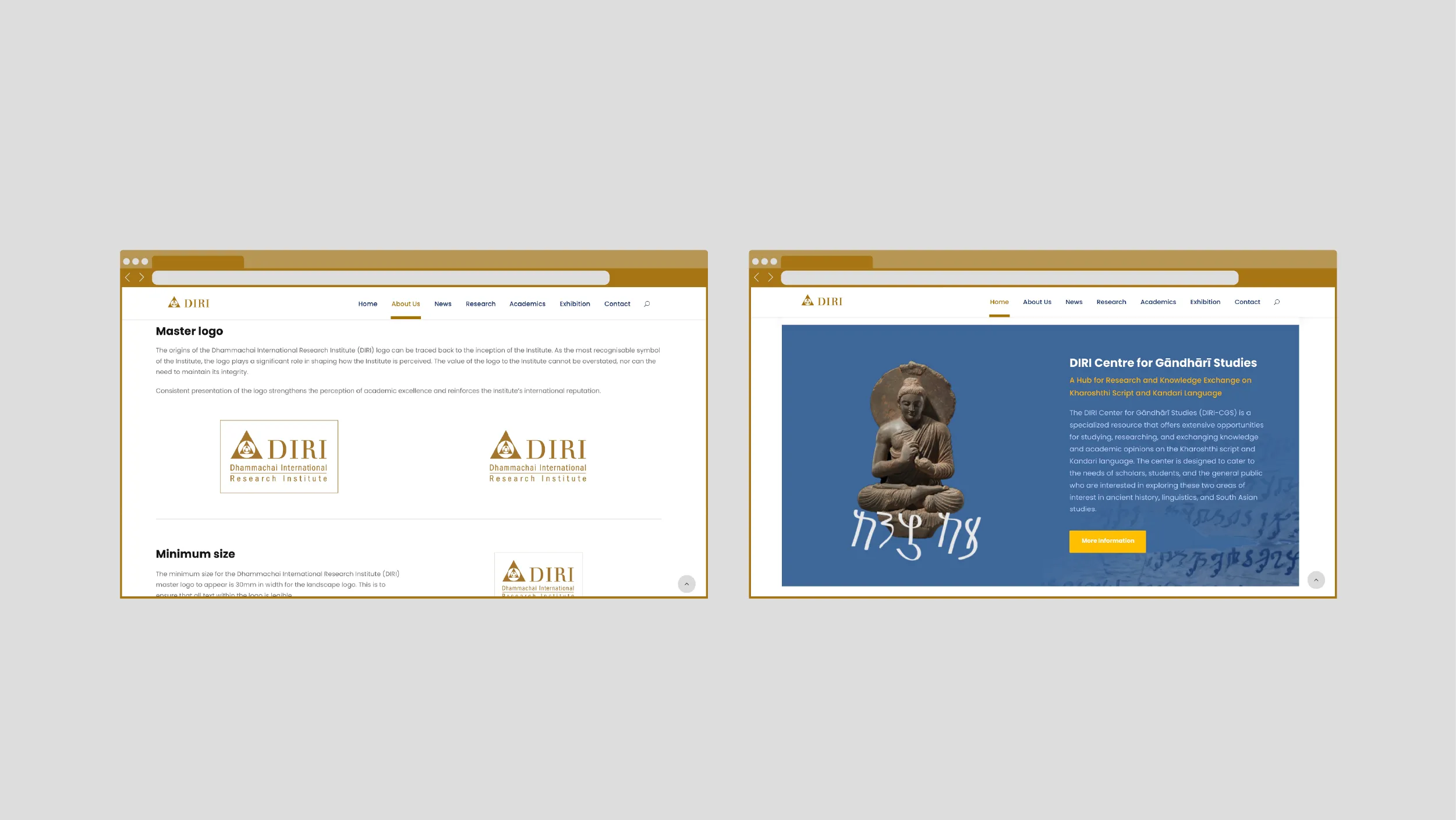
The Dhammachai International Research Institute (DIRI) of New Zealand and Australia, located in Dunedin, specialises in the academic study of Buddhism, ancient manuscripts, and mindfulness meditation. POV developed the complete brand identity and website for the institute, building a visual system directly grounded in the material history of the scholarship it undertakes.


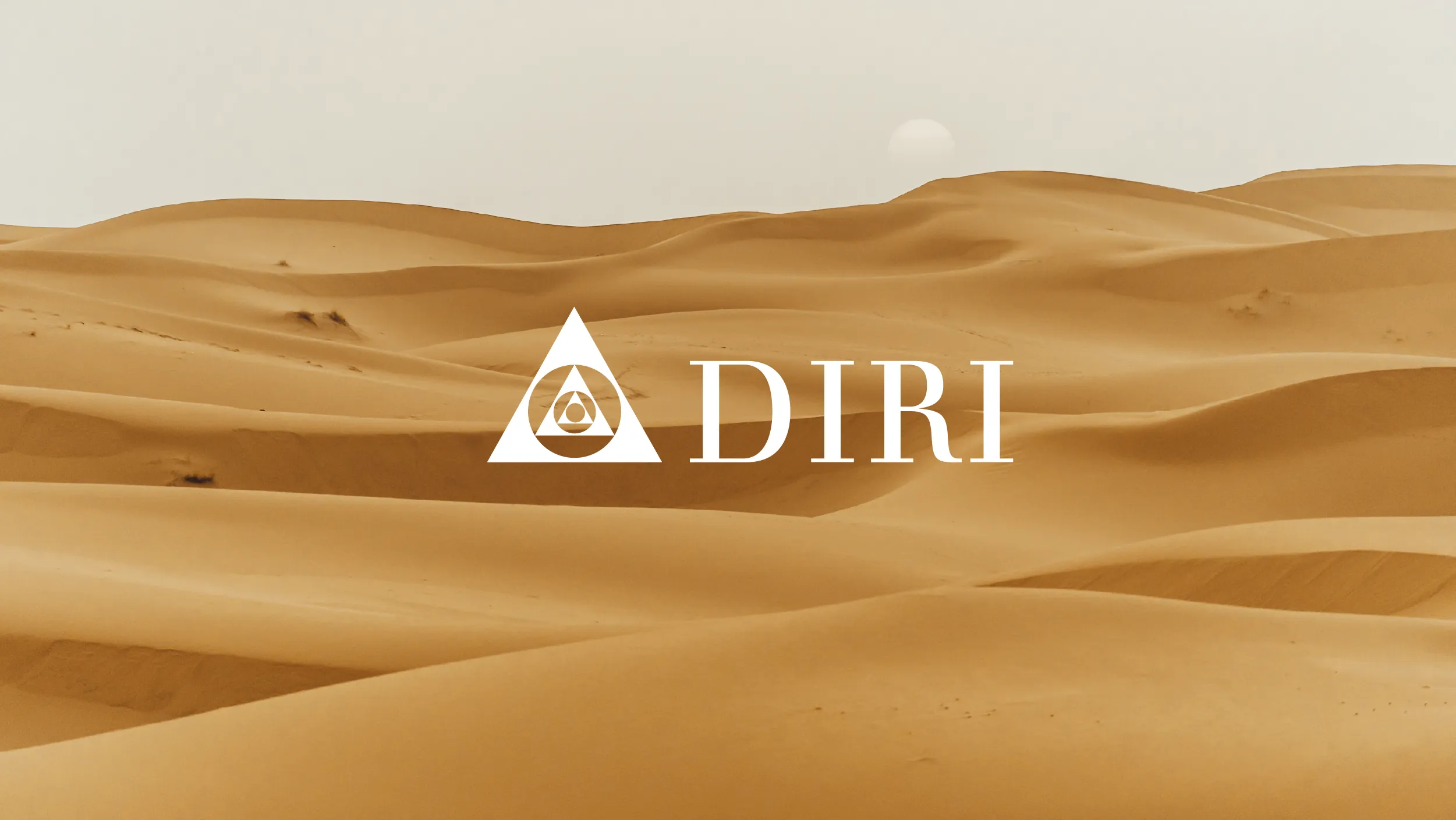
The primary brand colour, Ancient Gold, was not selected from a palette library. It was drawn from the desert sands of Central Asia where many of the ancient Buddhist manuscripts the institute studies were discovered, preserved in sealed clay vessels for more than two thousand years. That colour carries a specific and irreplaceable history. When it appears in the institute's communications, it connects everything DIRI does to the physical origin of the knowledge it is devoted to studying.

#1E3056
0%Denim Blue
#1E3056
Yale Blue
#466796
Academic institutions face a particular visual communication challenge: they need to be credible to specialists while remaining accessible to a broader public audience. The DIRI brand navigates this by using a visual language that is unambiguously scholarly in its seriousness and warmth, refusing the cold institutional aesthetic that many academic organisations default to. The result is a brand that welcomes the general public without condescending to the academic community.


The website was designed with two audiences in its architecture simultaneously: the international scholarly community engaging with DIRI's research outputs, and the Dunedin public interested in Buddhism, meditation, and the history of ancient manuscripts. These are very different readers with very different needs, and the site serves both without forcing either to navigate through the other's content first.

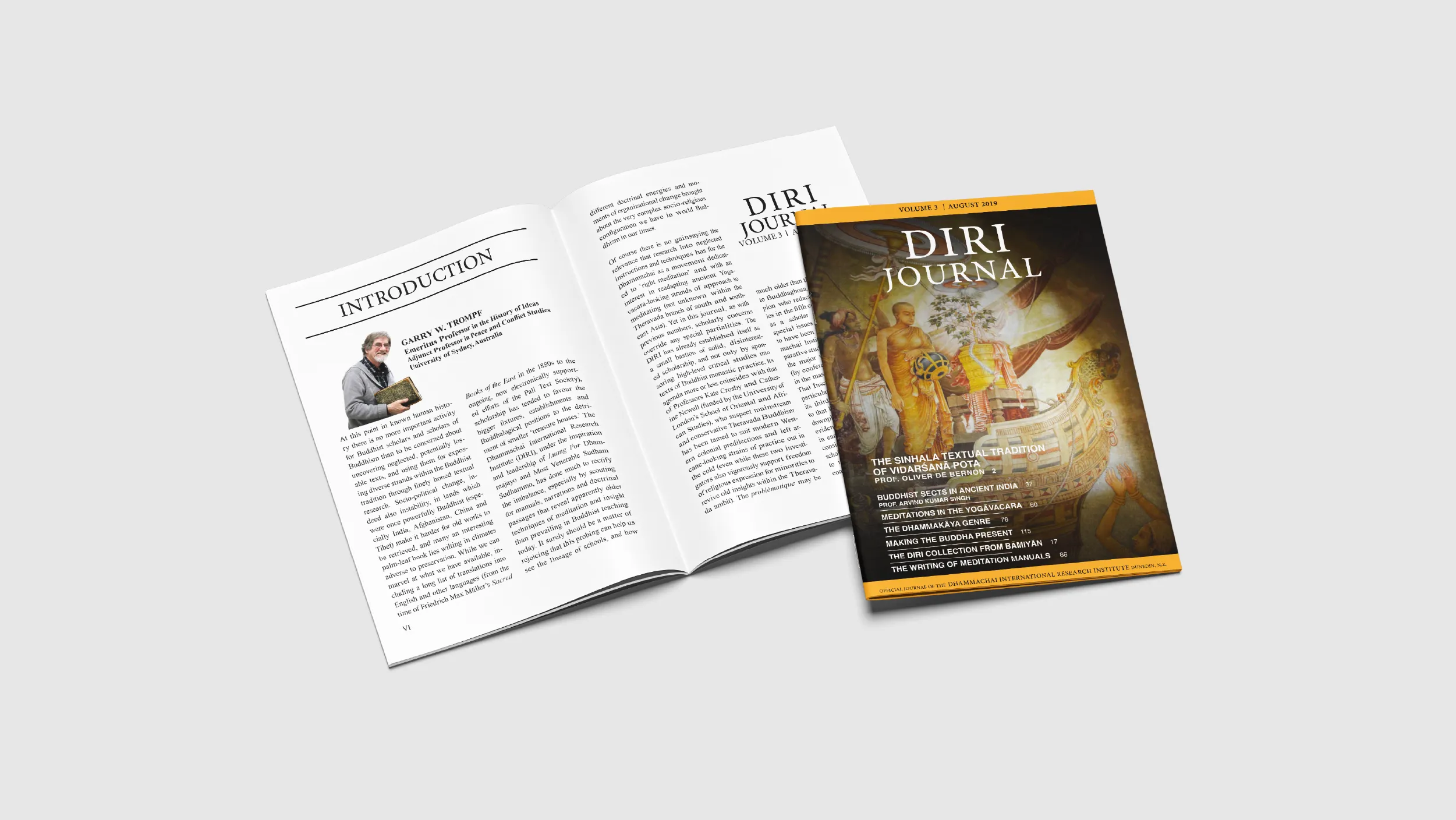
The Dhammachai International Research Institute (DIRI) of New Zealand and Australia is a specialist academic institution based on George Street in Dunedin. The institute’s primary focus is the Tipitaka, the canonical collection of ancient Buddhist texts, including the preservation, study, and scholarly analysis of manuscript traditions that represent some of the oldest written records of Buddhist teaching in existence. DIRI operates across two countries, New Zealand and Australia, and maintains connections with the international network of Buddhist manuscript scholars. Its work is genuinely significant in the field, and its brand identity needed to reflect that significance.
The creative challenge POV was given was to develop a visual identity for an institution that operates at the intersection of ancient scholarly tradition and contemporary academic practice. The identity needed to communicate serious intellectual credibility to the international scholarly community, warmth and accessibility to the Dunedin public and general Buddhist community, and the particular quality of an organisation whose work is simultaneously historical, cultural, and spiritually significant.
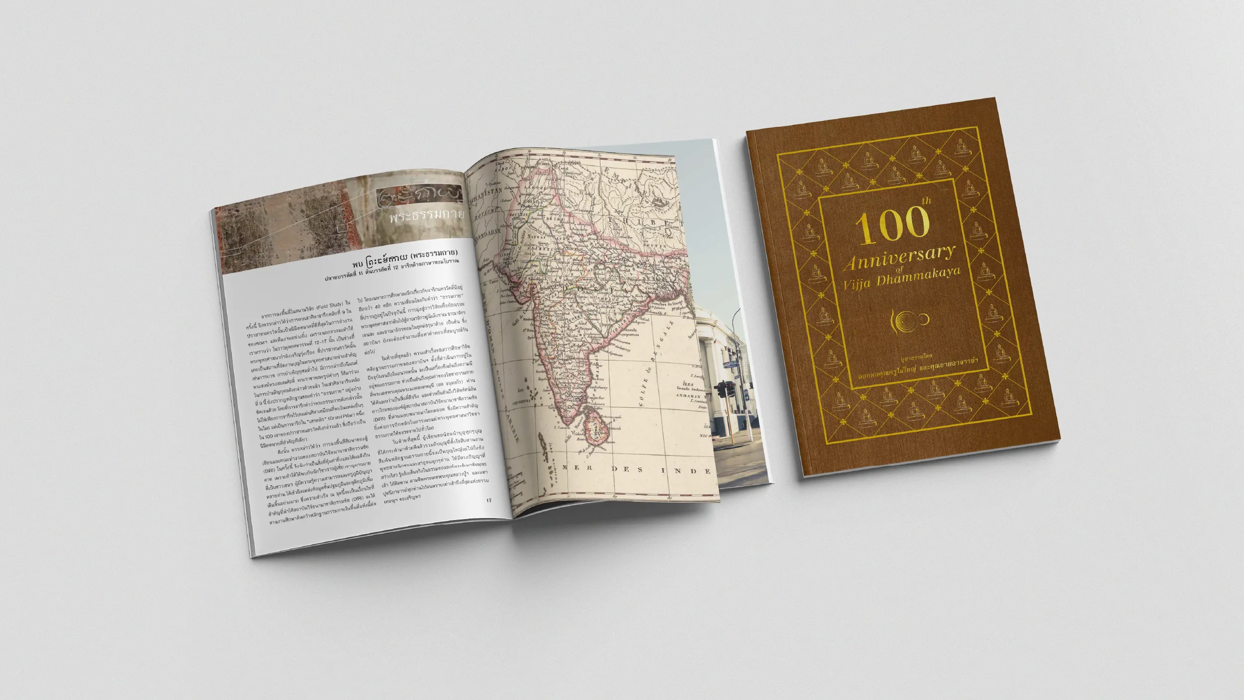
POV began the brand development process with research into the material and geographic context of DIRI’s scholarship. The ancient Buddhist manuscripts the institute studies were discovered in the arid landscapes of Central Asia, preserved in conditions created by the extreme dryness of desert environments that prevented the natural decay that would otherwise have destroyed them over centuries. Those landscapes, the sand colours of the Taklamakan Desert, the ochre and gold of Central Asian geology, became the direct source for the institute’s primary colour.
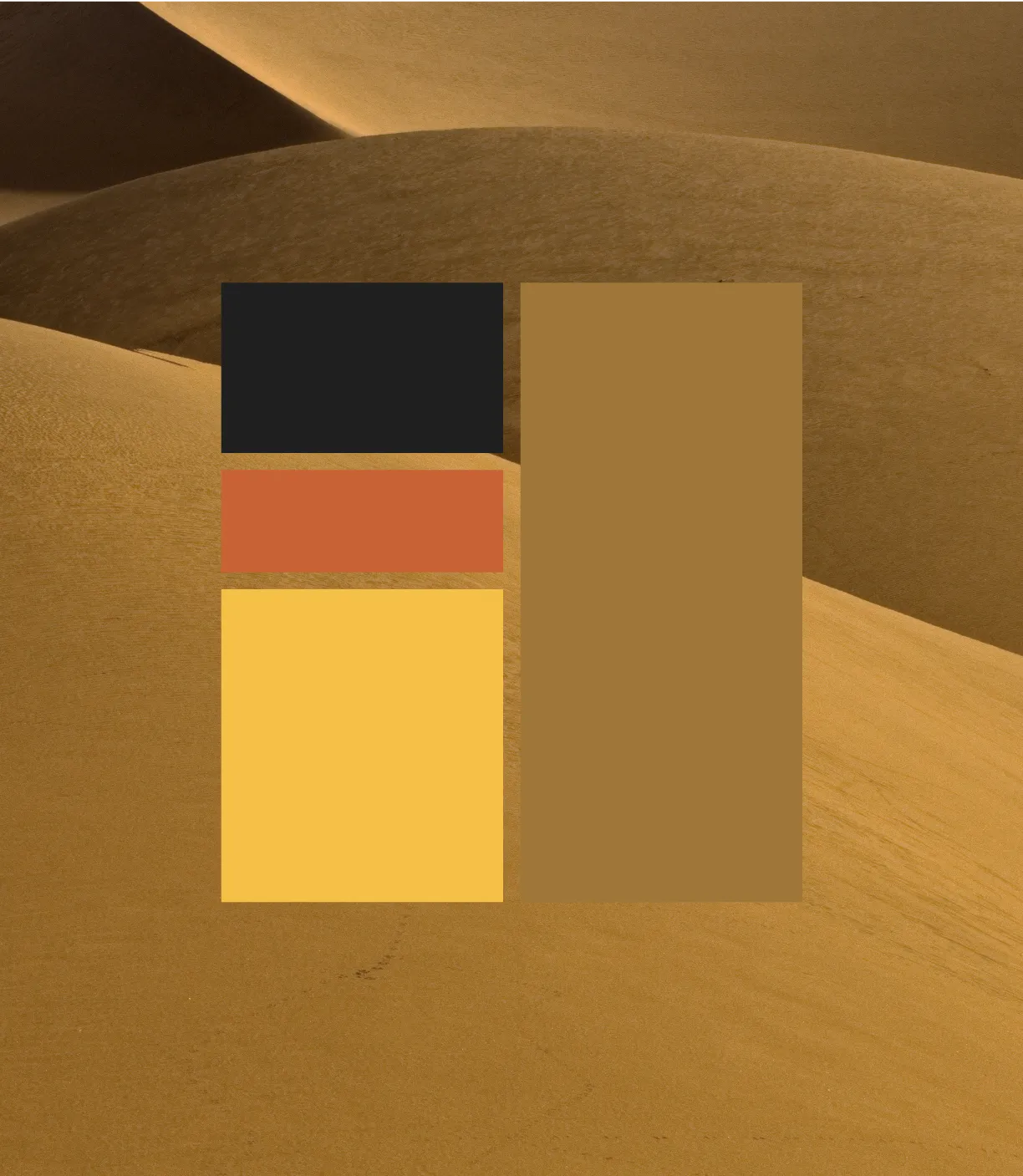
Ancient Gold (Hex #9E7739) is named for the material from which it is drawn. It is a warm, deep ochre that carries the visual weight of its historical reference without being decorative or superficial. This is a colour grounded in actual geography and actual history, and when it appears in DIRI’s communications, it connects the institution’s contemporary academic practice to the physical world in which the knowledge it studies was first recorded and first preserved.
Denim Blue (Hex #1E3056) provides the primary supporting tone, a deep, serious blue that anchors the palette with the scholarly authority the institution requires. Together, Ancient Gold and Denim Blue create a colour relationship that is both historically grounded and visually distinctive within the academic sector. Off White (Hex #E6E6E6) provides the third primary palette colour, giving layouts the breathing room they need without introducing the clinical coldness that pure white can produce in this context.
The secondary palette extends the system with Golden Yellow (Hex #F5C045), providing a lighter, more accessible accent tone for communications that need additional warmth. Yale Blue (Hex #466796) offers a mid-range blue that bridges the deep Denim Blue and the warmer golden tones. Standard black (Hex #000000), Dark Grey (Hex #202020), and white complete the system, giving the brand the full range of values needed for complex academic publication design and digital layout.
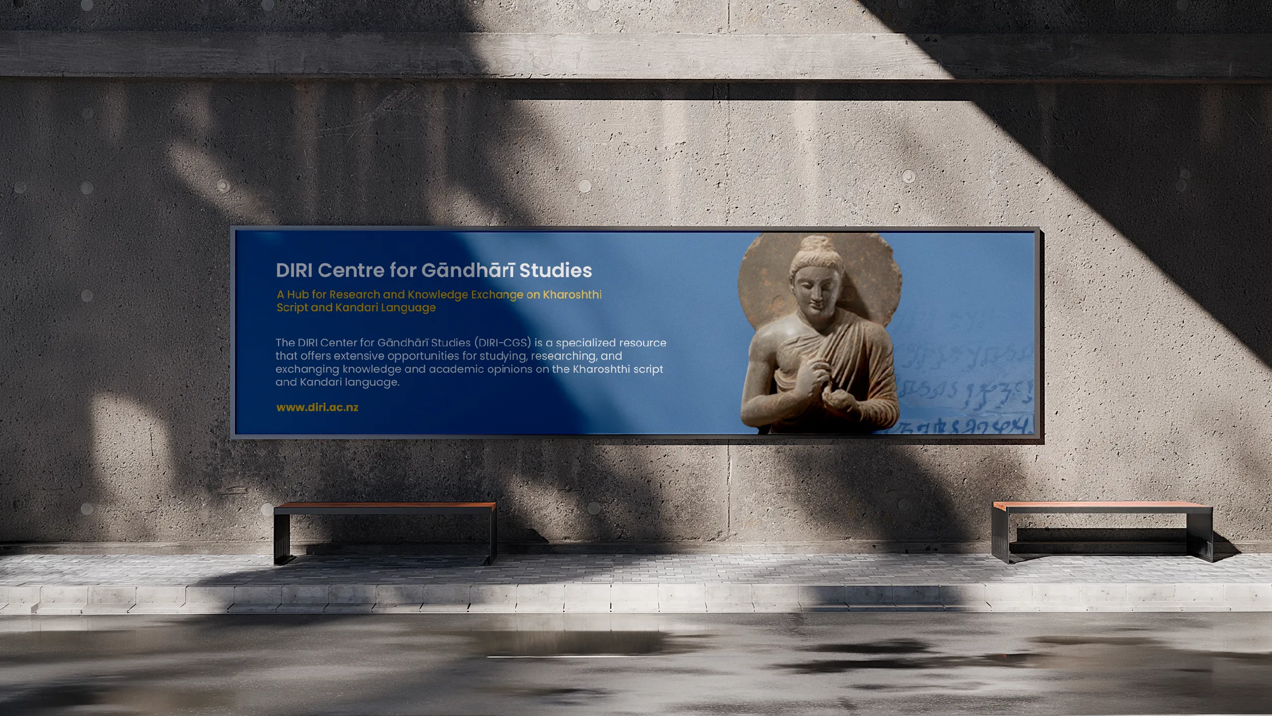
The website POV designed and built for DIRI at diri.ac.nz serves a genuinely dual audience. The information architecture was developed to serve both the academic community seeking access to research outputs and publications, and the general public interested in Buddhism, meditation, and manuscript history. These audiences have different needs and different entry points, and the site architecture was designed to serve both without confusion. The visual design throughout the site maintains the brand palette, creating a digital environment that is consistent with the institution’s broader visual identity and appropriate to its scholarly context.
Client
DIRI NZ & Australia
Sector
Education
Research
Non-profits
Disciplines
Brand Strategy
Logo Design
Visual Identity
Colour System
Brand Style Guide
Website Design
WordPress Development