Vowly is an authentic and professional wedding photography and film studio working across Queenstown, Wanaka, Christchurch, Dunedin, and other locations throughout New Zealand. The studio has built its reputation on a single guiding value: honesty. Honest light. Honest moments. Honest storytelling. That commitment to authenticity is both a creative philosophy and a service promise, and the brand identity POV developed needed to carry both dimensions with equal conviction.
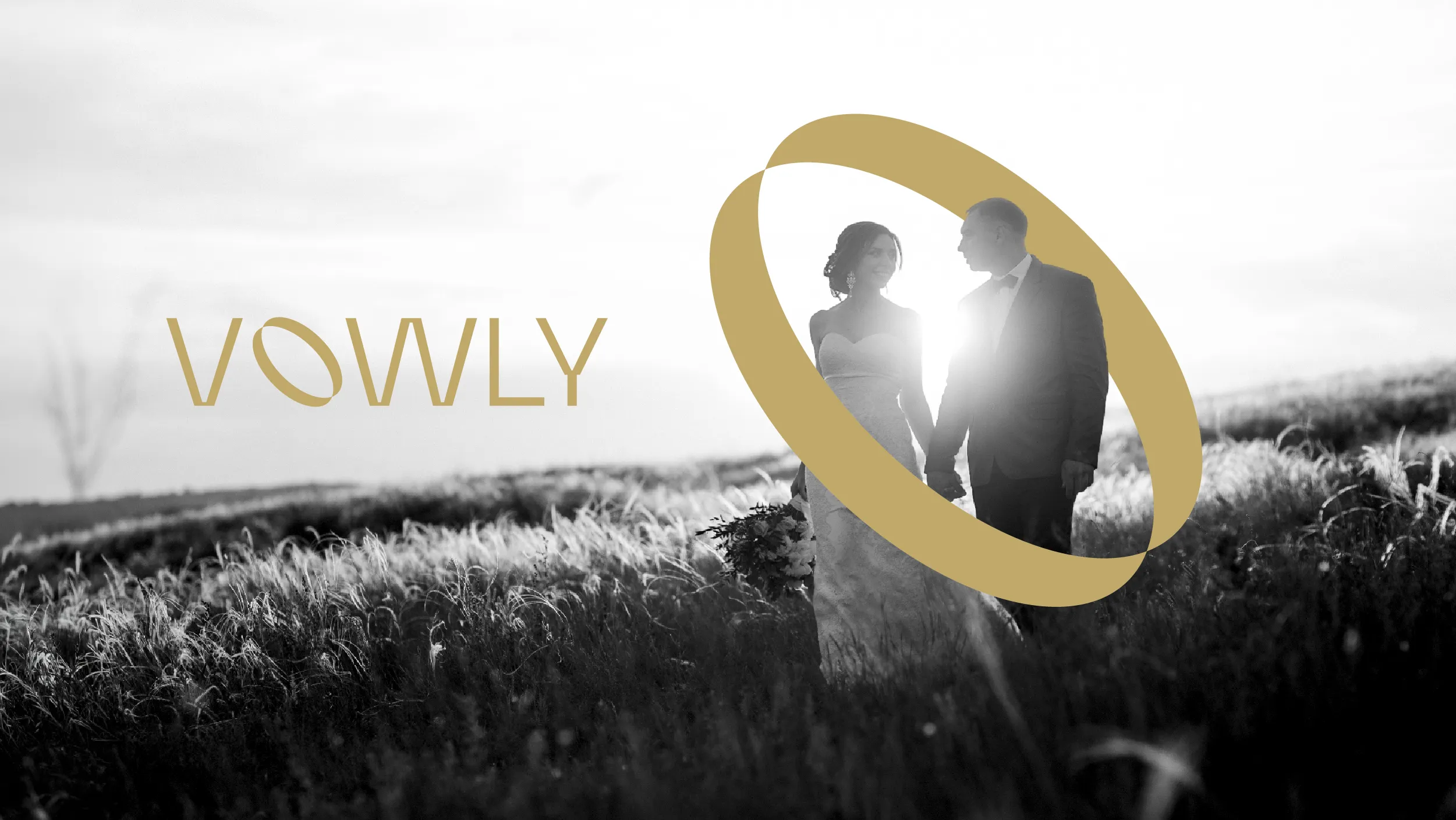
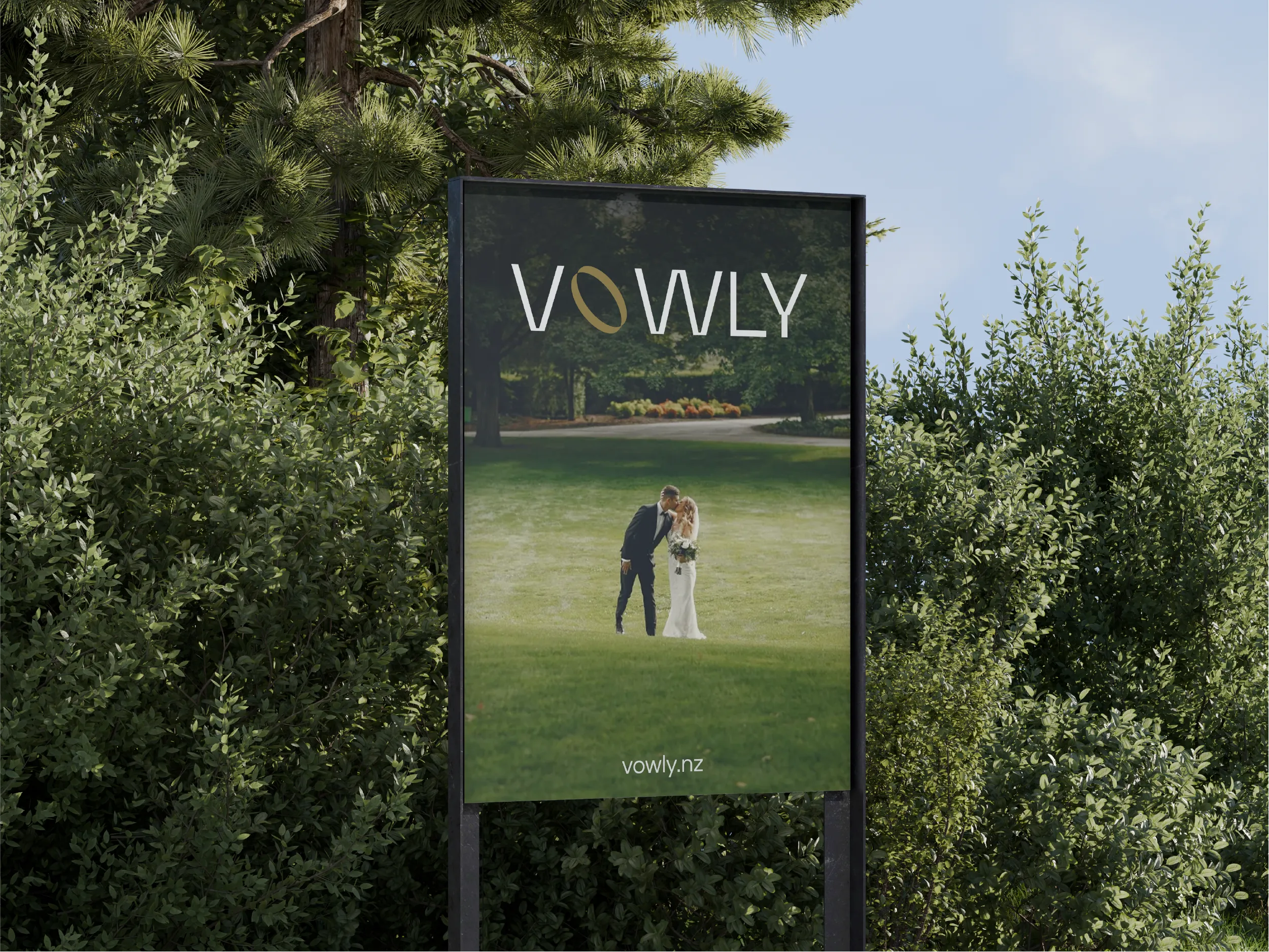
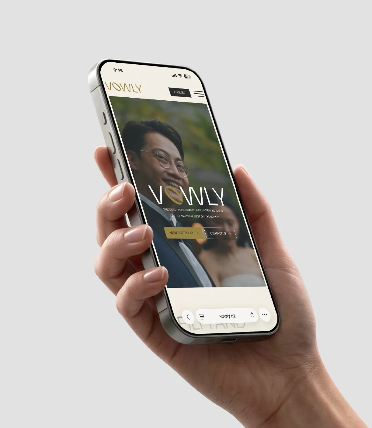
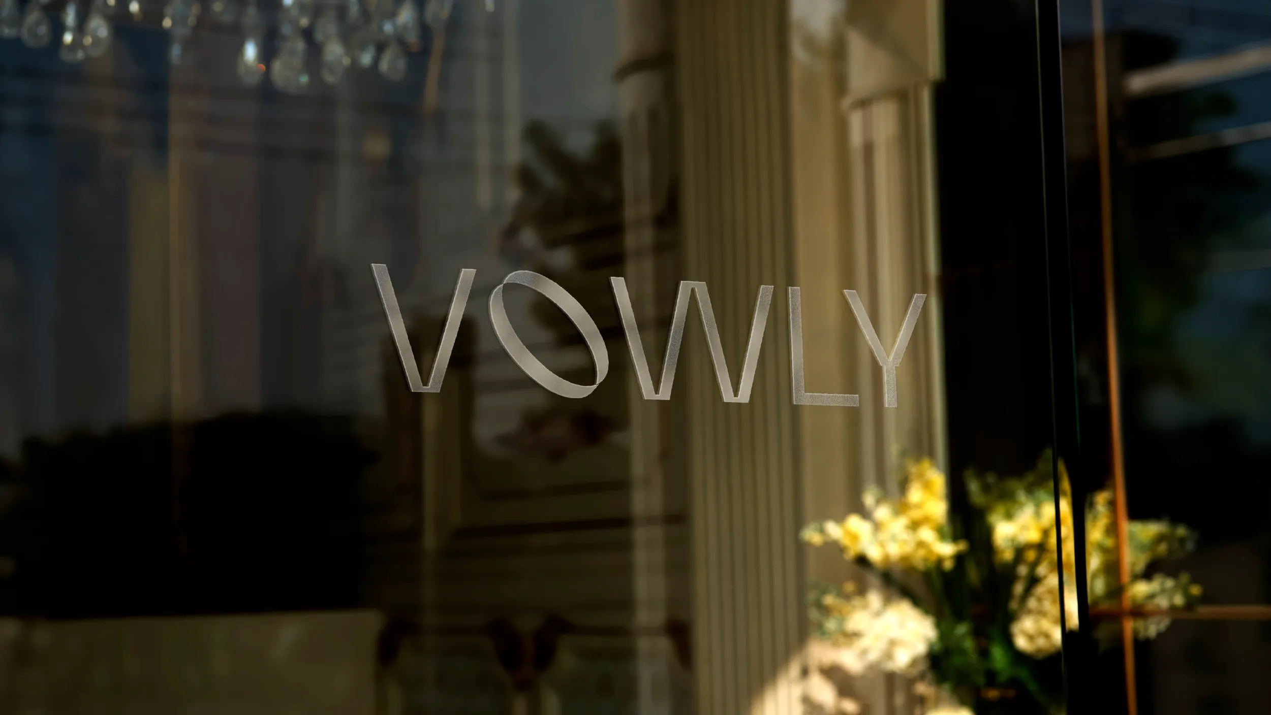
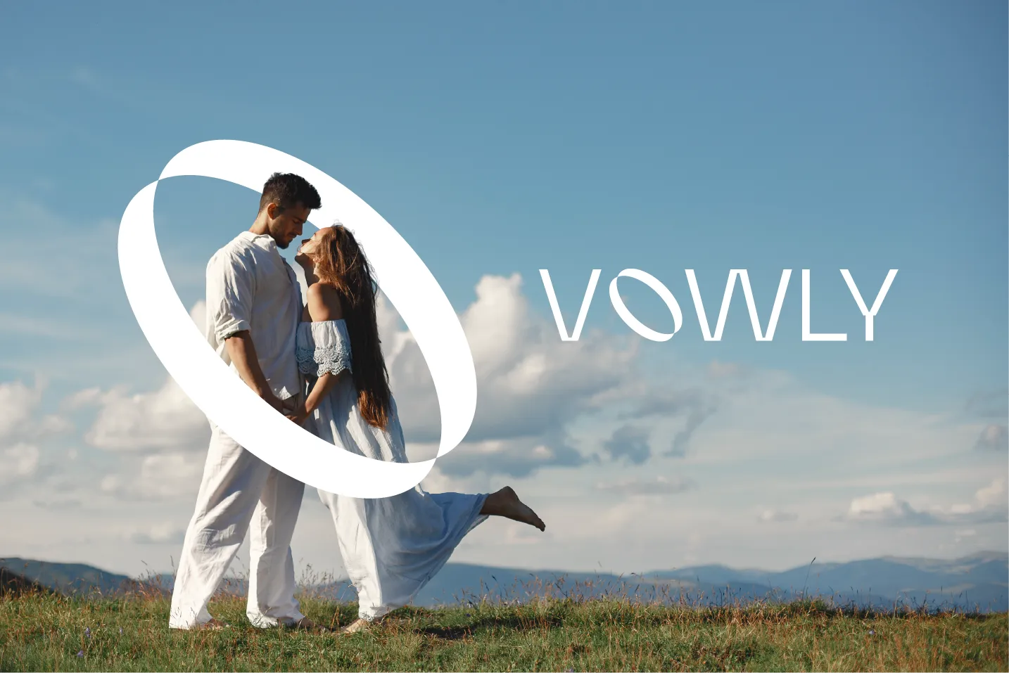
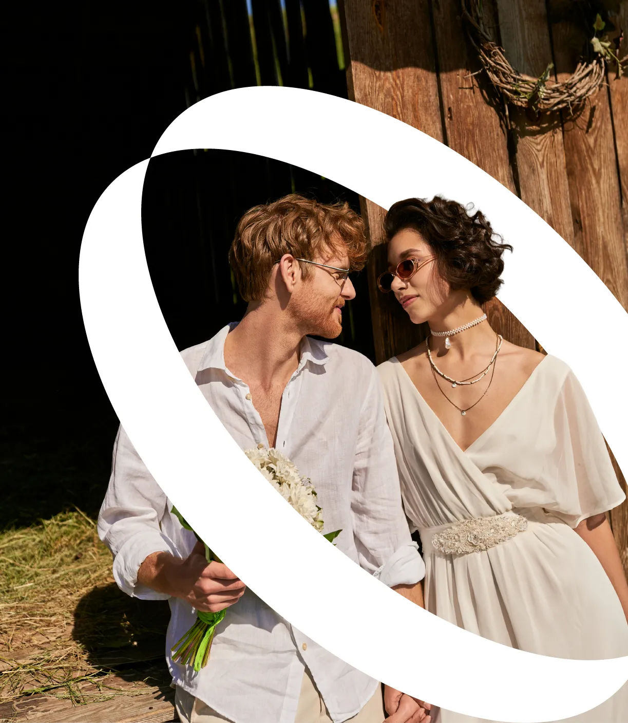
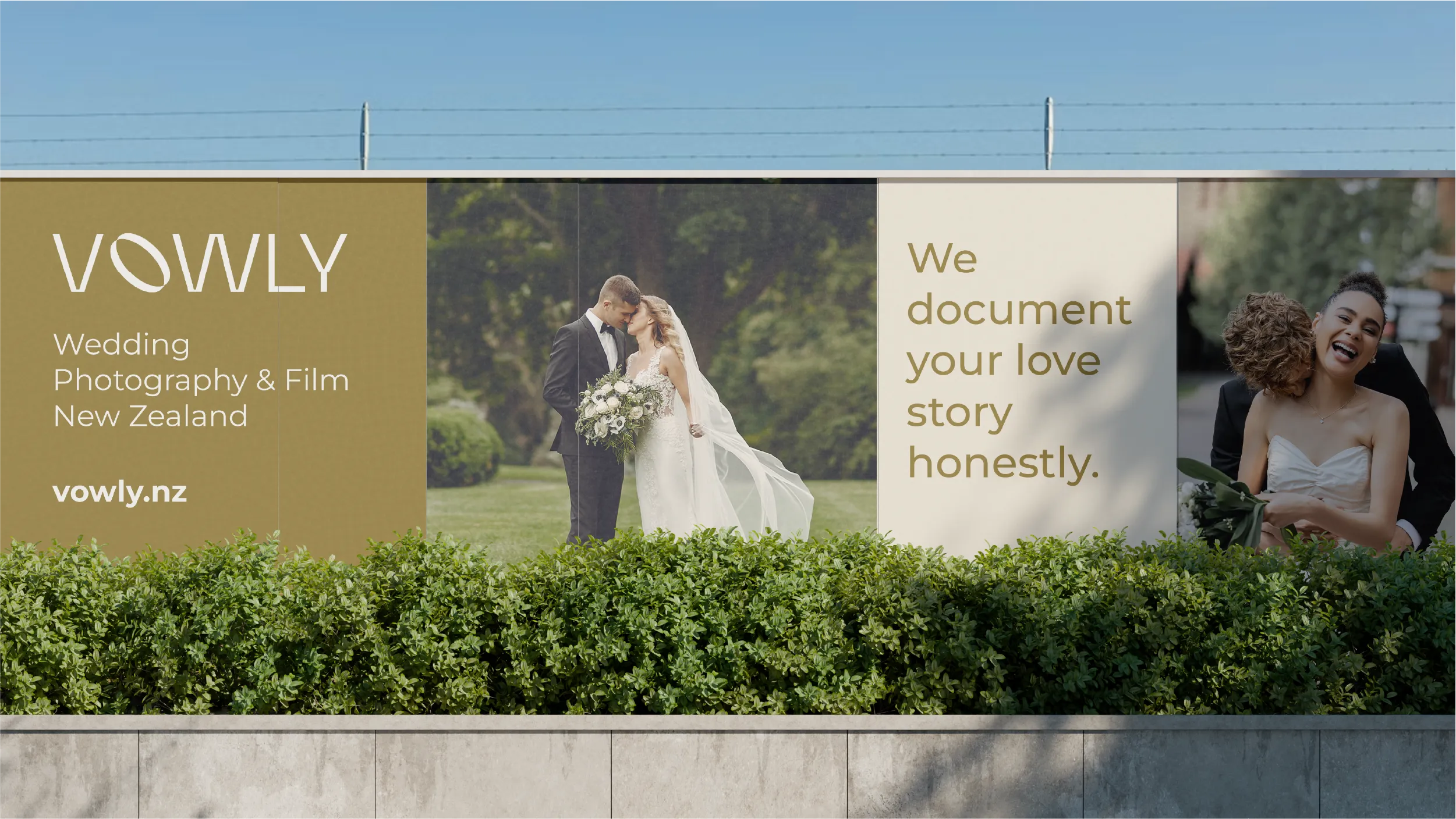
The starting point for the brand concept was the studio’s name. Vowly carries the word vow, which carries the ring, which carries the ceremony at the heart of every wedding. The ring as a visual element is the most symbolically resonant form available in the wedding industry, but it has been used across the sector so often and so generically that deploying it without distinction risks producing something forgettable. POV’s creative challenge was to derive the logo mark from the ring form in a way that was clearly intentional, precisely made, and specific to Vowly rather than to the broader category it operates in.
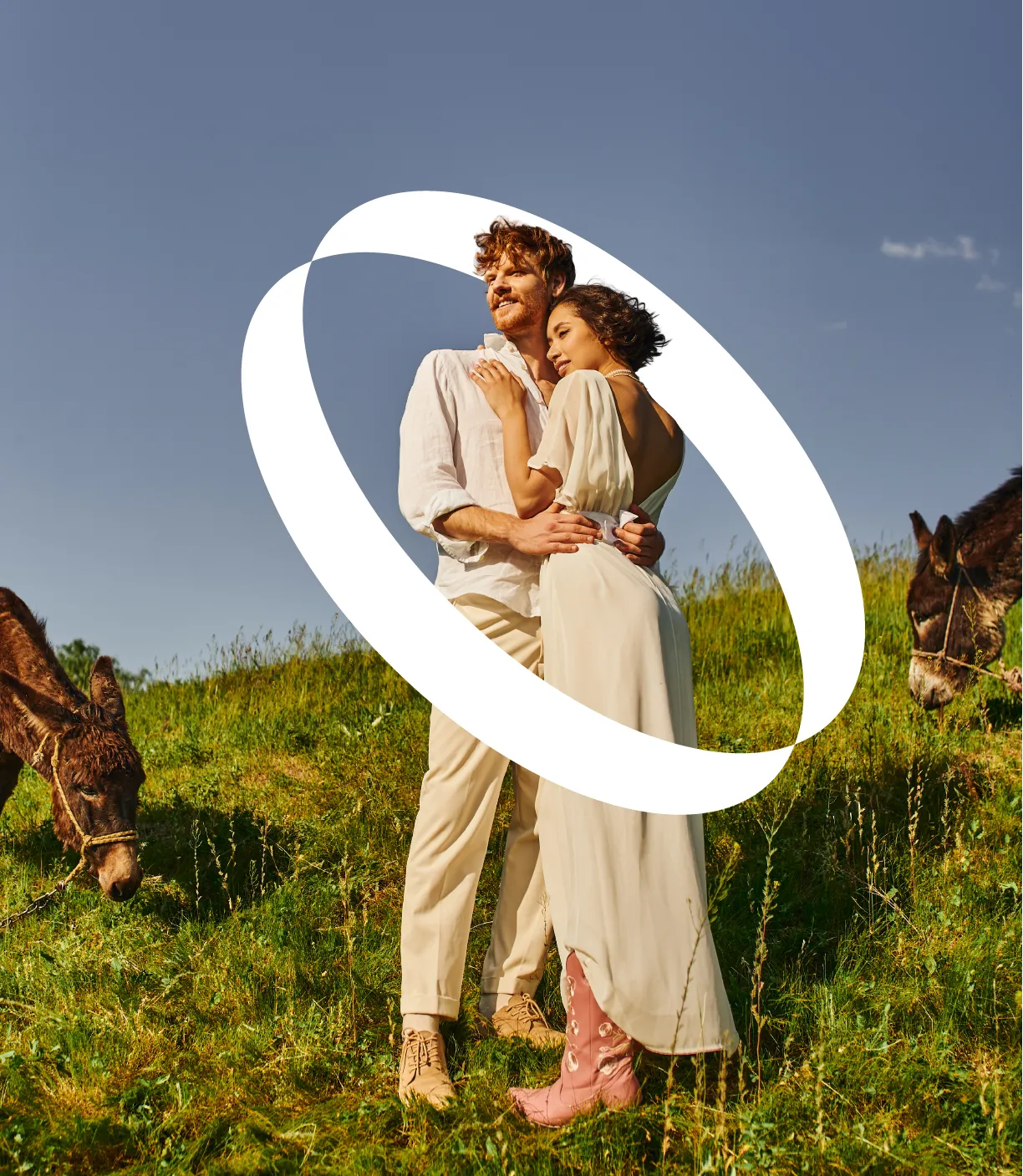
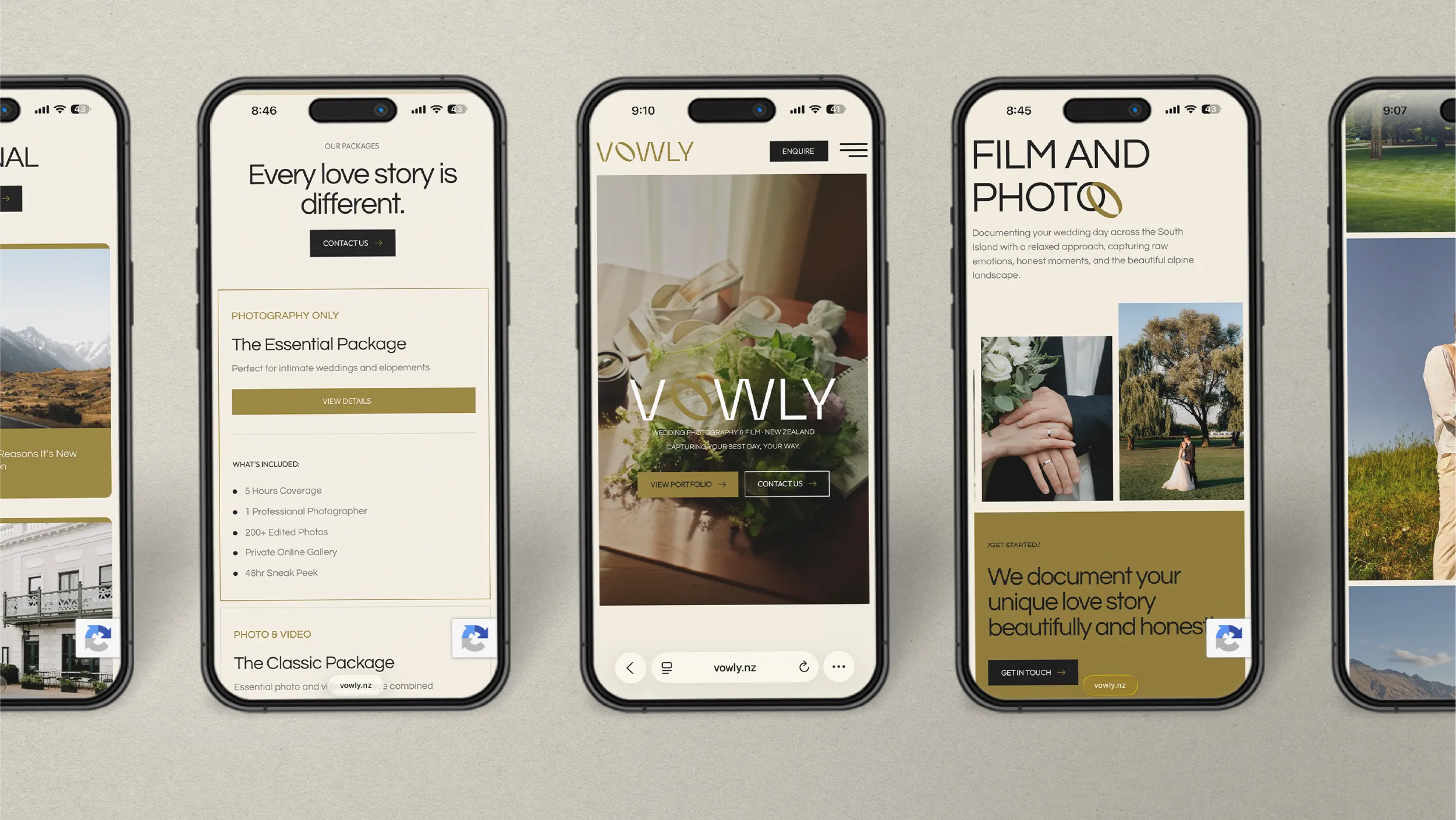
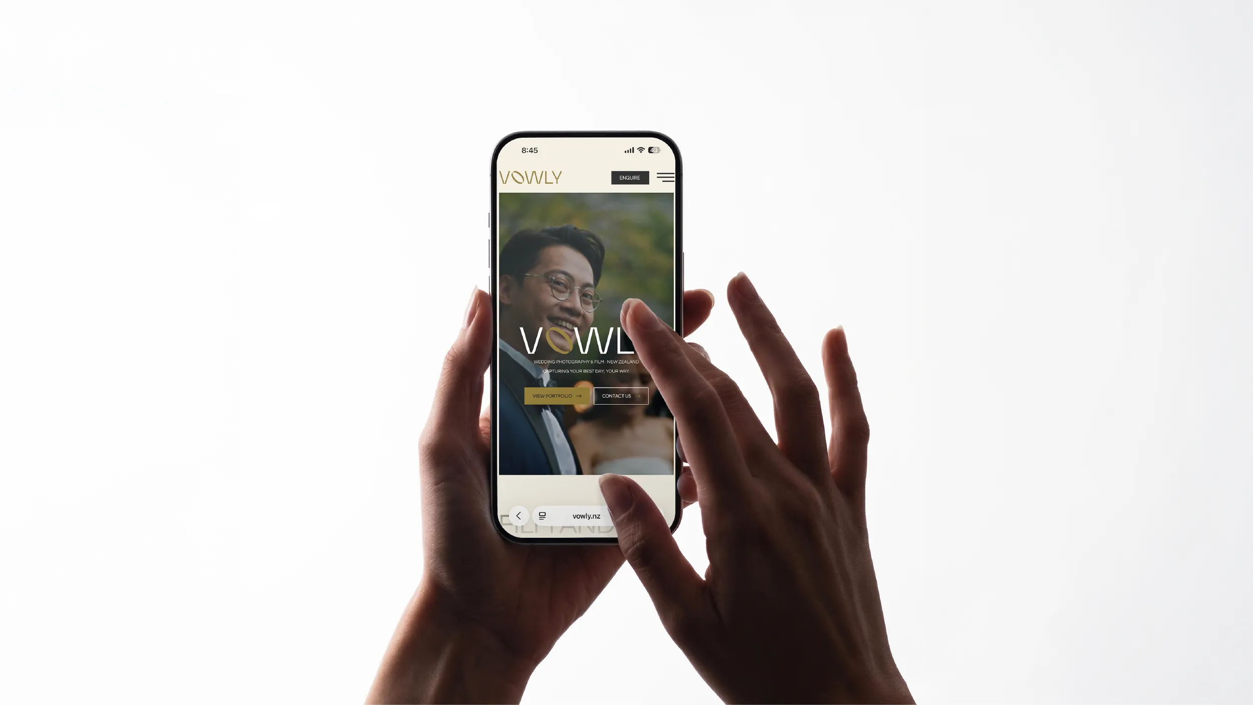
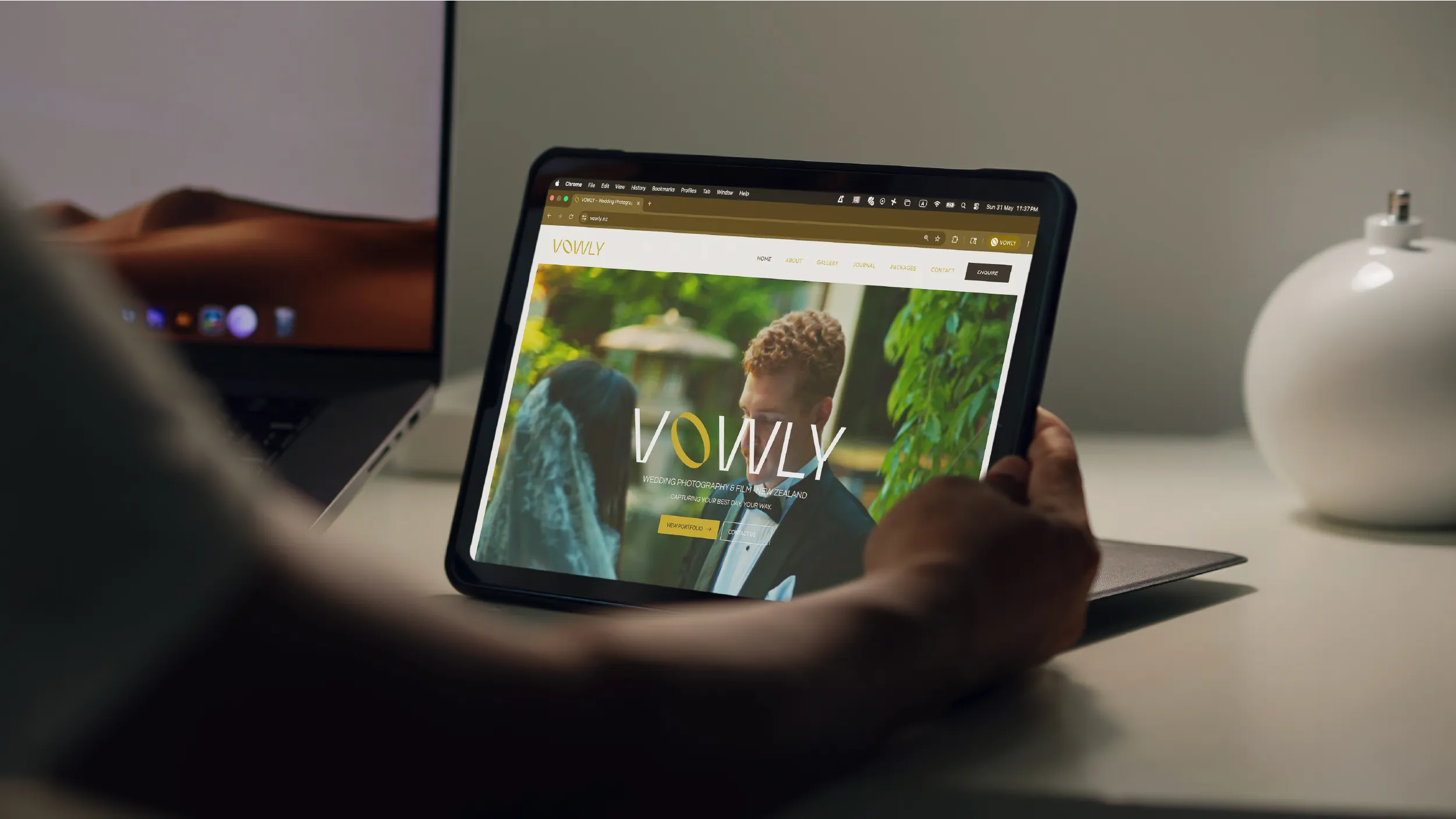
The resulting logo mark is clean and geometric, constructed with the precision that communicates quality at any scale. The ring form is the conceptual foundation of the mark, aligning it with the studio’s name, its service, and the symbolic heart of weddings, but it is not illustrated literally. The form has been abstracted and refined into something contemporary that rewards attention without requiring explanation. The mark works equally well at the small scale of a photograph watermark and at the large scale of a banner or signage application, which is a practical requirement for a studio whose brand appears across a wide range of physical and digital contexts.
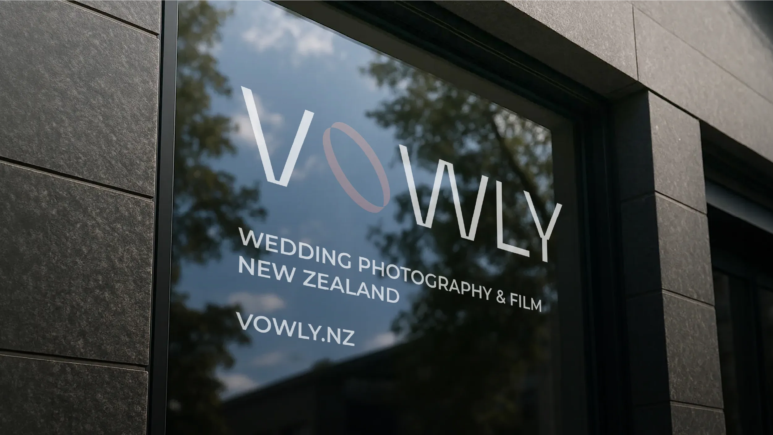
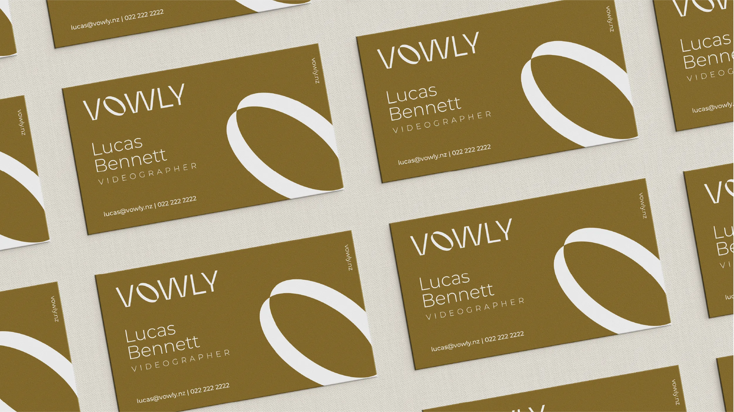
The colour system POV developed for Vowly is anchored in a single defining primary tone named Velvet Gold (Hex #8d752f). This is a warm, deep, slightly muted gold that sits in the space between luxury and calm, communicating both the premium quality of the studio’s work and the peaceful, unhurried atmosphere of the best wedding days. It was a considered choice to move away from the clean white and pale greige palette that dominates contemporary wedding photography branding. Velvet Gold gives Vowly a distinct visual character that is immediately recognisable in the market context it operates within.
The secondary palette introduces Ivory Silk (Hex #f4eee1), a warm off-white that pairs with Velvet Gold without competing with it, and standard white and black for typographic and layout applications. The full palette is restrained in its range while rich in its warmth, creating a visual environment that feels considered and premium without the coldness that some luxury aesthetics can produce.
Typography was selected to balance elegance with readability across the range of applications the brand requires. Questrial handles headings and title treatments, a geometric sans-serif with a humanist warmth that complements the golden palette without overstatement. Outfit is used for body text, button labels, and all supporting copy, providing clean, contemporary readability at smaller sizes. Together they create a typographic hierarchy that feels both professional and personal, which mirrors the character of Vowly’s service offering.
The website, vowly.nz, was designed and built by POV to the same standard as the brand identity itself. The site encompasses six pages: Home, About, Gallery, Journal, Package, and Contact. Each page was designed to give the photography the visual prominence it deserves while the brand identity provides the consistent frame. The design aesthetic is modern, restrained, and professionally executed, with generous use of white space and a layout approach that prioritises the images over the interface. The gallery experience was treated as the centrepiece of the site, given a format and interaction model that presents the studio’s work with the respect it has earned.
The overall approach to the brand positioning was to make Vowly stand out from the market while remaining completely appropriate to the category. Professional and friendly. Luxury and honest. Playful and considered. These are not contradictions in the brief. They are the character of the studio itself, and the brand POV built reflects all of them.