
KOK Consultancy
New brand identity for a New Zealand employment relations consultancy, with an arrow hidden in the lettermark and empathy built into the palette.
KOK Consultancy Limited is a New Zealand employment relations consultancy founded by Kelly O'Kane, providing specialist advice and support for clients navigating complex workplace situations. POV developed the complete brand identity and visual identity, producing a mark that communicates forward movement and professional purpose, and a colour system that balances authority with genuine human warmth.
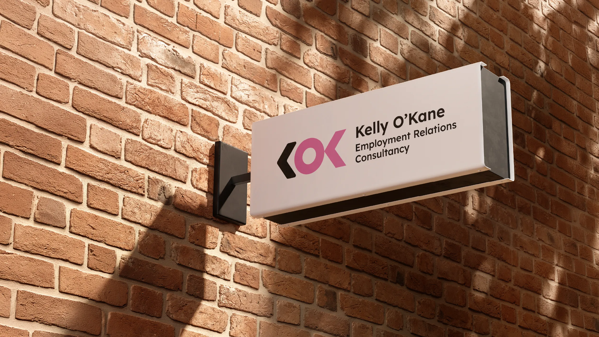
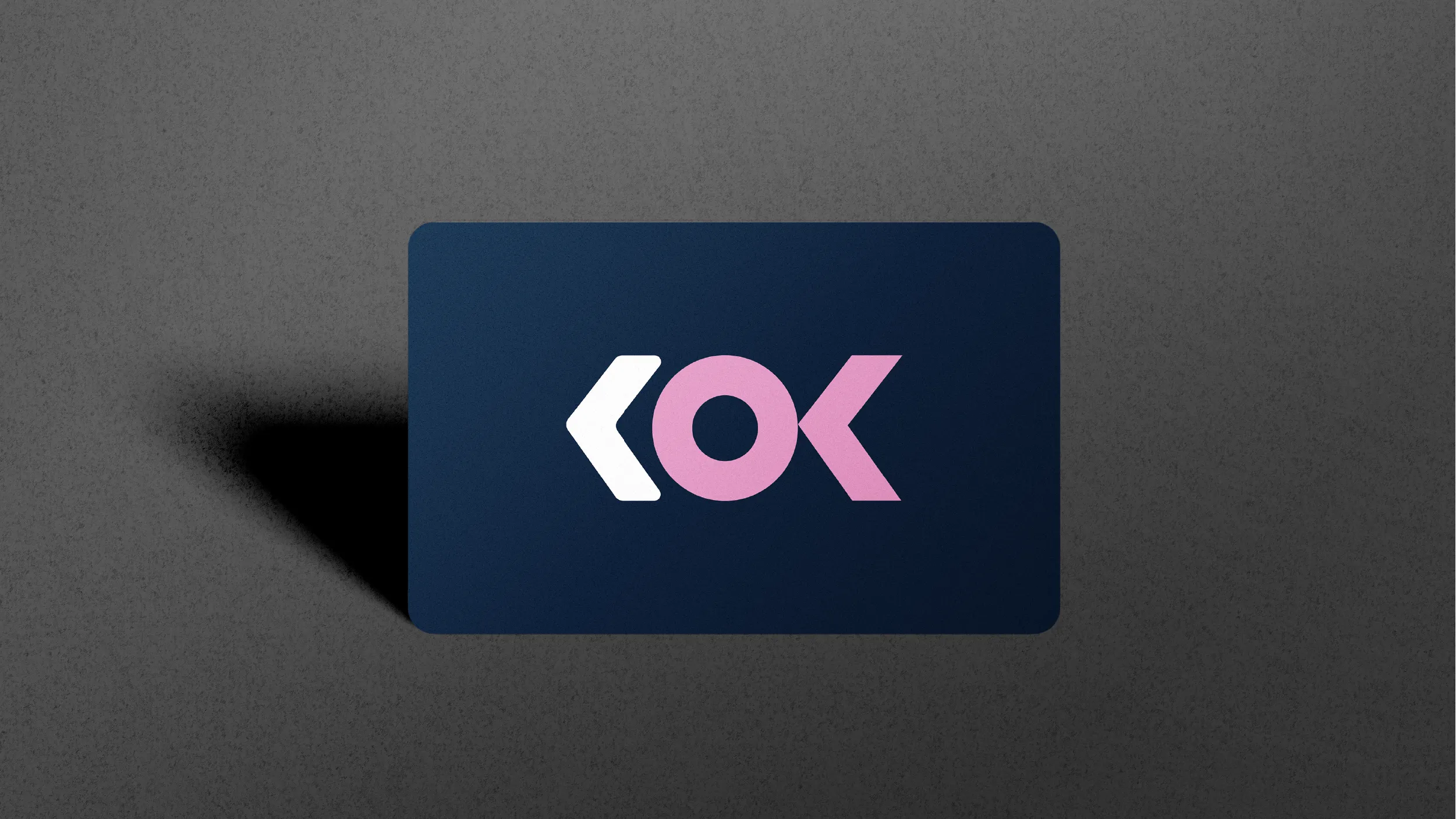
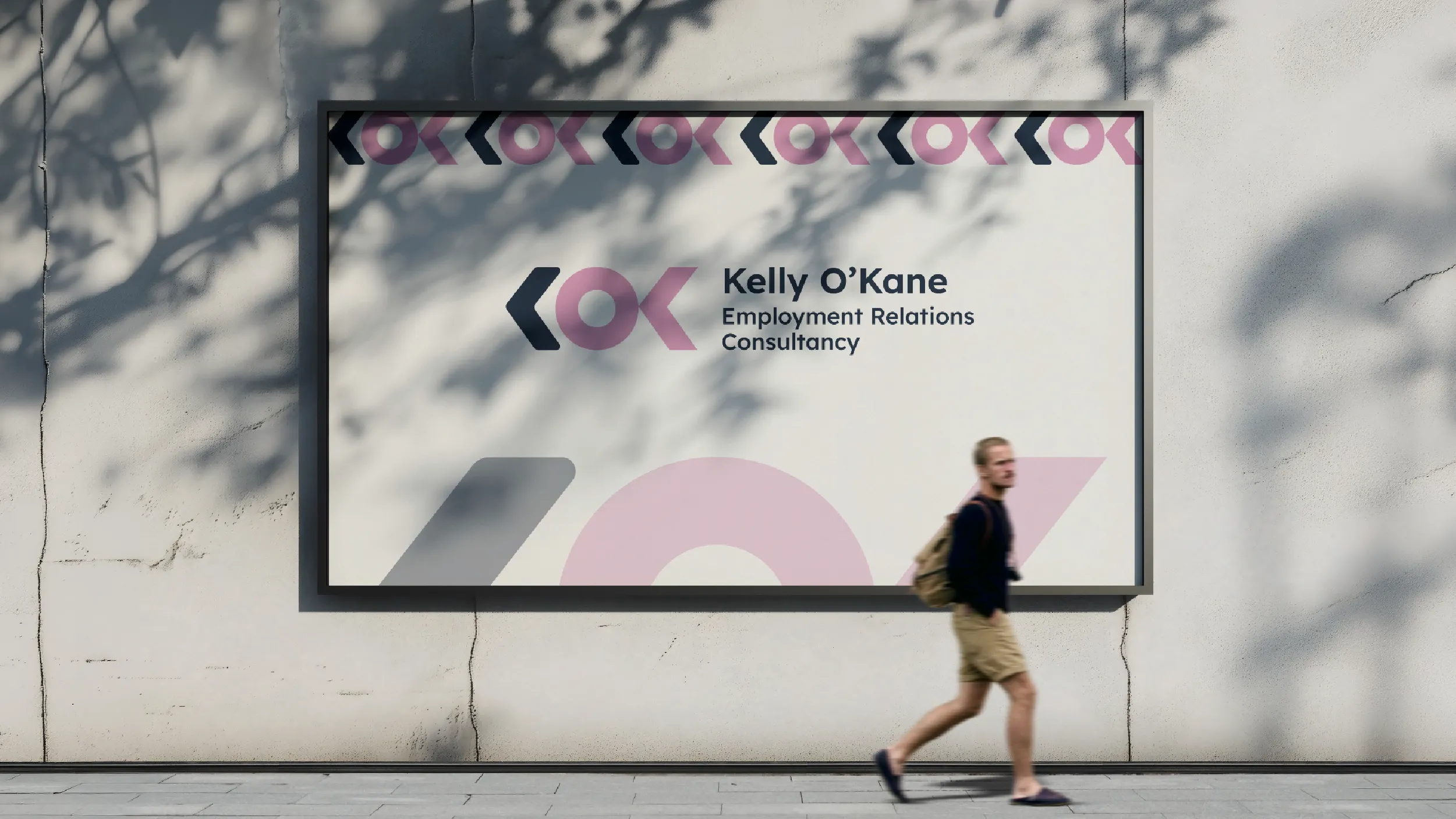
The K in the logo is not just a letter. The stylised form of the lettermark carries an arrow within its geometry, pointing forward and outward in a way that is subtle enough to read as a natural part of the letterform and deliberate enough to communicate direction and momentum to anyone who looks closely. Employment relations work can feel like a situation that is stuck. The brand communicates from the first visual contact that KOK's role is to move things forward.

#142640
0%Midnight Blue
#142640Orchid Pink
#E39EC7Pink and dark blue is an unusual combination for a professional services practice, and that is precisely the point. Dark Midnight Blue provides the professional foundation: credibility, authority, the visual weight of serious legal and commercial expertise. Orchid Pink brings something that most professional services brands are afraid to claim explicitly: warmth, empathy, and the recognition that the people on the other side of employment relations situations are human beings in difficult circumstances.
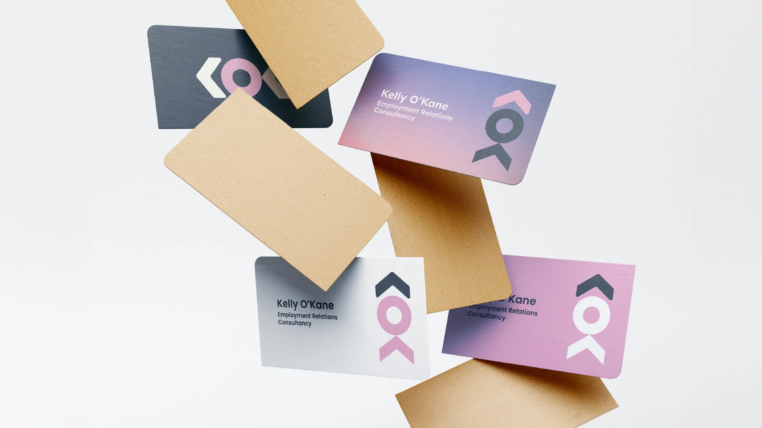
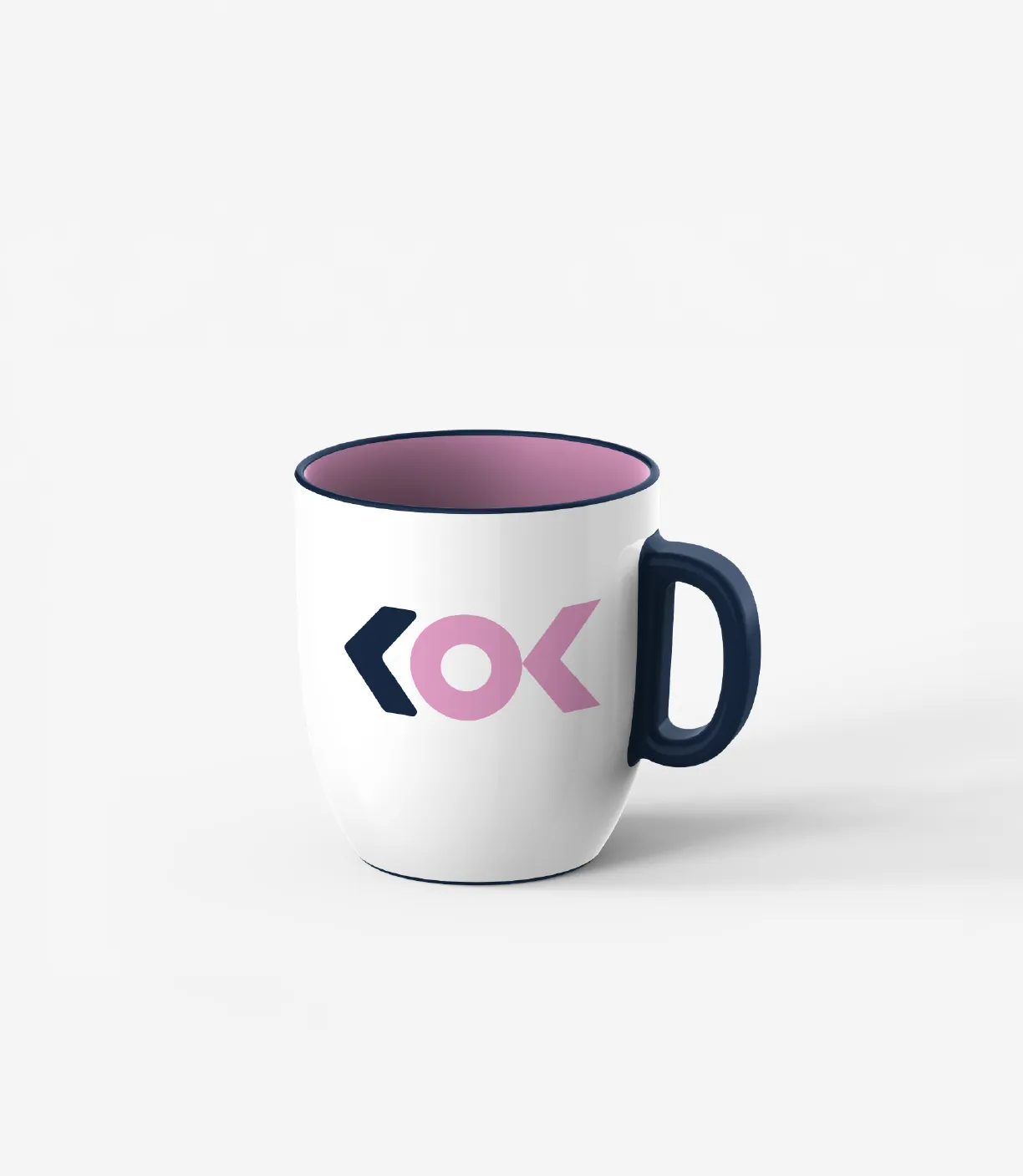


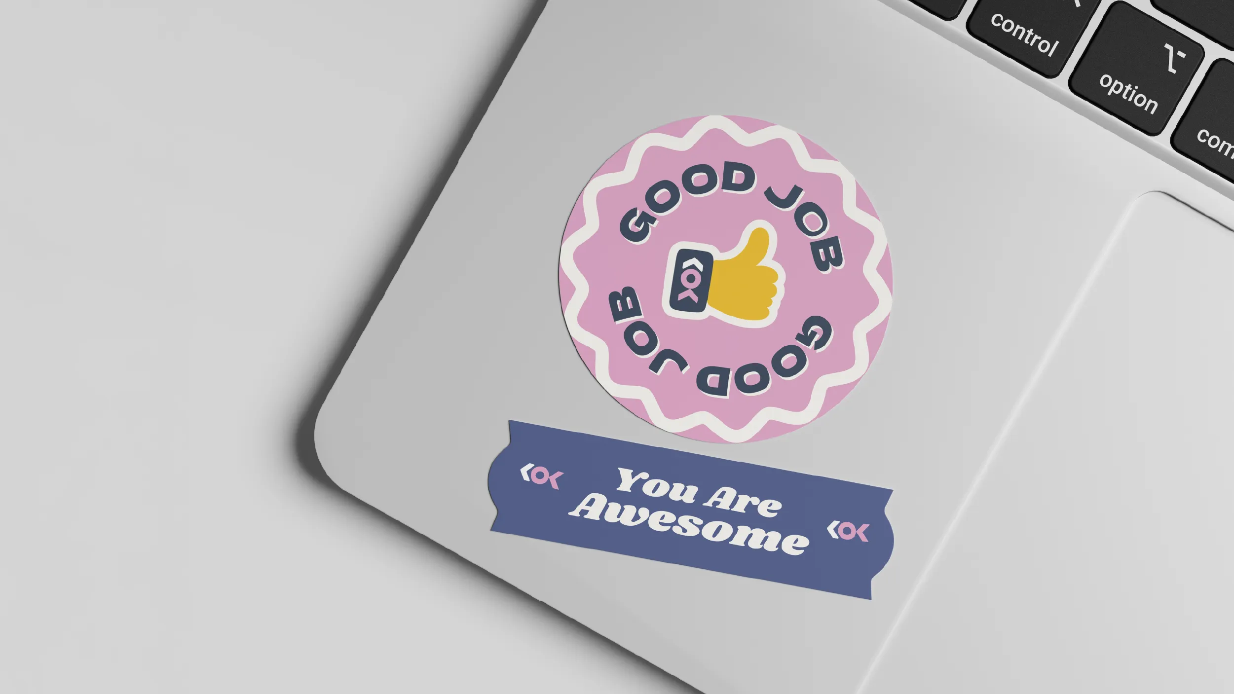
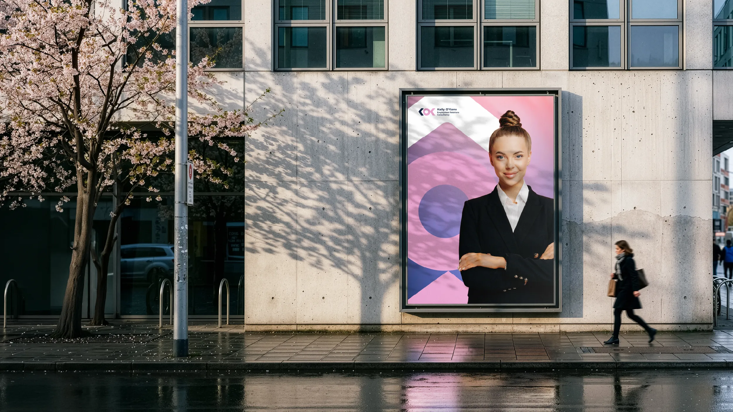
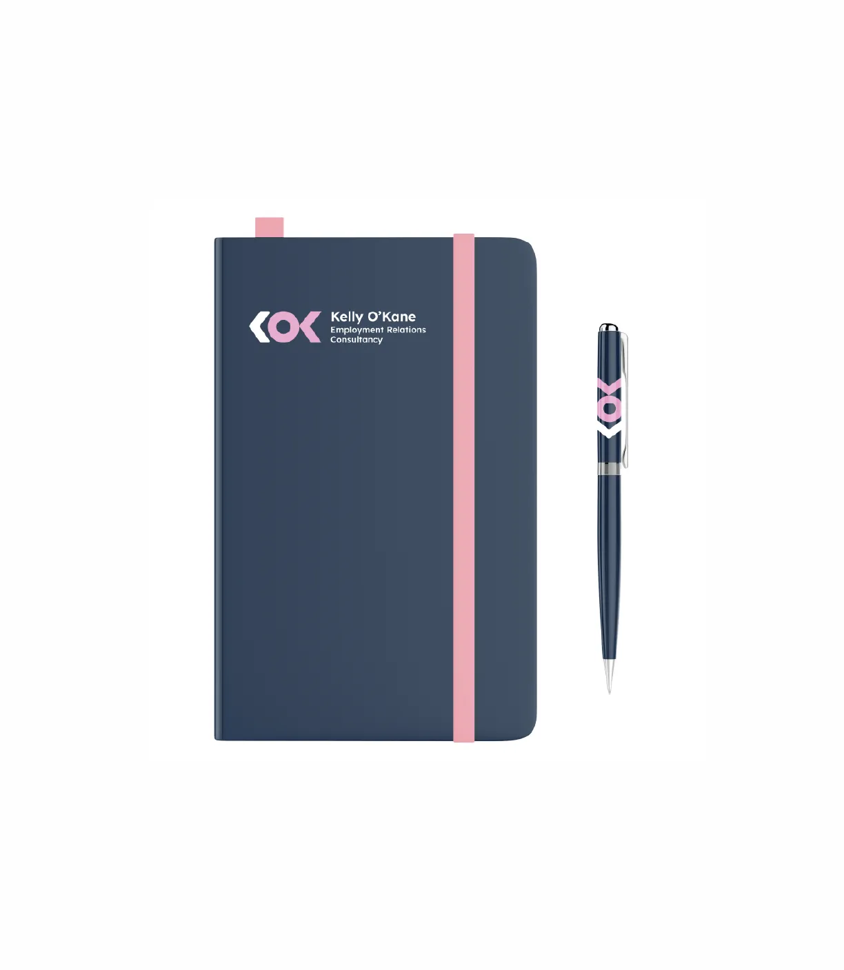
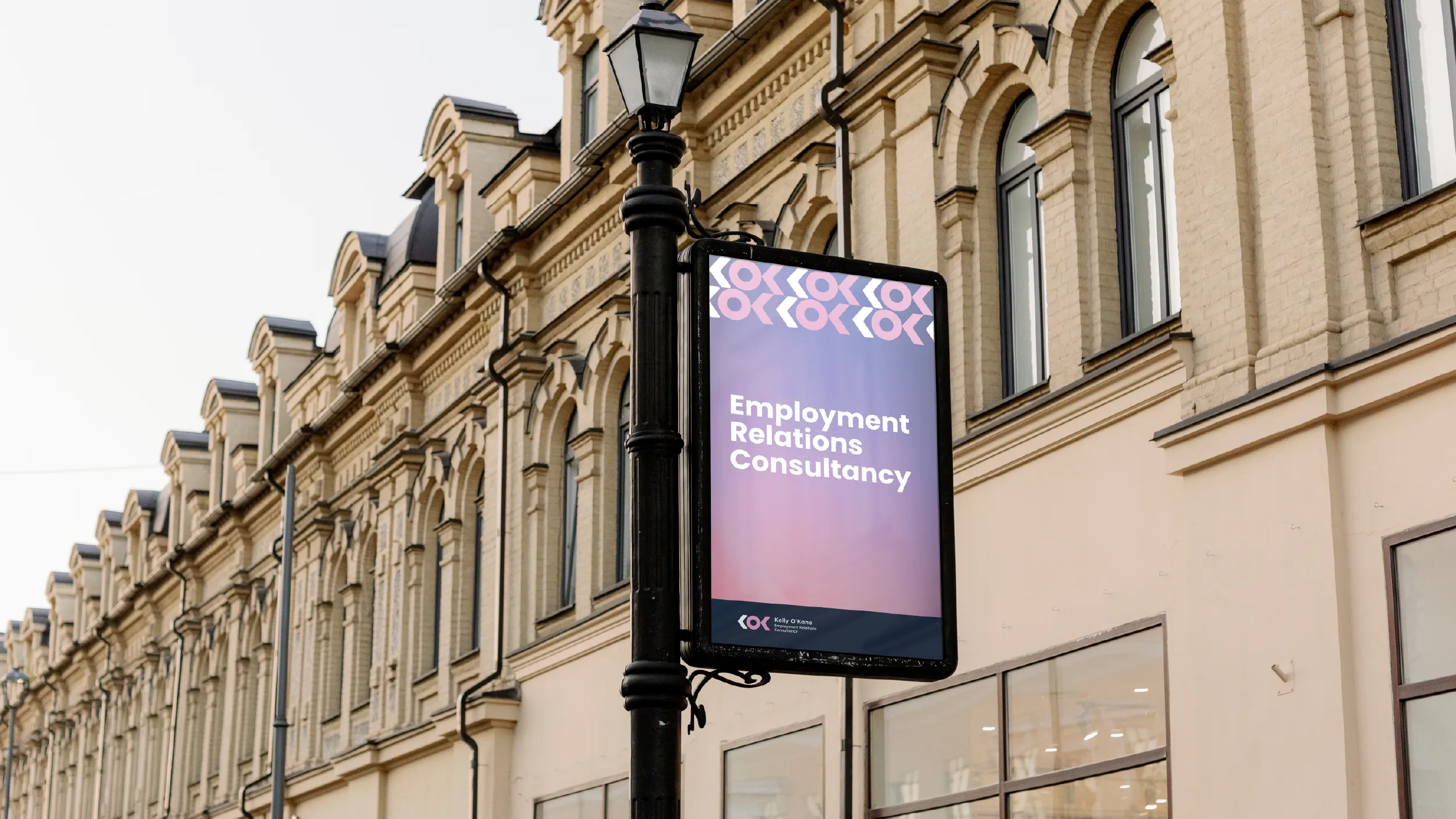
The brand was designed to be versatile across every medium from a business card to a billboard, from a digital platform to a branded notebook. Modern, minimalist, and immediately legible at any scale. The minimalist approach ensures it remains timeless while the colour system ensures it remains distinctive.
KOK Consultancy Limited was founded by Kelly O’Kane as a specialist employment relations practice delivering expert advice and support to organisations dealing with complex workplace challenges. Employment relations sits at a demanding intersection: employment law, human behaviour, organisational culture, and high-stakes decision-making about real people’s working lives.
The situations that bring clients to KOK’s door are rarely straightforward and rarely comfortable. Disputes, investigations, restructuring processes, performance management, personal grievances, and the full complexity of the employer-employee relationship in its most difficult moments. Kelly’s approach to this work is built on the combination of deep specialist expertise and genuine human empathy that the best employment relations practitioners bring to their clients.
The brand brief POV was given was specific and honest about the qualities the identity needed to communicate. Modern and minimalist. Approachable and professional. Forward-thinking and purposeful. The colour palette was identified as a deliberate combination of dark blue, representing professionalism and trust, and pink, representing approachability and empathy. The challenge was to use these colours in specific tones that would hold both qualities simultaneously without either one undermining the other, and to build a logo mark that communicated the forward-moving, purposeful character of the practice.
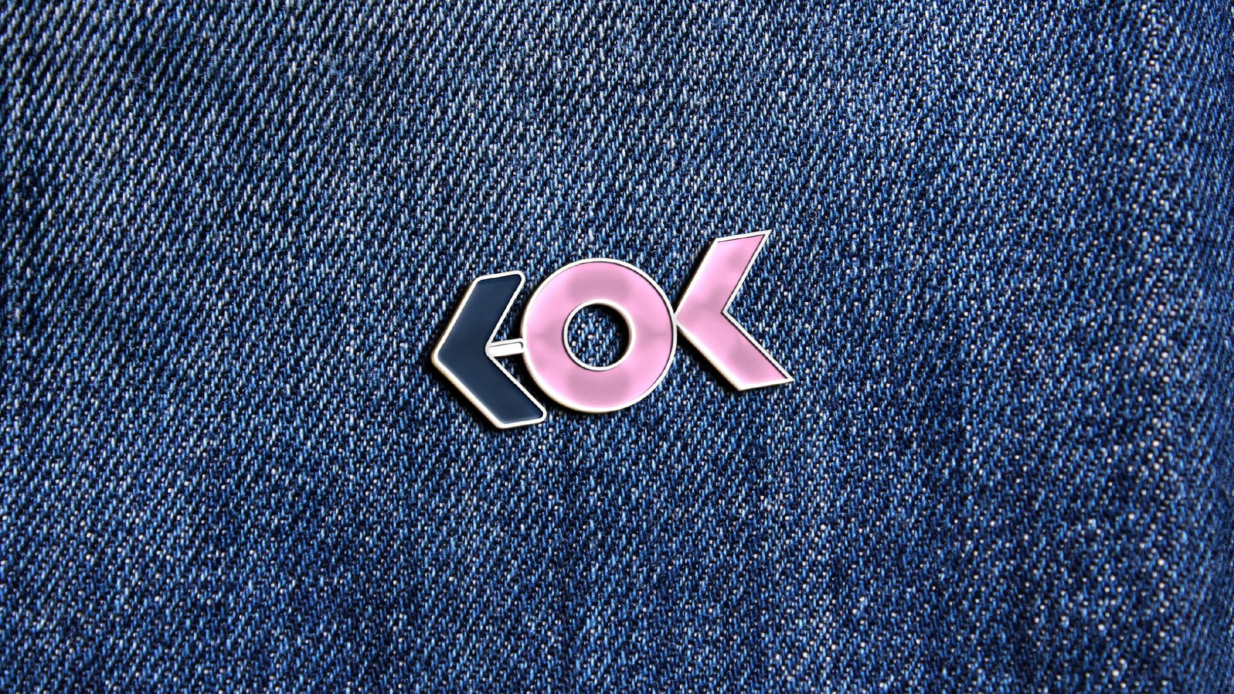
The logo mark POV developed centres on the letters KOK as the primary visual element, with the K given a stylised treatment that incorporates the form of an arrow within its geometry. This is not an added visual element. The arrow is contained within the natural structure of the letterform, emerging from the geometry of the K when the form is drawn with this specific intention. The directional quality it communicates, forward movement, progress, and dynamic problem-solving, operates at the level of visual impression before it reaches conscious recognition. A viewer encountering the KOK logo for the first time may not immediately be able to articulate why it feels purposeful and directed, but the formal quality of the mark produces that impression reliably.
The mark is provided in three formats as specified in the brand guidelines: horizontal, vertical, and icon versions. Each format is governed by clearspace and minimum size specifications that ensure the logo is always presented with the clarity and prominence it requires to communicate effectively. The icon version, using the K mark alone, is optimised for digital applications including social media profiles, app icons, and other contexts where the full wordmark would be too small to be legible.
The colour palette uses Dark Midnight Blue (Hex #142640) as the primary professional foundation. This is a deep, sophisticated blue that communicates the gravitas and credibility appropriate to a specialist legal and commercial practice. It is dark enough to carry serious professional authority and distinct enough from the generic navy that saturates the professional services sector to be visually memorable.
Orchid Pink (Hex #E39EC7) is the accent and secondary colour, a tone selected with precision for what it communicates within the specific context of employment relations. It is warm and human without being casual or informal. It signals empathy and approachability without undermining the professional seriousness that the practice’s work demands. Within the employment relations sector, where most branding defaults to conservative blues and greys, the introduction of Orchid Pink as a core brand colour is immediately distinctive and communicates clearly that KOK’s approach is different from the conventional model.
White (Hex #FFFFFF) completes the primary palette, providing the clarity and openness that a clean, modern visual system requires.
The brand applications documented in the style guide demonstrate the identity across the range of physical and digital materials the practice uses: business cards, signage, boards, mugs, pens, notebooks, and pins, as well as digital platform applications. Each application demonstrates how the two-colour primary palette and the KOK mark function across different scales and substrates, giving Kelly and any future suppliers clear reference for how the brand should be applied consistently.
Client
KOK Consultancy Limited, Kelly O’Kane
Sector
Professional Services
Employment Relations
Disciplines
Brand Identity
Logo Design
Visual Identity
Colour System
Brand Style Guide