
Convergence Consulting
Brand identity and website for a Canberra project management consultancy serving the Australian Government.
Convergence Consulting is a Canberra-based professional services firm providing end-to-end project management, governance, and commercial support for Australian Government agencies and large private sector programmes. POV delivered the complete brand identity, visual identity system, and website, producing a brand that stands apart in a sector where most firms are visually indistinguishable from each other.

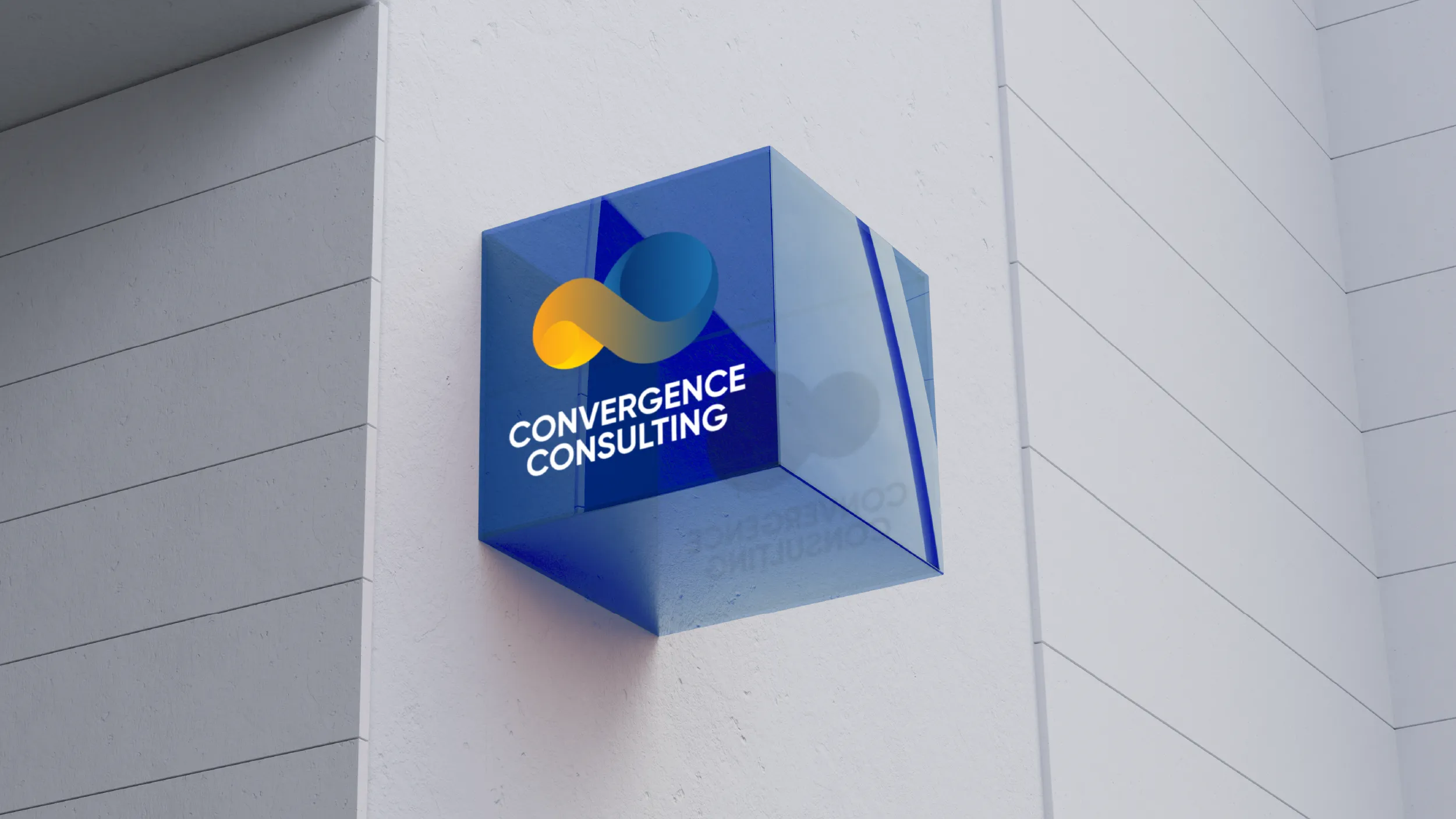
The two-sphere logo mark embodies convergence physically: two distinct forms, each complete in itself, coming together into a unified whole that is more than either could be separately. It is a mark about collaboration and synthesis, which describes exactly what Convergence Consulting does for the organisations it serves. The geometry is precise and three-dimensional, giving the mark a visual presence and solidity that communicates the rigour the firm brings to every programme it delivers.

#01235F
0%Midnight Navy
#01235F
Sky Blue
#1F73B2
Move cursor to distort fluid. Click to drop a swatch.
#01235F
0%
Interact with the core liquid bodies. Watch them interact upon contact.
0%
#1F73B2 / #FA9F1B
The two blues in the Convergence palette do different work. Dark Navy at #01235F carries the authority and professional weight the government sector expects. Light Blue at #1F73B2 opens that weight up, giving the brand range and approachability without sacrificing the credibility that dark blue provides. Together they create a palette that can be serious and energetic within the same communication.


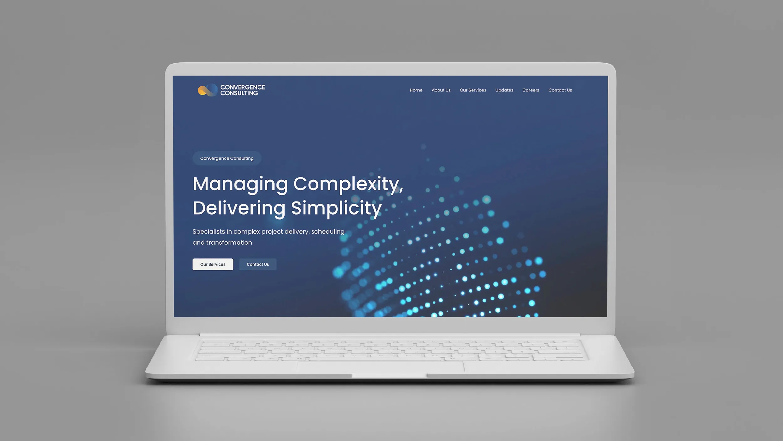
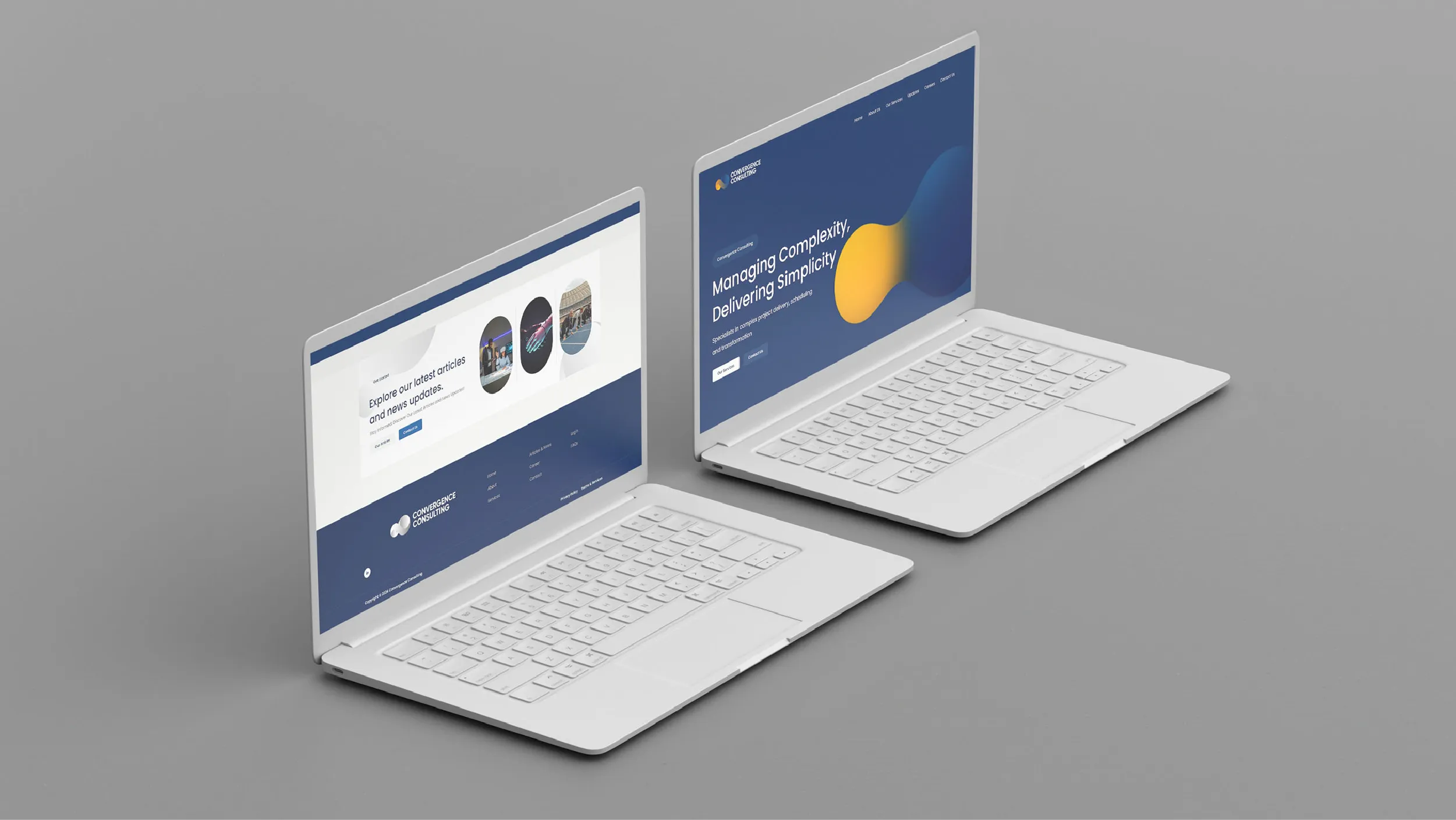
The website was designed to do one thing above everything else: give a prospective client, whether a government procurement officer or a private sector programme director, enough confidence in the quality and capability of the firm to make an initial contact. Every page, every section, every line of copy, and every design decision was measured against that outcome.
Convergence Consulting was founded by practitioners who spent years inside complex government and private sector project environments and identified an opportunity to deliver a higher quality of project management and business consulting service than the market was offering. The firm’s positioning captures this directly: Managing Complexity, Delivering Simplicity. Their work spans project and programme delivery, project controls, organisational change management, ERP implementation on Oracle and SAP platforms, mentoring and coaching for project teams, and grants and procurement support. The clients they serve are organisations for whom complexity is a given and delivery is non-negotiable.
POV was engaged to develop the complete brand identity and website for the firm. The creative starting point was an honest assessment of what Convergence was competing against. The Australian government consulting sector is populated by large global firms and a layer of mid-market specialists whose visual identities are, with very few exceptions, interchangeable: professional, conservative, dominated by navy and grey, and designed primarily to avoid saying anything wrong rather than to say anything distinctive. In this environment, standing out without undermining the credibility signals the sector demands was the central creative challenge.
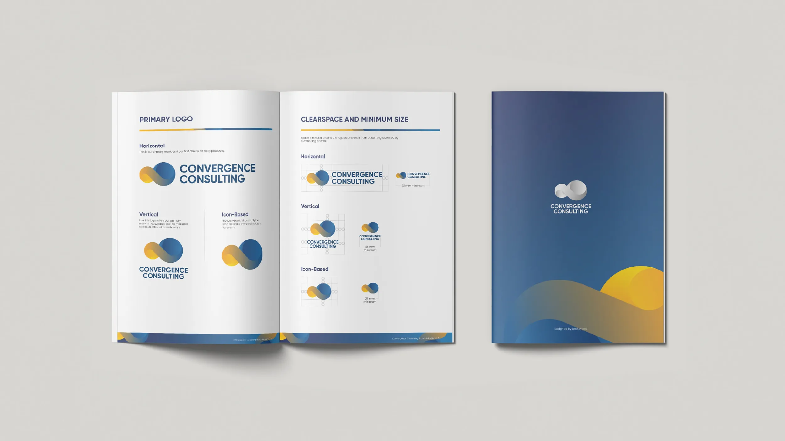
The primary logo mark POV developed is built around two overlapping spheres, a form that makes the concept of convergence immediately and visually explicit. The spheres are rendered with a sense of three-dimensional solidity and geometric precision that communicates the technical rigour of a firm that delivers complex infrastructure projects. The overlap between the two forms is the visual argument of the mark: different entities, different capabilities, different perspectives, brought together into a whole that is more effective than any of them separately. It is a mark that works conceptually as well as aesthetically.
The logo system was delivered in three primary orientations. The horizontal version is the primary mark, used wherever space allows. The vertical version provides a more compact footprint for contexts where the horizontal layout is impractical. The icon-based version, using only the sphere mark without the wordmark, is available for digital applications and small-scale uses where the full logo would be too small to read clearly. Each version was specified with minimum size requirements and exclusion zone guidance, and the full range of colour versions was provided for both light and dark application backgrounds.
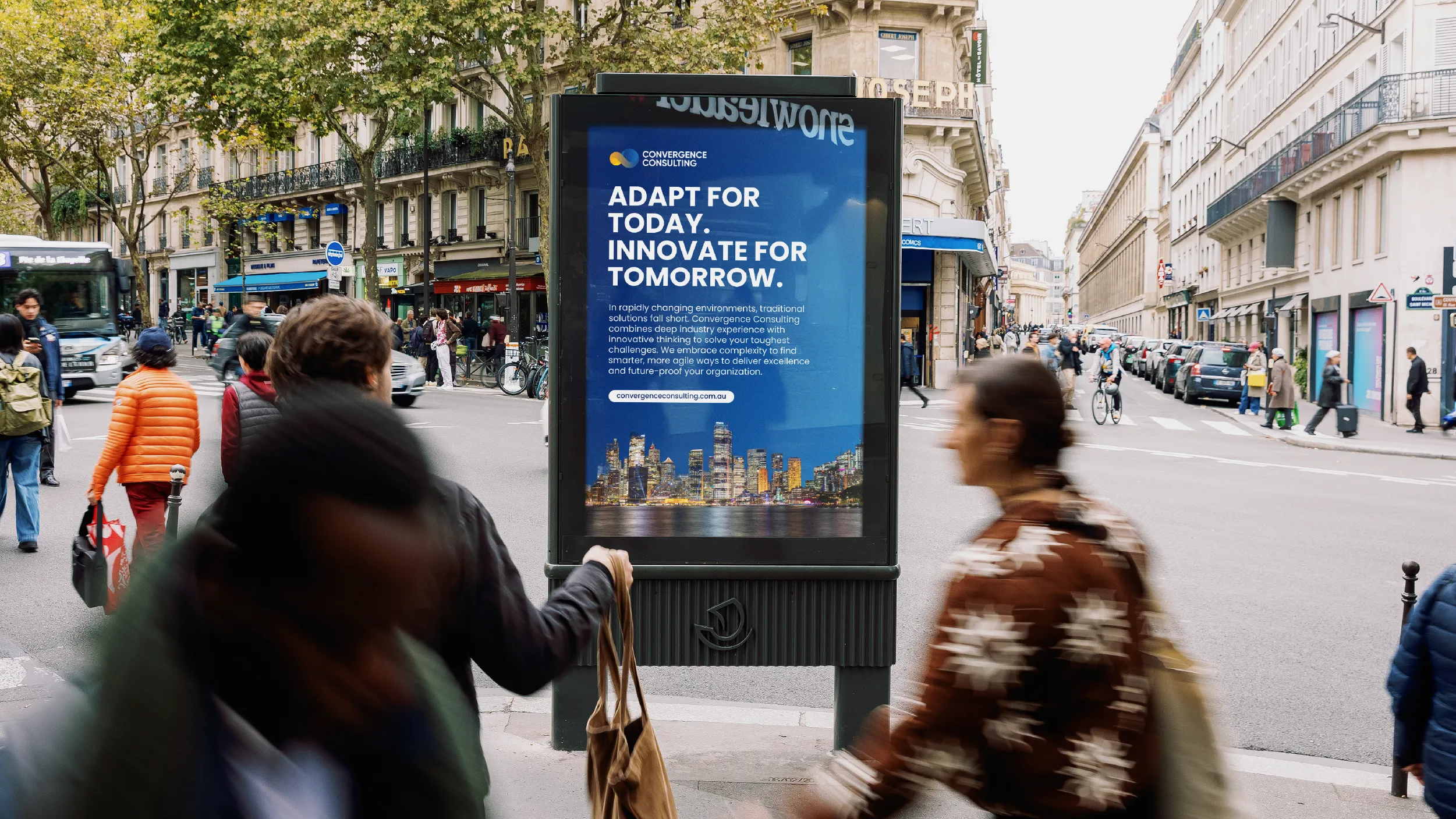
The colour palette for Convergence uses Dark Navy (Hex #01235F) as the primary brand colour, a deep and authoritative tone that immediately communicates professional credibility in the government sector context. Medium Blue (Hex #003367) and Light Blue (Hex #1F73B2) extend the blue family to provide range within the primary palette. The accent colours, Orange (Hex #FA9F1B) and Yellow (Hex #FFD700), are the distinctive element of the system: warm, confident tones that break decisively from the grey-blue conservatism of the sector. Used with restraint as accent and highlight colours, they give the brand a visual energy and distinctiveness that is immediately apparent when a Convergence communication appears alongside those of competitors.
Typography uses Gilroy for headlines and all display applications, a geometric sans-serif with the precision and modern confidence appropriate to the firm’s positioning. Poppins is used for body copy and all text at reading sizes, providing clarity and a slight warmth that balances the authority of the Gilroy display weight. The typographic system produces communications that are unambiguously professional while remaining readable and accessible.
The website was designed and built in WordPress with Elementor, providing the Convergence team with full control over their content after launch without requiring design or development support for routine updates. The information architecture was structured around the firm’s service offering, with clear, well-defined service pages covering each area of the practice. A case study framework was built into the site to allow the team to document and present project delivery evidence as the firm’s track record grows, which is the most important long-term content asset for a professional services firm in a sector that values demonstrated delivery above all else.
The final page of the brand guidelines document carries the credit: Designed by best.org.nz. This project was designed before the establishment of POV Creative Agency as a formal entity, and represents the direct predecessor of the work POV now produces.
Client
Convergence Consulting
Sector
Professional Services
Government
Disciplines
Brand Identity
Visual Identity
Website Design