CAYE Pacific
A brand identity and website built to represent eleven Pacific nations, carry Commonwealth authority, and feel genuinely rooted in Pacific identity.
CAYE Pacific is a youth-led Commonwealth-recognised network launched in 2023 to empower young entrepreneurs across eleven Pacific nations, in collaboration with the Commonwealth Youth Programme. POV designed the complete brand identity, visual identity system, and website. POV's founder Best Apisit Uthakhamkong serves on the CAYE Pacific Executive Committee as the New Zealand representative.
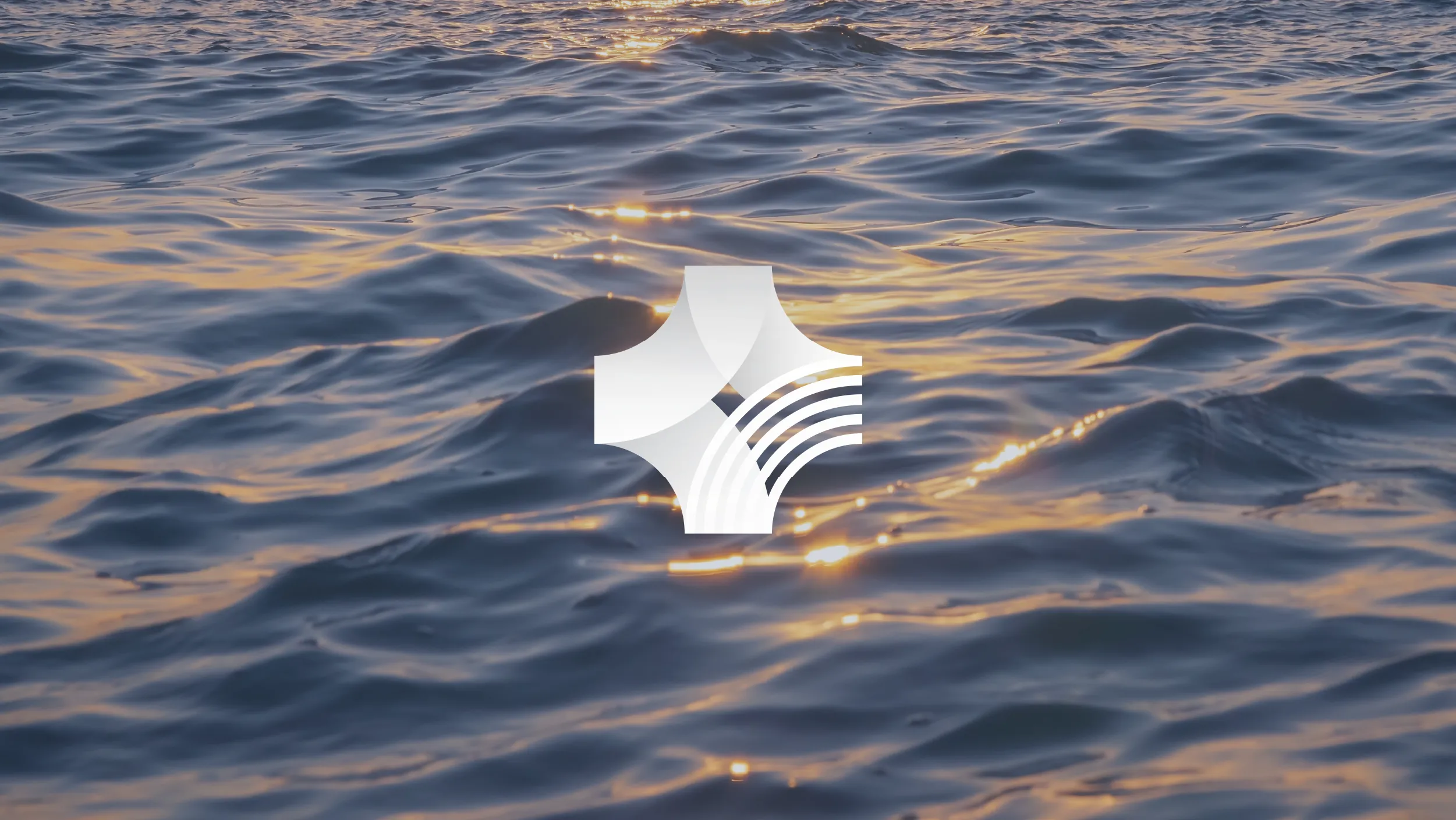


The wave and the weave. The wave is the Pacific Ocean, vast and present and connecting every nation in the network. The weave is the traditional practice found throughout the Pacific, the interlacing of different elements into something stronger than any of them separately. Both ideas are in the logo mark. Both ideas describe exactly what CAYE Pacific does and why it exists.

#E31E26
0%Crimson Red
#E31E26
Golden Yellow
#FEE000
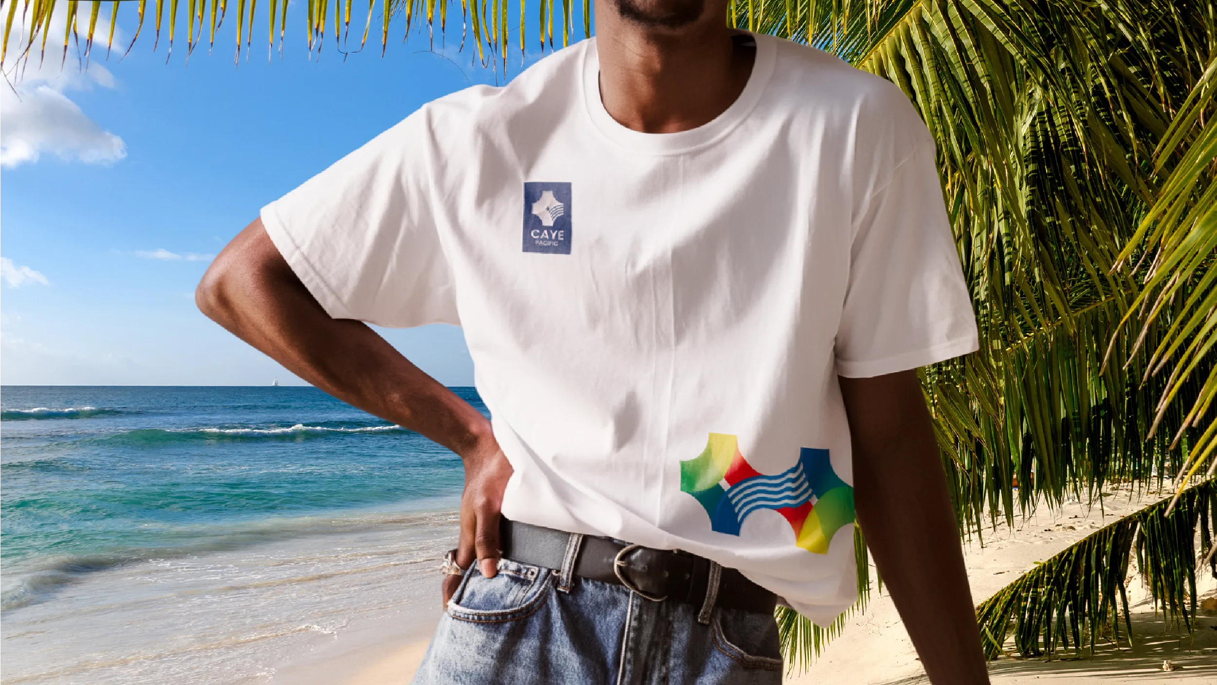
The colours in the CAYE Pacific palette are not invented. They are drawn directly from the flags of the eleven member nations: the dark blues, greens, reds, and yellows that appear across the flags of Australia, New Zealand, Fiji, Samoa, Tonga, and the rest. Bringing those flag colours into a unified gradient system creates a palette that is simultaneously a statement of inclusivity and a visual map of the network itself.
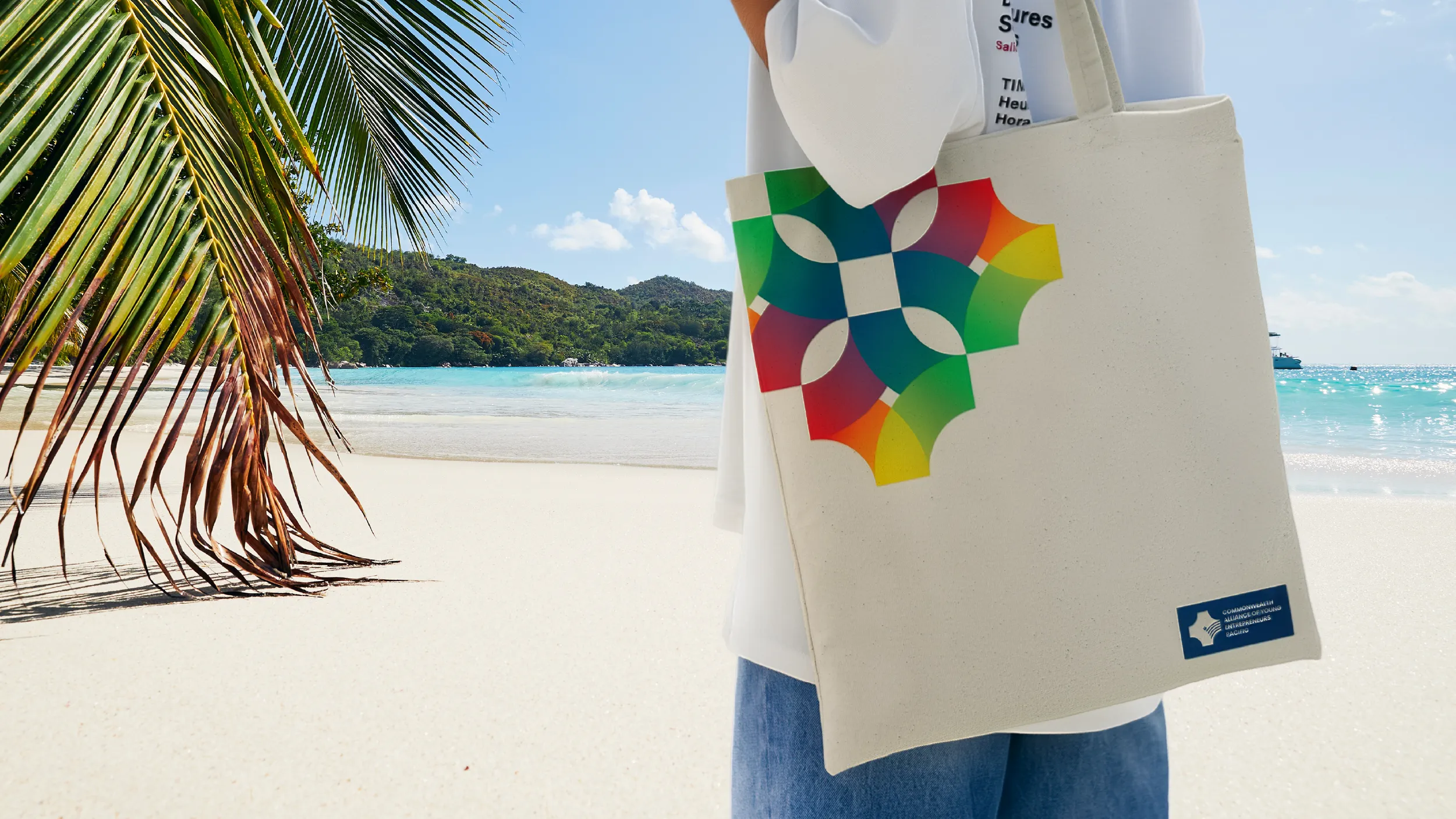


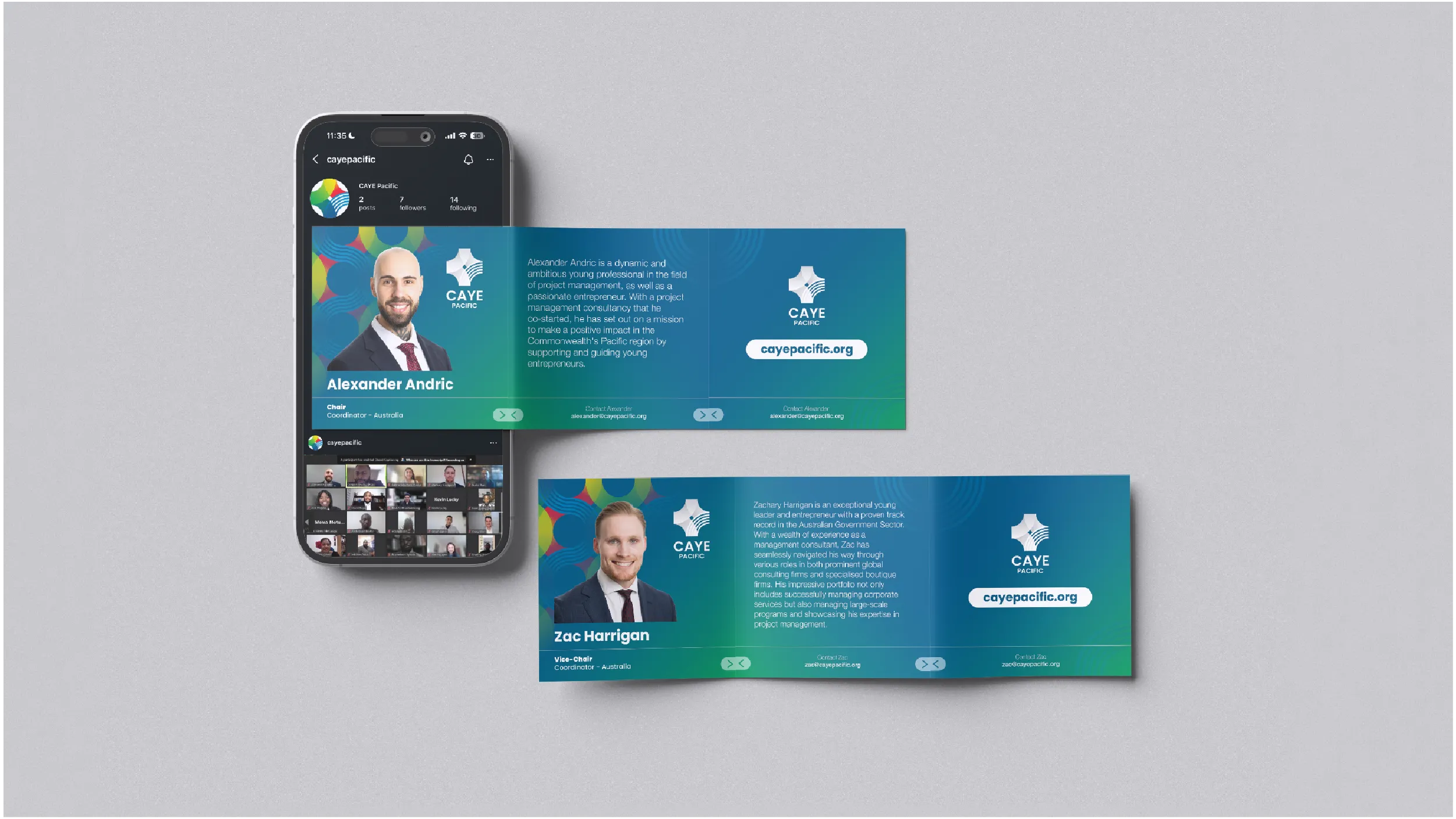
The graphic pattern system extends the visual identity beyond the logo into a rich library of wave and weave patterns inspired by Pacific textile and visual traditions. This gives the organisation the visual materials to create communications that feel genuinely Pacific at a cultural level, not just at the level of colour and symbol. Patterns named Woven Waves, Waveform, Unified Patterns, and Interwoven Threads each express a different aspect of the identity while maintaining coherence across the full system.
CAYE Pacific, the Commonwealth Alliance of Young Entrepreneurs Pacific, was officially launched in August 2023 in collaboration with the Commonwealth Youth Programme, as a contribution to the Commonwealth’s 2023 Year of Youth. The organisation was created to address a genuine gap in the representation of young entrepreneurs across the Pacific region: the eleven Commonwealth countries of Australia, New Zealand, Fiji, Kiribati, Nauru, Papua New Guinea, Samoa, Solomon Islands, Tonga, Tuvalu, and Vanuatu lacked a dedicated network that could represent their young entrepreneurs at a regional and international level.
The work CAYE Pacific does is substantial in its ambition. Policy analysis and advocacy for young entrepreneurs in member nations. Connection of innovative young people to local and international recognition events and investment opportunities. Cross-country collaboration and knowledge exchange. Partnerships with Commonwealth agencies, member state governments, and international entrepreneurship organisations. The network is modelled on equivalent Commonwealth youth entrepreneur alliances in Asia, the Caribbean, and Africa, and it has the potential to become one of the most significant platforms for Pacific youth entrepreneurship on the global stage.
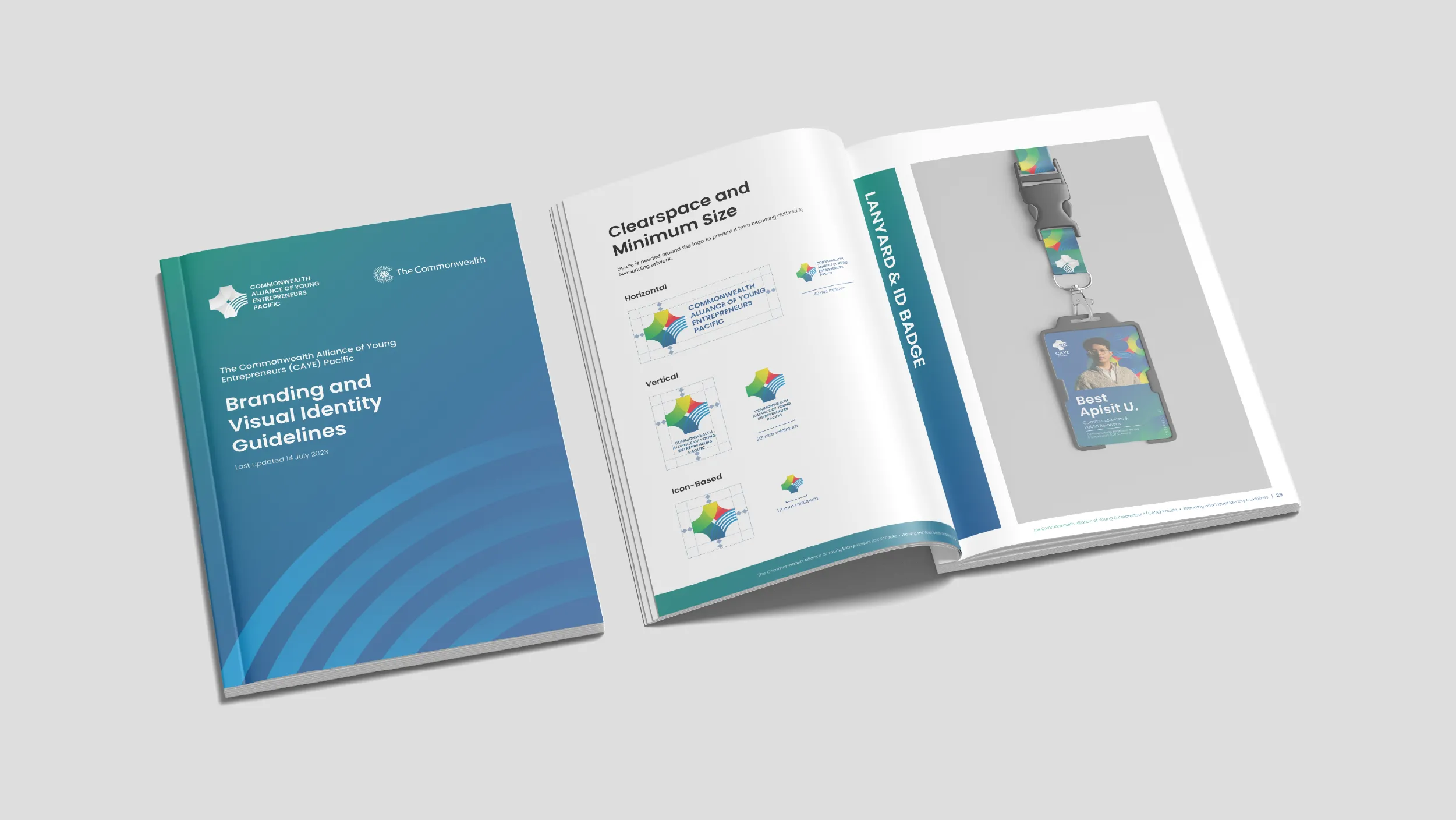
The brand brief was the most complex single brief POV has worked with. A visual identity for eleven nations could not favour any of them. It had to project the credibility and professional register appropriate to Commonwealth engagement while feeling authentically Pacific rather than generically international. It had to work for an executive committee of volunteers spread across multiple countries and time zones, which means the system had to be detailed enough to be applied consistently without design support and clear enough to be understood by people who are not design professionals. And it had to appeal to the young entrepreneurs who are the organisation’s primary constituency, communicating energy and relevance without sacrificing credibility.
POV’s creative direction began with the two foundational ideas that became the conceptual core of the visual identity: Wave and Weave. The wave references the Pacific Ocean, the physical reality that connects all eleven member nations and defines the Pacific experience more than any other geographic feature. The weave references the traditional craft practice found throughout the Pacific in different forms, the making of connections between separate elements, the interlacing of individual threads into patterns and structures that are stronger than any single component alone. As a metaphor for what CAYE Pacific does, weaving separate national entrepreneurship communities into a regional network that is more powerful than any of them independently, the weave concept is exact.
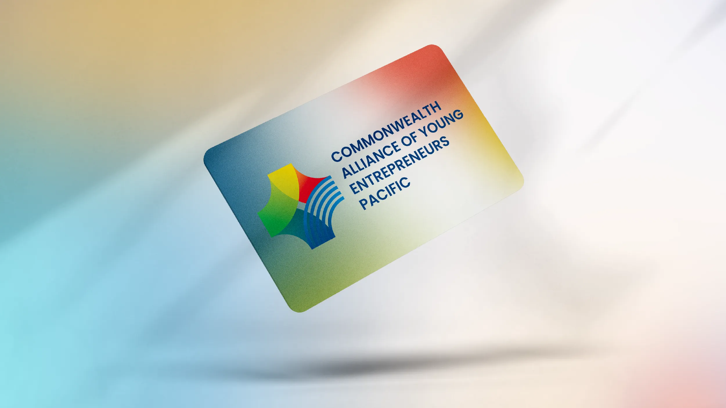
These two ideas were combined with the star form, a symbol present in the flags of multiple member nations, to produce the primary logo mark. The mark represents four directions of development, four nations joining at a common centre, the wave of the Pacific ocean running through the form. Colour is brought into the mark directly from the flags of the eleven member nations: the dark blue, green, red, yellow, and light blue that appear across those flags collectively are the colours of the CAYE Pacific identity, grounding the visual system in the specific national identities it represents.
The colour palette was developed into four primary gradient pairs, each moving between two flag-derived tones: the blue gradient from Dark Navy (#1A4079) to Sky Blue (#008DCE), the green gradient from Forest Green (#009E4B) to Navy, the yellow to green gradient from Golden Yellow (#FEE000) to Forest Green, and the red to yellow gradient from Crimson (#E31E26) to Golden Yellow. These gradients allow the organisation’s communications to shift in visual temperature across different contexts while maintaining a coherent palette that is always recognisably Pacific.
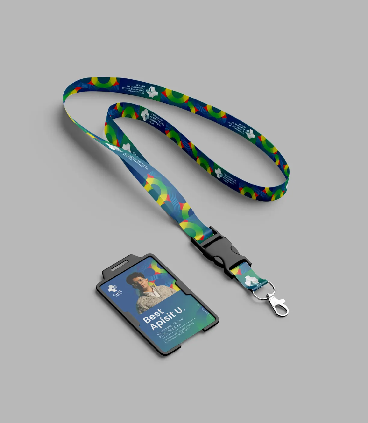
The graphic pattern system POV developed for CAYE Pacific is one of the most distinctive elements of the visual identity. Four named patterns, Woven Waves, Waveform, Unified Patterns, and Interwoven Threads, provide a rich library of visual material derived from Pacific textile and design traditions. These patterns can be applied across event banners, branded merchandise including tote bags and t-shirts, lanyards, publications, and digital backgrounds, giving the organisation the visual materials to create communications that feel genuinely culturally grounded at a level beyond colour and logo alone.
The website serves as CAYE Pacific’s primary digital platform and public presence, providing an information hub, news platform, and connection point for young entrepreneurs across the Pacific. It was designed to be manageable by a volunteer executive committee and to represent the organisation’s ambitions with the credibility required to engage government officials, Commonwealth agencies, and international partners.
Client
Commonwealth Alliance of Young Entrepreneurs (CAYE) Pacific
Sector
Non-profits
Civic and Public
Education
Disciplines
Brand Identity
Visual Identity
Website Design